Category: FEATURES

  • Scott Treleaven & Georgia Dickie at Cooper Cole Gallery

    In its current exhibitions Cooper Cole Gallery host two Toronto based artists, Scott Treleaven and Georgia Dickie. The main floor and upper level of the gallery is occupied by Scott Treleaven’s paintings, under the title Not Palaces.

    Installation view of Scott Treleaven, Not Palaces at Cooper Cole Gallery, 2017. Courtesy of Cooper Cole Gallery

    Abstract art always give a lot of opportunity for interpretations and various narratives imagined by the viewer. For guidance we turn to the essay printed on the gallery’s website. The one accompanying Treleaven’s show is a literature piece by itself, written by Emmanuel Guy, a Paris based art and literature historian. Guy starts with quoting the Italian poet, Pier Paolo Pasolini, walking in the forest with his male companions in 1941, near Milan, surrounded by fireflies. “There are no fireflies in Paris where I live, where I met Scott a few years ago” Guy continues, but “Some things flicker in the night if you look carefully, and if you are in the right place. The tip of a cigarette glowing in the dark at night in the hedge maze of the Tuileries garden for instance. These hedges shelter men – from the cameras of tourists and the headlights of passing cars – as they cruise through the night. The maze is right at the center of the city, between the two wings of the Louvre – that is, the palace of the power, be it that of the kings in the years before the Revolution, or that of cultural power and hegemony since it was repurposed as a museum, not to mention the glittering luxury mall that now squats beneath it. Here is only the red of the cigarette tip, the blue of the smoke, and above us not palaces, but the whales and the night.” There is were the title of the show, Not Palaces, comes from.

    Installation view of Scott Treleaven, Not Palaces at Cooper Cole Gallery, 2017. Courtesy of Cooper Cole Gallery

    Treleaven’s paintings depict the atmosphere of those places in the dark, filled with the energy of desire. In front of the darkness of the night blue cigarette smoke curl, that sometimes outline a moving figure, while orange cigarette tips, yellow and white moons shine. Treleaven is an internationally acclaimed film maker, so it is not a surprise that the black backgrounds of his paintings represent a role of film. The compositions explore various collage elements in conjunction with matte paint, and an unglazed finish. The paintings are most commonly presented as diptychs; producing the effect of an open book, creating a cohesive installation. Some of the works, located directly to the left of the entrance, hung above eye level as they are representative of Tibetan prayer flags, maybe quietly praying for those night cruisers. The works are pleasing to the eye with their style and throughout a closer analysis the collage elements, both abstract, and representational, become apparent. The way the exhibition is curated gives a sense of connectivity, as if it were installed in a circular room where the end of the installation would remain undetermined. 

    Scott Treleaven, Not Palaces at Cooper Cole Gallery, 2017. Courtesy of Cooper Cole Gallery

    Georgia Dickie’s installation is located in the small basement space of the gallery where Simon Cooper Cole invites artists to produce site-specific works. It focuses on the use of found objects that are familiar and allow the viewer to make connections. Dickie is deeply concerned with the materiality of the pieces she uses, and her works are pregnant with the many possible lives that hidden in those objects.

    Georgia Dickie, How Many Antennae at Cooper Cole Gallery, 2017. Courtesy of Cooper Cole Gallery

    The installation, How Many Antennae, is not only the largest one she has made so far, but is also the first one with a defined front and back; producing a formal sculptural piece. Cooper Cole describes it as “the most fantastic bedside table.” The large gestural piece is created from various elements, found wood, metal, plastic, forgotten toys and, indeed, a few antennae. A wooden door (or rainbow) above a door-bookshelf accompanied by a plastic container and cornered by an antennae. The center elements reminds us for an old machinery that becomes more like a fantastic creature by its flag, connected to two other antennae from the side that look like spider legs. At a closer observation we find personal mementos us well. At the lower right hand side Dickie has included a photo of the Barbara Hepworth Sculpture Garden in the UK where she was awarded a residency. This big bug-toy-structure is encapsulating by its playfulness as the viewer keep discovering its many elements. 

    Georgia Dickie, How Many Antennae at Cooper Cole Gallery, 2017. Photo: Victoria DeChellis

    Scott Treleaven, Not Palaces and Georgia Dickie, How Many Antennae are exciting shows, not to be missed.

    Victoria De Chellis

    *Exhibition information: Scott Treleaven, Not Palaces & Georgia Dickie, How Many Antennae, January 20 – March 11, 2017, Cooper Cole Gallery, 1134 Dupont Street, Toronto. Gallery hours: Wed – Fri: 1 – 6 p.m., Sat: 11 a.m. – 6 p.m.

  • Jim Reid: Field of Vision at Lonsdale Gallery

    Interview with Jim Reid (JR) by Nika Teper (NT)

    Jim Reid’s chaotic brush strokes enable atmospheric renderings that are especially provocative when slowly approached from a distance. His representations aim to convey the tensions of space in time. The contentious theme of land use becomes a conversation about conservation and development. To communicate the interaction of natural and human histories, he employs the method of onsite work derived from late 19th/early 20th century Plein Air painting. Peel Plain Farms, a locale northwest of Toronto, is a historic agricultural area facing development. This series presents the transience of nature, the uncontrollability of space; nature’s fragility and resilience, order and chaos. Up close his work appears to be energetic, chaotic, magnetic brushstrokes that interact and exchange. From afar his work becomes cohesive representations that recede in space.

    Jim Reid, Peel Plain 7-4-16: north from King Street west of Sloan Road, 2016, acrylic on canvas, 76″ x 114″

    NT: How does changing atmosphere and weather influence your work? Can you expand upon your process of Plein Air painting? Are the artworks in their entirety completed in the outdoors? How does this method influence the outcome?

    JR: For centuries, Western culture and science have sought to demystify and control nature. Today, no corner of the earth is unaltered by technology, yet nature remains beyond our control, infinitely complex and enigmatic. The fragility and resilience of nature, its order and chaos fascinate me. As a plein-air painter, I seek a complete involvement with the site. Working outdoors on the land, I am immersed in the vagaries of wind, rain, snow and sun. Depending on the site, I may also be buffeted by passing transport trucks or tormented by black flies. Plein-air painters believe that these various sensations of experience can be translated through paint. Many of my paintings are small-scale studies, which are easily transported and depict the landscape with immediacy. I also work on a monumental scale, which presents different challenges. Earlier work from my “Terraforms” series was based on fibreglass casts of the forest floor or Canadian Shield granite. These panels could be constructed on-site and left outside for many months during the process of work. Paintings from the “Forest” series were painted within hiking-distance of my studio, and plywood panels or stretched canvases were portaged to the sites and remained there during the painting process. The “Peel Plain” sites are more public, on roadsides or the edges of fields, and so must be more mobile. I may carry sectional panels tied to the roof of my car, or just unroll a large canvas directly onto the ground.

    2016, site #1, Peel Plain

    NT: Your work is rooted in real landscapes. Do you aim to convey a layered composition of different moments in time simultaneously? How long does it take to complete a piece?

    JR: The large paintings may take many months to complete. I often have several works in progress, and may move them to different sites during their development. The final stages of work are completed on a single site and day, and the works are titled by their completion date and location. The completed work is layered with place and time, be that from dusk until darkness, or through seasons. I use watercolour or acrylic paint, both of which are affected by temperature and humidity. Random “paint events” are allowed to occur, influenced by both the climate and the nature of the materials.

    NT: Your work thematically deals with the collision of nature and mankind and the result reveals many dichotomies. What is your personal opinion about urban expansion and humans’ lack of knowledge about nature?

    JR: On a trip to the south of France a few years ago I was struck by the respect shown to the history of landuse. Ancient towns were continuing to expand, but within boundaries and with architectural consistency. The agricultural land between them remained intact, revealing topography dating back to the Middle Ages. In North America we have held to an expansionist mentality, and we are spiritually poorer because of that.

    Jim Reid, Peel Plain 3-7-16, 2016, acrylic on canvas, 72″ x 108″

    NT: Will your future work also deal with the consequences of urban expansion?

    JR: The work is part of an ongoing observation of the Peel Plain. The Peel Plain is a historic agricultural area north-west of Toronto, defined by Brampton to the south and the Niagara Escarpment to the north. It’s farms reveal a time-layered working of the land, many going back 5 generations. Small sections of woodland date back to the pre-colonial era, when the land was part of the Mississauga First Nation. I have a long familiarity with the area, having frequently travelled through it since the 1960’s. My present studio is just north of the Peel Plain. From 1999 to 2002, at a time when I was working in Toronto and making a daily commute from rural Caledon to the GO station in Brampton, I created a photographic archive of over 2,000 images of the Peel Plain. These were panoramic photos taken from a moving car using a low-tech camera. They documented the transition from rural to suburban land-use at a time when the recent expansion of Brampton was just beginning. A selection from the series, titled “Marginal Lands” was shown at Lonsdale Gallery, and is now in the collection of the Peel Art Gallery. The work in “Field of Vision” revisits many of the sites photographed in “Marginal Lands”. Many other sites have since been built-over. I plan to continue painting and drawing in the Peel Plain in the years to come.

    *Exhibition information: August 24 – October 7, 2016, Lonsdale Gallery, 410 Spadina Road, Toronto. Gallery hours: Wed – Sun, 11 – 5 pm.

  • Mary Catherine Newcomb and Maria Gabankova at loop

    Two artists exhibit their solo shows in the simple and neat Loop Gallery. Mary Catherine Newcomb and Maria Gabankova are both art professors as well as veteran artists. The space is more or less divided into two, the front space displaying Newcomb’s works, and the back Gabankova’s.

    Newcomb’s works are entirely sculptural, utilizing animal remains as well as the edible parts, pondering the identity and belonging of animals that exist both as domesticated and in the wild: frogs, hares, cows, and bees. Two tables greet the visitors: one with cattle bones painted with decorative blue paint, and the other with clay toads, jars, a pot, and dirty paintbrushes. The curation proves to be quite effective here. On the wall are bees pinned in a circular pattern, leading the eye to the work around the corner: a hare skeleton positioned on a glossy black surface. The cattle bones have decorative patterns similar to that of heirloom china one might see displayed in a cabinet. Icons like home, portraits, flora, fauna are painted on the bones. These two tables exist in opposition to each other. Whereas one is organized and neat, displayed on a clean white table, the other is unruly, disorganized, messy, and dirty on an unfinished wooden table.

    Mary Catherine Newcomb, Miss Real Silver, detail, watercolour on cattle bones, dimensions variable

    The dirty table looks like the work table for all of Newcomb’s works in the show. It has the jar of honey and honeycomb for the bees, blue paint for the bones, and clay remains for the frogs. The pot on the table is definitely one of the more interesting thing here, filled with congealed wax, leftover clay, with metal and wire sticking out of it, that produce a fascinating abstracted visual.

    Mary Catherine Newcomb, Augury 1, Plasticine, dried currants, and honeycomb, dimensions variable

    Furthermore, her exhibition as a whole has a fascinating visual to it. The hare skeleton arranged with edible ‘organs’ made of Plasticine, dried currants, and honeycomb.

    Mary Catherine Newcomb, Augury  2, detail, Plasticine, dried currants, and honeycomb, dimensions variable

    Mary Catherine Newcomb, Augury  2, mixed media, dimensions variable

    Past the hare is the beginning of Gabankova’s exhibit. Two large building facades, portrait paintings, as well as sketches of faces adorn the walls. While Gabankova has certainly proved her skills in rendering a face with paint, her pencil/charcoal sketches are where the power really is. In one of the Residents section, four works are hung, two paintings on top and two sketches on the bottom. On the paintings the faces are effectively painted, but their rough sketches grab our attention immediately. The sketches are fast, rough, gestural, and powerful. They focus on the face and the expression; the ‘essence of the moment’.

    Maria Gabankova, House without Home I, charcoal and encaustic on paper, 64″ x 57″.

    The overall theme of the show is fairly clear. These dissidents have been displaced from their home, just like the nursing home residents. However, while the residents are portrayed in their moment of action, either walking or being fed; the dissidents are grouped together in an incongruent manner. Certainly paintings by no means require a ‘finished look’, and they do not have to be painted with the same style or colours. In this show each painting is different. One is half finished with conte, one is a black and white face overlaid with bright rainbow-like colours, one is a traditional portraiture with a splash of glossy black around the face, and one is an off-green portrait that shares none of the same palette with the rest. They are not connected in any other way than the theme of the show, depicting people who are displaced and removed from their original place. 

    Maria Gabankova, Dissidents, 2016, acrylic on canvas

    Maria Gabankova, Resident feeding, 2016, acrylic on canvas, 20″ x 30″

    In the corner of the space there is a little sketch of two people walking away accompanied with a quote from Vincent van Gogh about a heavenly journey. This dialectical presentation, along with the quick but powerful sketch, remained most in my head afterwards.

    Maria Gabankova, Coming home, pencil on paper, 10″ x 8″

    Text and photo: Sunny Kim

    *Exhibition information: Mary Catherine Newcomb, Augury & Maria Gabankova, Home / Residents & Dissidents, June 18 – July 10, 2016, loop Gallery, 1273 Dundas Street West, Toronto, (three doors west of Dovercourt). Gallery hours: Wed – Sat 12 – 5, Sun 1 – 4 p.m.

  • Gavin Lynch: The Prelude & The Recluse at Angell Gallery

    Before entering into the Angell Gallery, one walks through a twisted parking lot maze, a rather poetic contrast to the quiet splendor of Gavin Lynch’s wooded landscapes. The exhibition titled The Prelude & The Recluse is a pointed reference to the masterpiece of William Wordsworth, the Romantic poet spent his life constantly reworking this three part epic poem. Coming into the space, the viewer is immediately captivated by the large canvas “Prelude no. 6 (A Return to the Edge of the Lake)” whose monochrome contrast and thick build up of gold paint initially beguile.

    Gavin Lynch, Prelude no. 6 (A Return to the Edge of the Lake),  2015/2016, oil and acrylic on canvas, 52″ x 72″. Image courtesy of Angell Gallery

    The artist, uses a masking tape method, whereby the background of the painting is completed first in acrylic, next, the leaves and other small elements of the painting are built up with oil paint framed neatly by masking tape. These details stand centimeters off the canvas giving the work at tactility and plasticity, without lacking the precision that a general impasto technique affords. “A Return to the Edge of the Lake”, presents a re-imagined Romantic landscape, replete with the proto-typical repoussoir, as four slender trees positioned at the left side of the work attempt to navigate the viewer’s eye further into the image. The gallery describes the gold monochrome of “Prelude no. 6” and “Prelude no. 4 (Lost on the Slope)” as endowing ‘them with a celebratory quality’, yet the longer I stood in their presence the more I was convinced that they echoed a profound melancholy. Here, the gold is sobered by the singular polarity of light and dark highlight its artificial nature leaving the viewer feeling isolated.

    Gavin Lynch, Prelude no. 4 (Lost on the Slope), 2015, oil and acrylic on canvas, 84″ x 60″. Image courtesy of Angell Gallery

    In returning to the title of the show, it becomes important to consider Lynch’s allusion to Prelude. Wordsworth’s poem was an autobiographical exploration, stressing the necessity of nature to fulfill the author’s spiritual needs. Is the same true of Lynch? This Ottawa based artist, presents us a body of work devoted exclusively to landscape, it registers then that his autobiographical or self-portraiture would come to us in this format. Stepping into the heart of the Angell Gallery, the impossibly tall walls feature the five remaining works of Prelude, the viewer is encircled in the wooded landscape of Lynch’s self-consciousness. Moving on from “Prelude no. 4.”, the four other compositions enter into a new realm, that of technicolour. This welcomed change is powerfully felt as I circled counter clockwise around the room stopping before “Prelude no. 1. (Farewell to the Janus Idol).”

    Gavin Lynch, Prelude no.1 (Farewell to the Janus Idol), 2015/2016, oil and acrylic on canvas, 60″ x 84″. Image courtesy of Angell Gallery

    The severity and unforgiving edges of Lynch’s lines and forms are the constant element of the exhibition, but with “Prelude no. 1” the depth and richness of his palette make the work easier to process and appreciate than the earlier gold monochromes. We are able to stay engaged with the composition, as our eye gets lost between the many subtle shades and hues of Lynch’s quilted arcadia. In much the same way that Wordsworth charted the course of his life with Prelude, so to does Lynch as “Farewell to the Janus Idol” captures the inevitable passing of time, the leaves framing the forest have turned red and yellow. The autumnal colours are aglow demanding our attention and in a memento mori like fashion the contemplation of the passing time seem inevitable.  

    Gavin Lynch, The Recluse. Image courtesy of Angell Gallery

    The exhibition ends in the Angell’s Project Gallery, a smaller, enclosed space with Lynch’s “The Recluse.” A large mirror acts as the conduit to the work, reflecting a series of small images for the viewer to consume. A great change of pace from his monumental landscapes the work acts as a scrapbook for Lynch’s travel into Killarney National park, the site and inspiration for the entire show. Ultimately, the exhibition’s success lies in “The Prelude,” whose landscapes convey a reflexive awareness of their creator, the solitary and melancholic artist, whose reverence and communion with nature is exacted through the sharp and acute lines of his surreal landscapes.

    Meghan O’Callaghan

    *Exhibition information: February 5 – February 27, 2016, Angell Gallery, 1444 Dupont St., Unit 15 (Entrance off Campbell Ave.). Gallery hours: Wed – Sat: 12 – 6 p.m.

  • Kristopher Karklin at Barbara Edwards Contemporary

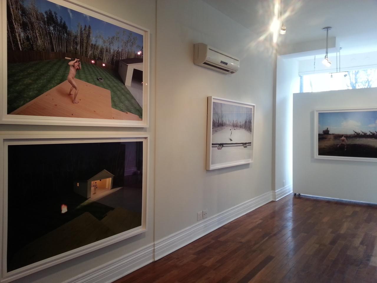
    For those who have yet to see the work of Alberta-based photographer Kristopher Karklin, you may want to pay attention. On the vast spectrum of emerging-to-mid-career artists on the Canadian contemporary scene, he is most certainly one to watch. His most recent work, the subject of a solo exhibition currently on display at Barbara Edwards Contemporary, has not only generated a considerable amount of buzz, but has also piqued the interest of a number of high profile collectors, both individual and institutional. And for good reason. His newest series, a combination of photography and sculpture, strikes with uncanny accuracy not only at the northern Alberta landscape by which it was inspired, but also at many of the confining and alienating elements of contemporary rural and suburban life.

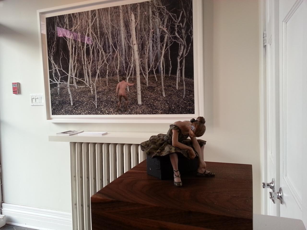
    Installation view. Photo courtesy of Barbara Edwards Contemporary

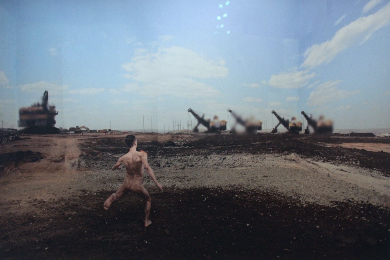
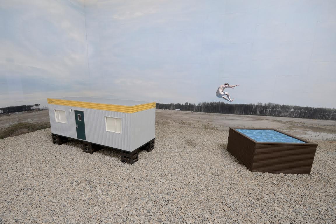
    When, years ago, Karklin began working in Fort McMurray, Alberta – a community now infamously known for its connection to the oil sands — he had no specific intention to create art from his experience. Yet, as he described in a recent interview, he was immediately captivated by what he saw there and simply started taking photographs. “It was like being on the moon or in the middle of the Arctic,” Karklin recollects. The experience was, for him, powerfully surreal. It is a feeling Karklin is remarkably effective at capturing. Building on his previous work, this newest series consists of figures set in strangely pristine, manufactured settings — an aesthetic result of an uncommon and very labour-intensive process. Like Berlin-based artist Thomas Demand, Karklin first creates his landscapes from meticulously constructed scale models — not unlike theatre or architectural maquettes — which he then photographs. Yet, in a departure from Demand, whose images tend to be uninhabited, Karklin also photographs human figures and transposes these into his scenes. The result is a thrillingly disjointed meeting of human and environment, set among layers of photographic and sculptural mediation. 

    Kristopher Karklin, Runner, 2015, inkjet print, edition of 7, 36″ x 54 “. Photo: Catherine MacArthur Falls

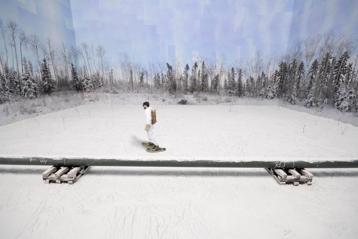
    This mediating effect stems in part from Karklin’s use of photocollage. The backdrops of sky, forest, and field we see in his images are Karklin’s original snapshots of the landscape, which he has pasted like wallpaper to the inside of his scale models and then re-photographed as part of the whole scene. The works are thus not only photographs of built environments, but also photographs of photographs. As the viewer, our distance from the ‘real’ landscape — the landscape that is up there, in northern Alberta, right now — is very far indeed. This distanciation mirrors that of the figures, who are separated from their environment in a number of ways. The most obvious of these, of course, is that the figures represent real people, while the environments are fake on almost every level. But there is also separation by process. Photographed independently, the figures and their environments never inhabit the same space or moment in time — wherever and whenever that might be — until Karklin artificially stitches them together. The snowshoer in “Pipeline” never actually snowshoed past the pipeline; the runner in “Runner” never really ran through the industrial site. The place and time captured in the image never existed. It is a disjuncture that reveals itself in the uneasy, often incongruous, positioning of each figure within his space. The awkward gait of the runner, for instance. The implausible physics of the jumper in “Reclaimed Tub”. The asynchronicity of the snowshoer, whose blurred edges suggest movement, but whose posture is rather still, wooden. It all adds up to a very clear sense of alienation between the figures and their environment, one that Karklin says was a palpable component of his experience in northern Alberta. 

    Kristopher Karklin, Pipeline, 2015, inkjet print, edition of 7, 36″ x 54″. Photo courtesy of Barbara Edwards Contemporary

    It is an effect that is somewhat complicated by Karklin’s enclosure of his environments within the interior space of the model. This seemingly small move to bring the outdoors in constitutes a shift from his previous work, which involved maquettes of solely interior spaces. Of his new work, Karklin recalls that, while working in Alberta, he spent much of his time outdoors. The result was that the landscape became more his home than any indoor space. The series, he claims, is an attempt to capture this feeling. Yet, the work also creates a startling sense of un-hominess. By bringing the outside in, Karklin curtails an Alberta landscape known for its expansiveness, rendering it finite, enclosing. This has a surprising effect: the figures are distant from, yet confined by, their surroundings. Far from appearing at home, they seem trapped, in a way, by their rural or suburban environments. It is, perhaps, a feeling many rural, small town and suburban dwellers can relate to. Having myself grown up in suburban Alberta, I can say with certainty that it is a sense I am deeply familiar with.

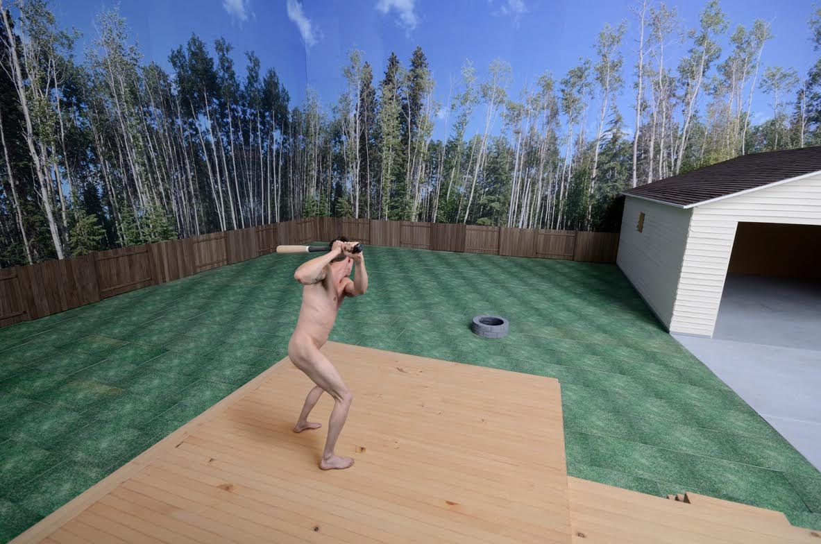
    Kristopher Karklin, Backyard (Daytime), 2014, inkjet print, edition of 7, 36″ x 54″. Photo courtesy of Barbara Edwards Contemporary

    Karklin at least partially exposes the interiority of his outdoor spaces by allowing signs of his work’s construction to remain visible. A sky will have clearly discernable corners, for example; a forest will have conspicuous seams. Shadows will appear where none should be. It is a display of artifice that also manifests in the materials and textures used—in the hard, plaster-like snow in “Pipeline”, the flat graphic water surface in “Reclaimed Tub”, or the tiled grass in “Backyard (Daytime)”. As Karklin explains, he uses such techniques to emphasize the fakeness of the environment, to bring the landscape into focus, to preclude it from blending into the background. Such details force us to consider the landscape and its relationship to its inhabitants. And, while these details are allowed to show through, many others are conspicuously erased. In all but one photo, for instance, the figures are photographed nude. Karklin thus strips them of much of the information that differentiates one individual from another. The landscape is similarly stripped. In Karklin’s backyard scenes, no toys or lawn equipment are left on the grass, no pots of flowers beautify wooden decks, no Christmas decorations, tools, or sporting goods wait patiently in the garage. There is no sense that anyone really lives in these spaces at all. These are places, persons, and lives that are eerily generic, replicable.

    Kristopher Karklin, Reclaimed Tub, 2014, inkjet print, edition of 7, 36″ x 54″. Photo courtesy of Barbara Edwards Contemporary

    The series is, all in all, full of tensions and provoking contradictions, not unlike the real landscape that inspired it. And though it is hard not to read Karklin’s work as a critique — particularly of a place that continues to receive so much negative attention — he is careful to note that he did not set out to produce political art. He was, rather, simply attempting to document the often-surreal place in which he was living, in all of its ambiguities. In this and many other respects, the work is spectacularly successful. But don’t take my word for it. Even this early in his career, Karklin’s sales history speaks for itself. Many of his pieces currently reside in the collection of Sir Elton John, for instance. Meanwhile, the entire set currently on display at BEC has been purchased by a major yet-to-be-announced Canadian museum. This means — fingers crossed — that it would be available for public viewing for many years to come. We should be so lucky.

    Installation view with Kristopher Karklin, Hunter, 2015, inkjet print, edition of 7, 36″ x 54″. Photo courtesy of Barbara Edwards Contemporary

    Catherine MacArthur Falls

    *Exhibition information: November 20, 2015 – January 9, 2016, Barbara Edwards Contemporary, 1069 Bathurst Street, Toronto. Gallery hours: Tue to Sat, 11 am – 6 pm (or by appointment).


  • Propeller Gallery Gala Launch

    The new Propeller Gallery at 30 Abell Street

    Gallery Gala Launch: Saturday, January 17, 2015 / 6 – 10 p.m.

    With a new space to reveal, Propeller Gallery had quite an evening to celebrate on the January 17, 2015. The sounds of live jazz from saxophonist Bill Prouton, guitarist Henrique Matulis and a chattering crowd filled the two-room gallery at 30 Abell Street.

    Live jazz from saxophonist Bill Prouton and the guitarist Henrique Matulis

    Gallery view with its two rooms

    Chosen works from several of the gallery’s artists decorated the event; colorful paintings, photographs, drawings, and even some sculpture complimented the cheery evening. It is evident that Propeller’s new space provides a greater sense of agency to the works, giving them opportunity to interact with the viewer. Propeller artist Heather Gentleman described the new space as “organic” providing guests with a greater sense of flow. I think that was distinct in the space’s design. Guests circulated between the two rooms with ease. Joseph Muscat, Propeller’s Chair, was excited about the new space and the prospective of a lot of future success at the Artscape Loft location.

    Guest with Sharron Forrest, ” Leaves Light and Shadow” (left) and Tatjana Hutinec “Renaissance Woman” (right)

    Propeller artists Heather Gentleman and Philip Hare with Gentlemen’s work “Innana” (on left)

    Propeller Chair, artist, Joseph Muscat

    Installation view

    Guest looking at Anthony Saad’s “Aurora Megalopolis

    The gallery is soon hosting their annual “Black and White Ball V” on January 29th, an event coordinated by Gentleman, who seemed excited for the event’s success in the new space. With many new faces and a great turnout from the Opening Gala, future events at Propeller should be a great success. It is with great excitement that I look forward to future shows at Propeller!

    Text and photo: Brinae Bain

    *Exhibition information: January 15 – 25, 2015, 30 Abell Street, Toronto. Gallery hours: Wed – Sat: 12 – 6, Sun: 12 – 5 p.m.

  • Yangyang Pan: Inside Out

     Rain, I don’t Mind, 2014, acrylic, spray paint, oil on canvas, 36”x 48”. Courtesy of the artist.

    Throw a glance out the window, feel the pull. Eyes seek, settle; mind follows, stays. The border between inner and outer zones fades to a blur. Yangyang Pan has done her job. What has been outside comes in.

    Yangyang Pan situates the onlooker as an integral part of her work, for it is the ability to view the landscape that provides the link between seeing, seen and scene. She makes the connection between human and natural elements, to remind us that the landscape is not alone. Indeed, nor are we – and through artists such as Yangyang, we are made aware of how we are linked intrinsically to the gifts of the natural world.

    Yangyang’s emotional viewfinder and her bold use of colour, stroke and texture allow us to see, somewhat clearly, through a degree of abstraction. Cheeky, she makes sure to leave us at a point where we must make our own way to the end of the journey.

    What is outside is gathered close and absorbed. What is internal to us is set free and reborn in our interpretation. What is inside is out.

    Sabine Modder

    *Exhibition information: YangYang Pan: Inside Out, Nov 6 – 30, 2014, Parts Gallery, 1150 Queen Street East, Toronto. Gallery hours: Wed – Sat 12 – 6, Sun 12 – 5 p.m.

  • A Journey to Belong

    Reading the title of the two-part exhibition at Robert Kananaj Gallery I’ve found it interesting, as belonging is a major issue in our society. But when I went to see the show and talked to gallery owner/curator Robert Kananaj, I realized how wrong I was since I totally misunderstood the title. He completely turned around the meaning of belonging and instead of focusing on its social relations he went back to the roots of the problem, the person. A Journey to Belong for him starts with the individual and not with the society. We waste our energy in focusing so much on what supposedly significant, said Kananaj, instead of giving ourselves to what is really important to us as human beings. Kananaj wants to create an awareness of the “insignificant”. Society could wait with it’s demanding, sometimes even depressing, pressure. Finding ourselves is the first step to belonging to anything or anywhere.

    Installation view of Part 2. Courtesy of Robert Kananaj Gallery

    So the Journey starts inside, finding yourself – who you are – going back to the roots, and then slowly recognizing yourself as an individual. Then you can belong to yourself, contemplate your newly found character, maybe build it further for a while, and then, if you want, reach out to others and the society.

    Lula Motra, Embroidery. Courtesy of Robert Kananaj Gallery

    It is indeed a very interesting theme to cover. The first exhibition was dedicated to Lula Motra’s work. This was the first solo exhibition of the Italian based Motra with drawings, embroidery and sculptures. She is a total outsider, with no formal art training. She started three years ago with drawings, then embroidery and most recently assembly like sculptures. Embroidery is one of the oldest art forms practised traditionally by women. It requires skills, discipline and persistence to finish something like an altar cover or even a bed cloth. Motra wasn’t influenced by any school or style. Her sensitive hands, guided by her special imagery, created a one of-a-kind-piece. There are large areas of empty spaces surrounded or disrupted by light colored silk lines depicting flowers, lakes or city maps mainly in abstract forms; a very unusual but also very beautiful embroidery. Motra’s drawings are colored pencil compositions also mixing realistic images like a piazza with abstract elements. They are very colorful and full of emotion – great fun to look at and try to decode. Motra’s drawings and embroideries are visual diaries of her state of being, recording her inner journey.

    Lula Motra installation from Part 1.  Courtesy of Robert Kananaj Gallery

    Kananaj put up the second show in an unusual way, since some of Motra’s pieces from Part 1 continue into Part 2. A few of her drawings and embroideries are there and her tubes made of plastic straws are still moving over the gallery’s walls. Three more artists are included in Part 2: Torsten Richter, Hollis Alexis Baptiste, and Luca Reffo. Torsten Richter is a Berlin based artist whose drawings depict everyday objects such as scythe, pitchfork, an old fence or just a piece of wood the carpenter left behind with his tool is still in it. Richter’s realistic drawing skills are great and he is a true follower of the old German masters. The focal point of each drawing is an object on a white surface of the paper, calling attention to simple functionality of the device with amazing sensual properties. There is an almost religious dedication in his method of sitting long hours in front of his object and lovingly depicting the smallest details. The final product is almost conceptual with its imbedded super realistic parts. It is again a journey to the self, motivated by the meditative process of creating these drawings by worshipping the objects and cultivating the self.

    Torsten Richter, Board with Right Hand, 2011, graphite pencil drawing on paper, 75 x 350 cm. Courtesy of Robert Kananaj Gallery

    Hollis Alexis Baptiste, the only Toronto based artists in this show, also works with everyday object. For more than 15 years, Baptiste has been incorporating these objects of no significance, like plastic bottles or unusual shaped objects, to be part of his strange structures. Large plastic bottles become abstract compositions and detergent containers create a group of strange figures, “illegal aliens”, as he calls them. Baptiste paints some of them bright yellow or deep blue or even Halloween black and red. They are funny and scary at the same time, an out-of-the-real-world assembly of his ghostly journey.

    Hollis Alexis Baptiste’s installation. Courtesy of Robert Kananaj Gallery

    Luca Reffo’s from Milan, Italy brings artistic research to his paintings, rendering disquieting movie-like atmospheres, imitations of original stage-set photographs and vintage film frames into his paintings. Each event is portrayed as a still image, conveying a sense of anguish for dream-like situations often heavy with psychological references. The visionary aspect of his realistic images is further emphasized by an original and disturbing use of lighting.

    Luca Reffo, The Reader, 2010-2011, oil on canvas 50 x 70 cm. Courtesy of Robert Kananaj Gallery

    The exhibition is interesting itself and you can easily lose yourself in the details of the artworks. If you go there, I suggest that you talk to Robert Kananaj and listen to his enthusiastic comments about the Journey, the artists and their work.

    Emese Krunák-Hajagos

    *Exhibition dates: October 10 – November 23, 2013, Robert Kananaj Gallery, 1267 Bloor Street West, Toronto. Gallery hours: Tue – Sat 11 – 6 p.m.

  • Frances Ferdinands / Convergence

    Frances Ferdinands / Convergence

    Frances Ferdinands, Voyager #1, 2013, acrylic on canvas  24″ x 24″.

    Ferdinands’ work reminded me of curry, in its rich color palette, or textiles, in her patterns and details. Reds, yellows and orange are dominant creating a very, very vibrant atmosphere. I had the good fortune to be able to meet Frances Ferdinands at the opening of her show ‘Convergence’ and have her explain a little about her work, and why she chose this title.

    What interests me most about Frances and her work is the thought process that her paintings reflect. This richness might be a result of her background, her heritage and more importantly her journey. She came to Canada from Sri Lanka aboard a ship, when she was very young and as a result her memories of this journey and the life she left behind are somewhat fragmented. Perhaps her artwork demonstrates this, drawing on abstract expressionism to display the hybridization that has come to define her identity as a Canadian South Asian.

    Frances Ferdinands, Paisley to Plaid, mixed media, acrylic on canvas.  36″ x 52″

    Hybridization is an important term in analyzing Ferdinand’s work. Several motifs such as paisley and fabric demonstrate this hybridization, mixture of cultures, as we can see influences that are borrowed and integrated. Paisley itself has such a rich history that it is perfect to symbolize Ferdinand’s own journey from the East to the West, a convergence of sorts, in terms of culture and influences. Therefore it is accurate to say that ‘Convergence’ is about a journey, both literally and metaphorically. This journey is a realization of a fragmented past and coming to terms with it through her artwork. These paintings are very different from Ferdinands’ previous work that was mainly representational.

    Frances Ferdinands, Bits, mixed media, acrylic on canvas,  18″ x 18″

    An interesting aspect of Convergence is the fact that these pieces were created in a vacuum, as Ferdinands said it herself. She was moving away, drastically, from what she was known for, what she was comfortable with, thus adding to her own personal anxiety and uncertainty. What we can see of it in the show is a truly marvelous artistic journey, both in its context and visually.

    Haafiz Karim

    *Exhibition dates: October 15 – 27, 2013, Propeller Centre for the Visual Arts, 984 Queen Street West. Gallery hours: Wed – Sat 12 – 6, Sun 12 – 5 p.m.

  • Call for Submissions

    Call for Submissions

    Online Sale & Event

    Come celebrate with us!

    Artoronto.ca is an online visual art publication started May 29, 2011. As we near our first year anniversary we have decided to have a fundraiser where art works will be on display both online and at our event venue at Fran Hill Gallery.

    Place: Fran Hill Gallery, 285 Rushton Road. Toronto
    Date: June 13 – June 24, 2012.
    Gallery hours: Friday – Sunday, 11-6 p.m.
    Opening reception: Wednesday, June 13, 6–9:30 p.m.
    Drop off: Sunday, June 10, 6–8 p.m. and Monday, June 11, 2–5 p.m.
    Pick up: Sunday, June 24, 5–8 p.m.

    We are looking for recent art works.
    Size restriction: no larger than 36 inches in width or height.
    All medium accepted. Works must be ready to hang.
    All works under $800.
    Artists will receive 50% of the asking price after the sale.

    Please contact artoronto.ca ASAP if you are interested at philanderson@rogers.com.  or at admin@artoronto.ca. Artists are asked to submit 1–3 low resolution jpeg images, a CV and a brief introduction about themselves and their work (maximum 100 words) to philanderson@rogers.com, attention Phil Anderson.

    Deadline for submission is June 3. Works will be posted online as they are accepted.
    More information is available at admin@artoronto.ca or call Phil at 416-525-7688.

  • Judith Geher: Courage

    November 10 – December 4, 2011
    Opening: Thursday, November 10, 7-9 pm
    PARTS GALLERY
    1150 Queen Street East
    Toronto, ON M4M 1L2
    T: 416.465.8500
    Hours: Wed–Sat 12–6, Sun 12-5 pm
    info@partsgallery.ca
    www.partsgallery.ca

    Judith Geher’s paintings explore contemporary images of an idealized feminine aesthetic. Working within the parameters of commonly held notions of beauty, she collects images from various fashion magazines and similar internet sites.

    This vehicle carries her impressions, thoughts and desires toward these images. Judith Geher lives and works in Toronto, Canada, and holds a Bachelor of Architecture with honours from the University of Toronto. Her practice includes

    drawing, painting, and sculpture, as well as designing thoughtful and considered architecture. Her work has been exhibited nationally