Category: FEATURES

  • The Modern Toronto Reopens

    The Modern Toronto Reopens

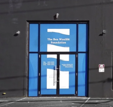
    The modern.toronto front doors at 230 Niagara Street

    The modern.toronto: The Ben Woolfitt Foundation Reopens With a Fresh Look and a Bold Celebration of Abstraction.

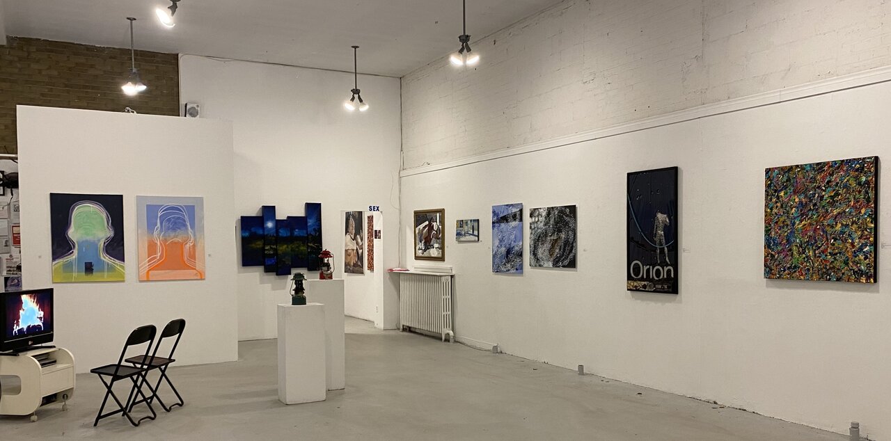
    After undergoing a complete renovation, the modern.toronto is preparing to reopen its doors at 230 Niagara Street with a grand reopening celebration on September 12th at 2:00 p.m. The newly transformed interior features more wall space and a clean, refocused aesthetic designed to put the artwork—and the experience of viewing it—front and centre.

    A thorough transformation of the museum’s interior

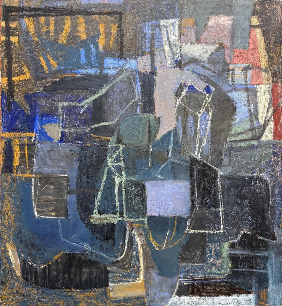
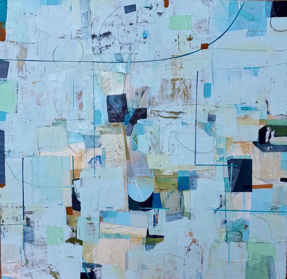
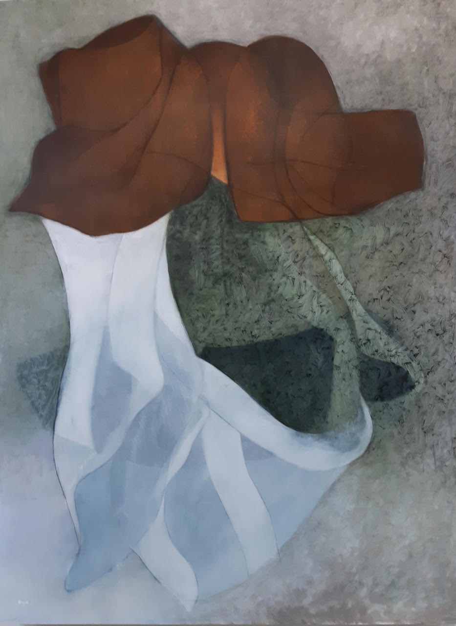
    The work of Ron Shuebrook and Steve Rockwell will be showcased, two artists whose work reflects the spirit of experimentation, energy and visual exploration at the heart of the modern.toronto. For a museum devoted to non-objective abstract art, the transformation of the space is more than cosmetic. More wall space means more room for art to command attention, while the newly refined interior creates an uncluttered environment in A New Look for an Unconventional Art Experience.

    The modern.toronto is a not-for-profit organization dedicated to educating the public and increasing the public’s understanding and appreciation of the arts. Its focus is distinctive: the museum exhibits and promotes modern visual art in the form of non-objective abstract art, presenting works by Canadian artists whose practices are innovative and influential.

    The newly renovated space reflects that philosophy. Clean lines, additional wall space and a more focused interior allow the artwork to take centre stage. Visitors can move through the gallery without visual distractions, giving each work the opportunity to make its own impression. And with abstract art, that impression can be remarkably personal. There may be no recognizable landscape, portrait or object to explain what a viewer is supposed to see. Instead, colour, line, shape, texture, movement and gesture become the vocabulary.

    “The question is no longer simply What is it? It becomes What does it make you feel?“

    Looking Beyond the Familiar

    Non-objective abstract art—or abstract expressionism—is a post-World War II genre of art that is nonrepresentational and improvisational. The style characteristically depicts non-organic images in an unstructured space, emphasizing emotional expression and technique. For audiences unfamiliar with abstraction, the experience can initially be challenging. But that uncertainty is also part of its appeal.

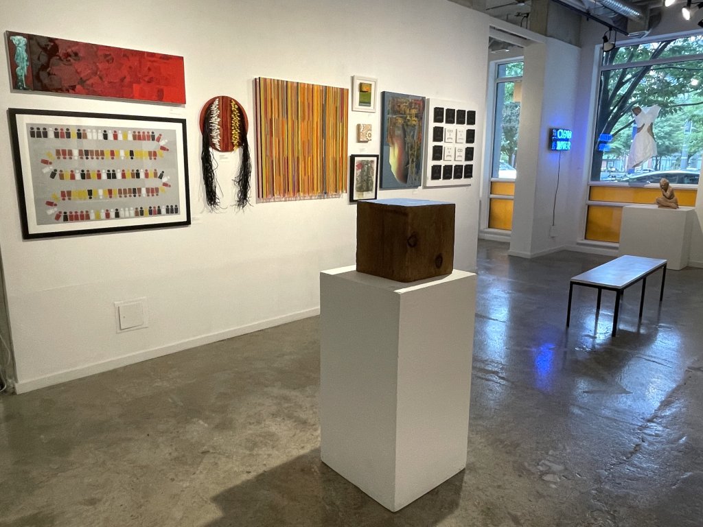
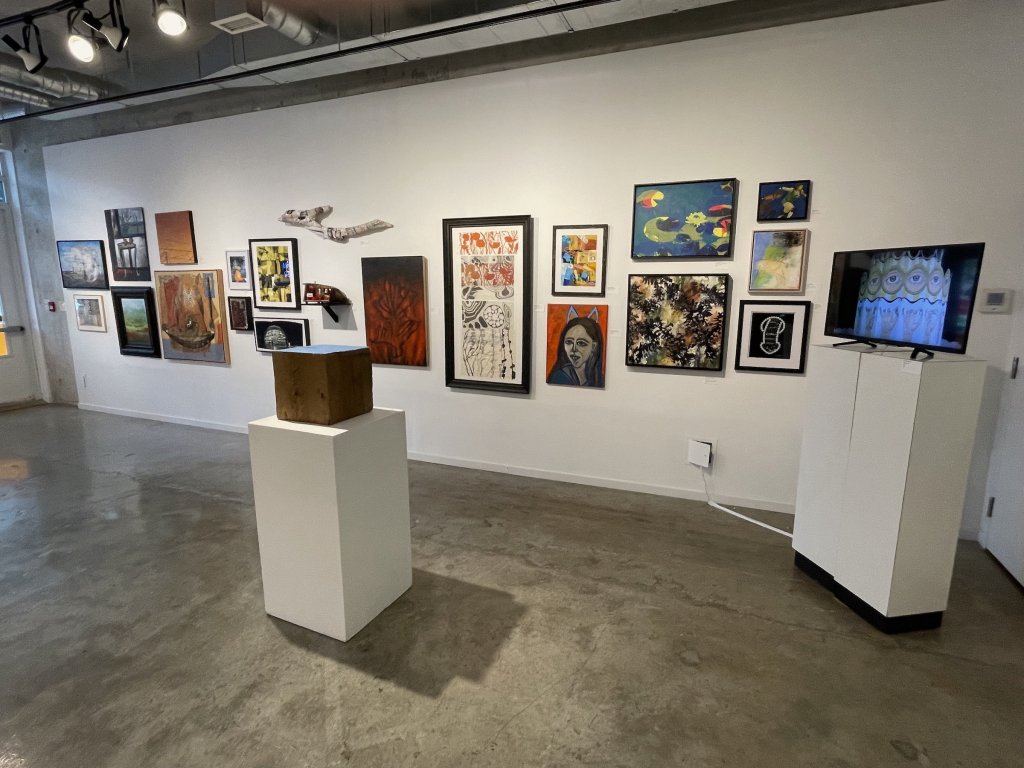
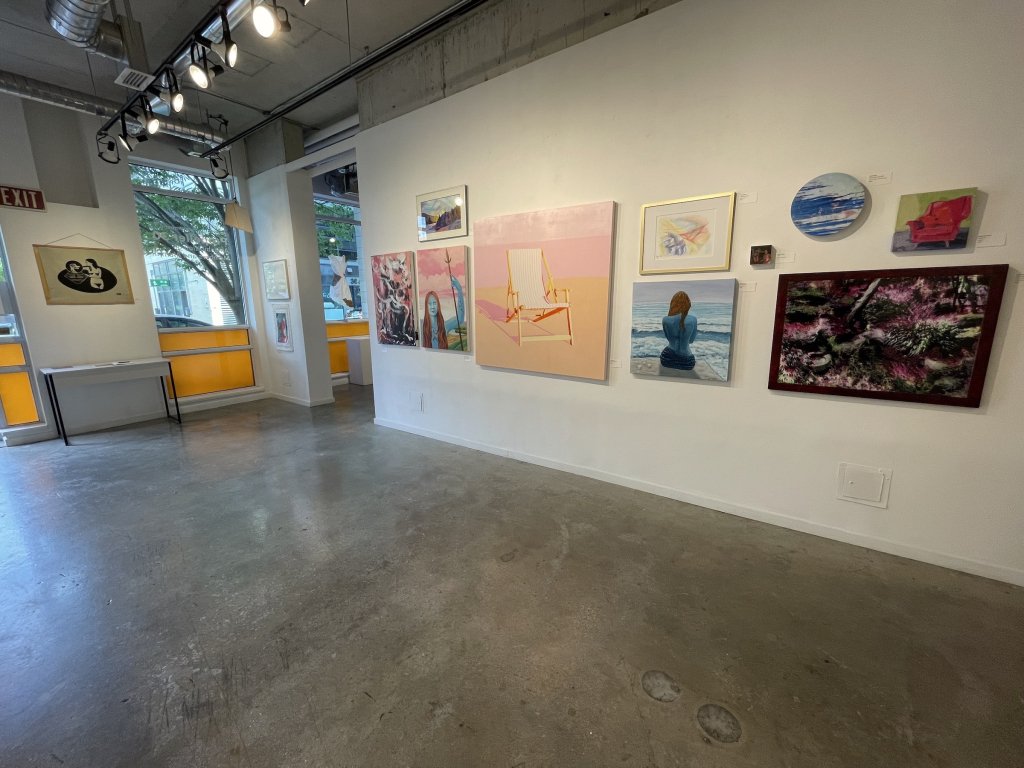
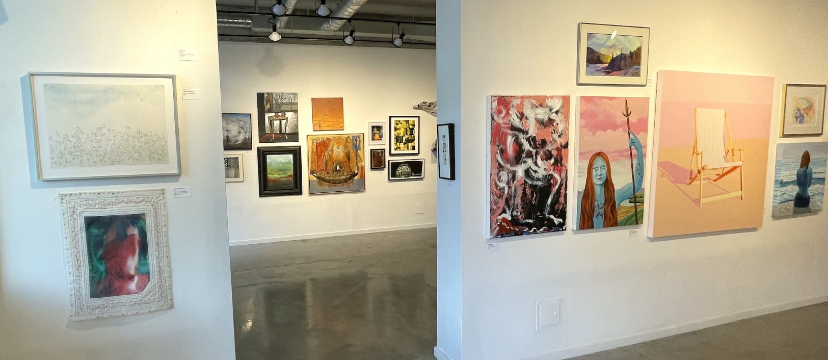
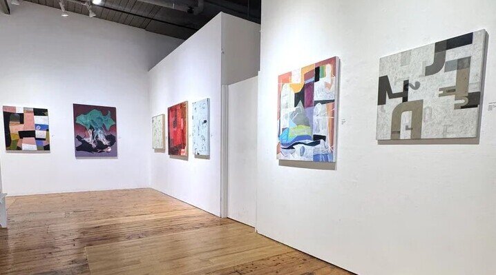
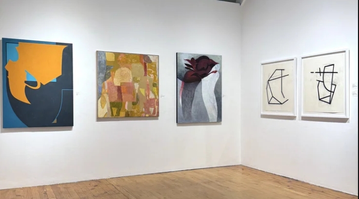
    The toronto.modern exhibition view before its renovation

    A single work can evoke movement, tension, calm, energy or emotion without depicting anything recognizable. Brushwork can become a record of physical action. Colour can establish mood. Layers and textures can reveal the process behind the finished piece. Rather than providing a single interpretation, abstract art leaves room for the viewer. That openness is central to the experience the modern.toronto seeks to create.

    The grand reopening will showcase the works of Ron Shuebrook in the main gallery and Steve Rockwell in the front gallery, providing visitors with the chance to experience two artists within the museum’s revitalized setting. Shuebrook is an abstract artist, a distinguished educator, and a writer whose works are included in the collections of the National Gallery of Canada, the Art Gallery of Ontario, the Art Gallery of Hamilton, the Beaverbrook Art Gallery, and the Art Gallery of Nova Scotia, among others. Rockwell, a long-established artist, writer, and publisher of dArt International magazine, views his publication as an extension of his artistic expression. Rockwell is a significant figure recognized throughout the art community and will be showcasing his newly created abstract forms. Their work provides an ideal introduction to the kind of artistic dialogue the modern.toronto is committed to encouraging: art that asks audiences to look closely, consider technique and engage with the emotional and visual possibilities of abstraction. With the renovated gallery offering more space to display the work, visitors will have an opportunity to experience the exhibition in an environment designed to allow the artwork to breathe.

    A Different Kind of Museum Visit

    Artist Katie Pretti delivering an artist talk regarding her showcased works.

    The modern.toronto hosts weekend afternoon artist discussions, where the currently exhibited artist discusses their work in the presence of an audience, elaborating on their creative process, medium and more. Attendees have the opportunity to engage in an intimate setting with the artist

    The modern.toronto occupies an interesting place in Toronto’s cultural landscape. It is not simply a place to walk through, glance at a painting and move on. Abstract art rewards attention. The longer a viewer spends with a work, the more details can emerge. A seemingly simple composition can reveal layers of colour. A spontaneous-looking gesture can expose extraordinary control.

    An arrangement of forms can shift depending on where the viewer stands. That makes a visit to the modern.toronto an active experience. By increasing public understanding and appreciation of the arts, the organization hopes to encourage audiences to engage with modern art rather than feel intimidated by it.

    “You don’t need to be an art historian to have a response to a painting. You simply need to look.”

    An opening at the modern.toronto before its renovation

    A Not-for-Profit Powered by Community Support. The modern.toronto is also committed to maintaining its work as a not-for-profit cultural organization. The museum gratefully accepts monetary donations and will issue a Charitable Donation receipt in return. Community support helps the organization continue its mission of exhibiting innovative and influential modern art while educating and engaging the public. As the museum enters this new chapter, that support becomes particularly meaningful.

    Located at 230 Niagara Street in Toronto, the museum will be open to the public every Saturday and Sunday from 12:00 pm to 5:00 pm. For longtime supporters, the reopening offers a chance to see a familiar institution in a completely new environment. For first-time visitors, it is an opportunity to discover a museum with a distinctive point of view. The walls may have changed. The space may be cleaner, brighter and more focused. But the invitation remains the same: Come in. Slow down. Look closely. And experience modern abstract art for yourself.

    On September 12th the modern.toronto opens a new chapter—one with more space, a renewed sense of purpose and the work of Ron Shuebrook and Steve Rockwell waiting to be discovered.

    Roy Bernardi

    Images are courtesy of the modern.toronto gallery.
  • Ry Van Der Hout: In Broken Light at Spadina Museum

    Ry Van Der Hout: In Broken Light at Spadina Museum

    Ry Van Der Hout’s recent installation of works at Spadina Museum curated by Adrien Sun Hall is an active reimagination of the historical home’s many stories and the echoes of memories held within its ornate objects and spaces.

    In Broken Light acts as a journey through time where Van Der Hout starts at the creation of the universe and grapples with stories of past, present and futures, leading to death and hopeful rebirth. As you move throughout the floors of Spadina House, the chronological journey of each work reflects the many tales that the museum holds, both through its historical occupants and its current historians. These artworks accompany the museum’s restored 1920’s decor and allow viewers to immerse themselves within the history of the site while actively interpreting its stories through the lens of contemporary art. Its use of light as a natural fixture of the home through its windows, mirrors and sunlit rooms ties seamlessly to Van Der Hout’s chosen material and its reflective properties.

    Partly inspired by Hanya Yanagihara’s To Paradise and its storytelling of multiple timelines interconnected through a singular setting, this exhibition takes on the chronological stories of Spadina House’s inhabitants and pairs them within the contextual rooms of the house. Its conceptual approach is both a literal progression as the viewer travels upwards and a metaphorical reflection of real lived experiences, ones that fill the historical site with humanity and a sense of connection within disjointed narratives.

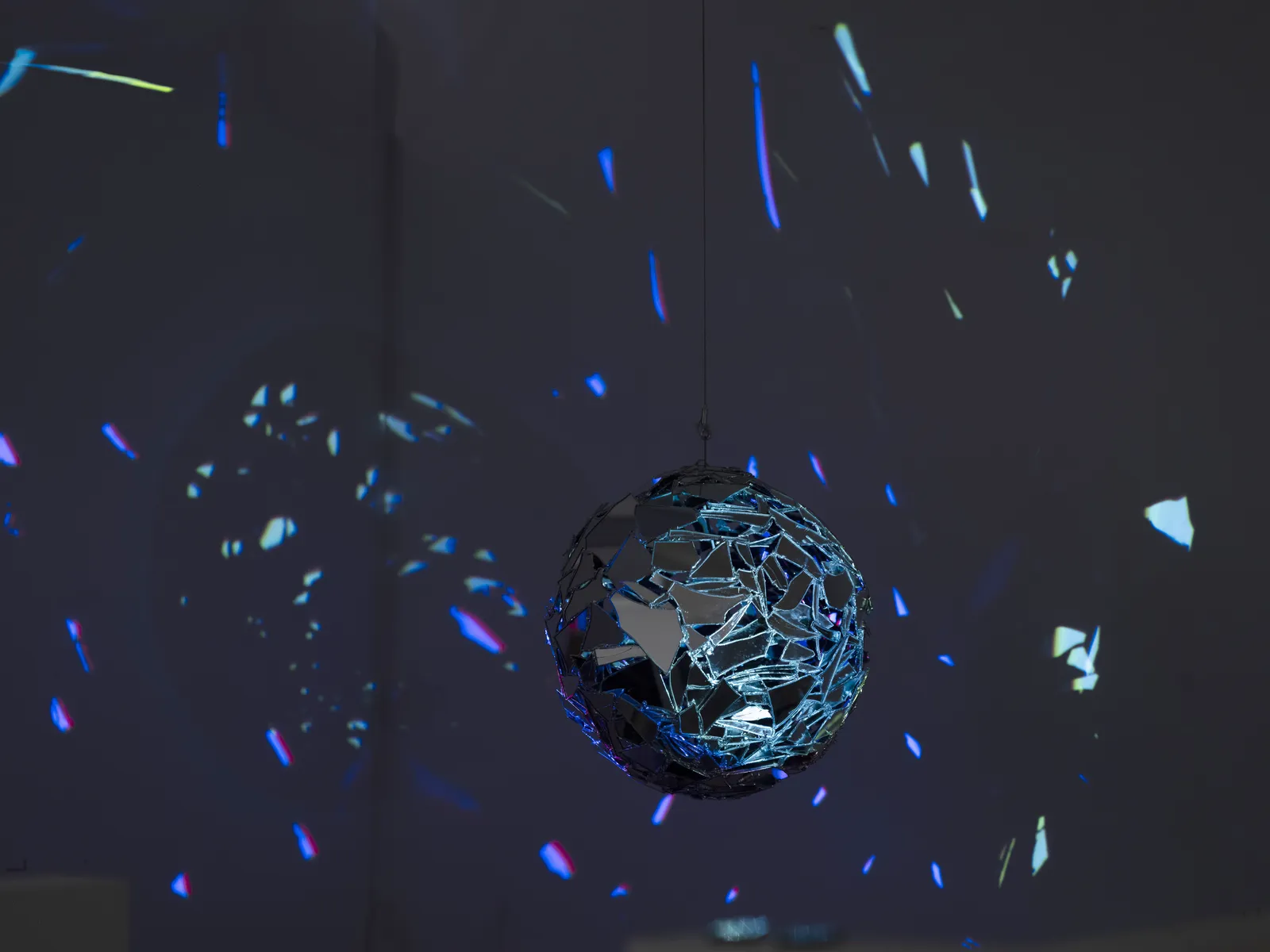
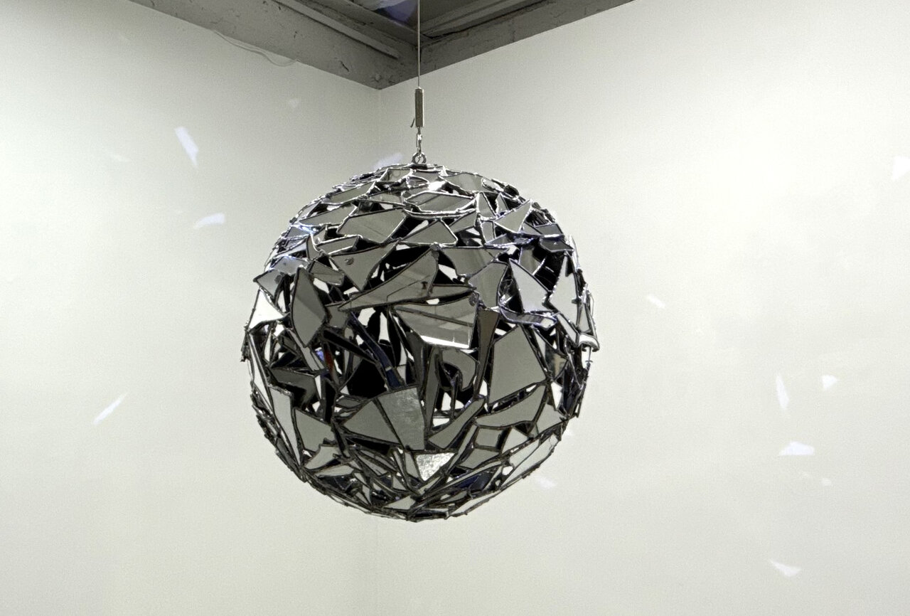
    The exhibition begins in the basement where two works are tucked away in the archeological dig sites of the Museum’s fieldstone foundation. The Shattering and Orpheus, Twice are enclosed within dimly lit brick ruins where both pieces illuminate the space through shards of broken glass. The former captures the fragmentation of a disco ball; mimicking ideas of shattered vessels found in creation stories by reflecting fragments of light across the room. The latter continues ideas of fragmentation while incorporating one of the first historical stories of Spadina House, that of Robert and Eliza Baldwin’s tragic romance. Tackling themes of longing in death and physical devotions, Orpheus, Twice beautifully embodies the artistic process and its connection to mending what was once broken.

    The Shattering, 2026, mirror, solder, copper, stainless steel, 28″ Diameter. Courtesy of the artist.

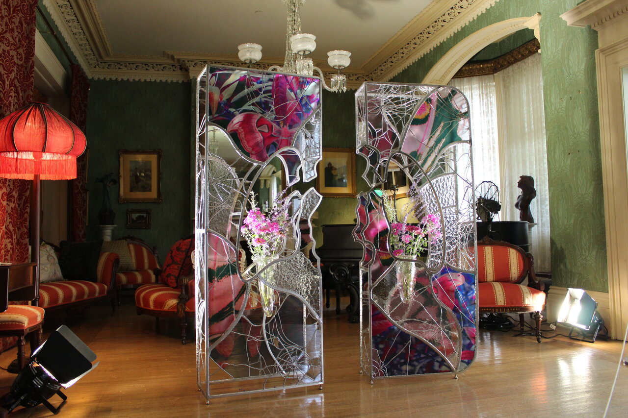
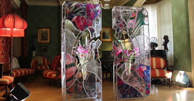
    Led by a museum guide to the first floor of the home, we are educated about the Austin family and their stories as they occupied Spadina House for most of its existence. Among them being Albert Austin, who contracted tuberculosis and sadly died at a young age, bringing a looming emptiness to the family house. As the centerpiece of this floor After – Breath acts as a reliquary where shattered glass and decaying flowers reflect the body’s inability to withstand expectations, pondering the weight of both the body and of the social obligations that follow with living such a lavish lifestyle. Positioned near an ornate drawing room, this piece hauntingly reminds us of the fragility of our own physical core while embracing the ephemeral nature of the living.

    Installation view with After – Breath, 2026, Glass, Uv Print on Glass, Solder, Steel Tin Coating, Flowers, 71″x71″x 12″. Photo: Marina Diolaiti

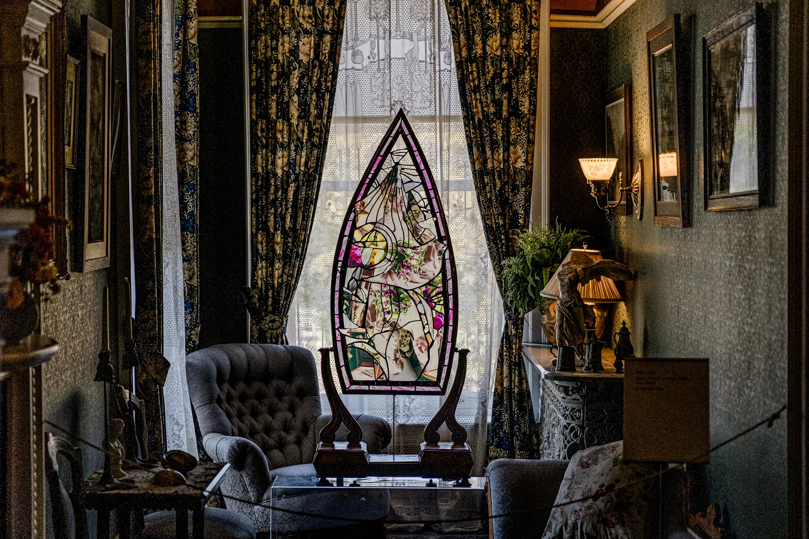
    Upon reaching the second floor, we instantly feel a sense of imposition as we are guided through the private bedrooms of past occupants. Tiber greets us in a small seating room near the main bedroom where its colourful shattered fragments reflect through the warmly lit window onto the quaint furniture, evoking the stained-glass techniques of gothic cathedrals. In this work, Van Der Hout flips the story of Narcissus into a tale of affirmation and reflection on one’s innermost self while telling the story of a contemporary historian who serendipitously found their way to the museum through an innate desire to collect old antiques. While the work is smaller in presence and tucked within the quiet atmosphere of the main lady’s bedroom, Tiber is a beautiful ode to the present and the many stories that Spadina Museum continues to create.

    Tiber, 2026, UV Print on Glass, Steel, Antique Mirror, Solder, Copper, Wood, 16″ x 47″x 6″. Courtesy of the artist.

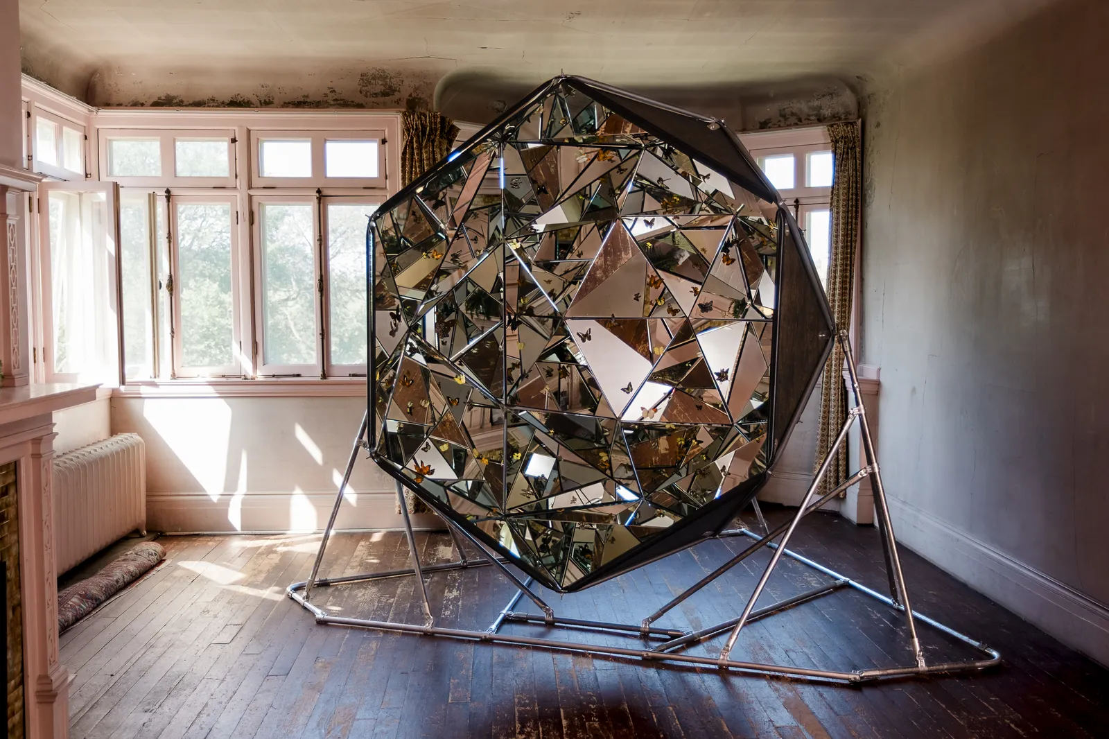
    As we reach the third and last floor of the house, we enter the servants’ quarters and additional bedrooms, which all carry a sense of emptiness in the faded original wallpaper and in the antiquated practices of keeping household servants. As we discretely walk through each room, we are eventually faced with an empty sun filled space where Open Wing Death transports us through its reflective interior housed by hundreds of moths and butterflies. The hexagonal dome fully immerses us into Van Der Hout’s fictional future where organisms take over restoration efforts, completing the natural cycle of decay and rebirth. Through its reflections, the work immerses us within multiple perspectives of the family’s unrestored bedroom and acknowledges the temporality of such a fragile historical site.

    Open Wing Death, 2026, Moths, Butterflies, Mirror, Coated Steel, Wood, Silicone, 12′ x 9′ x 12′. Courtesy of the artist.

    In Broken Light successfully delivers on the daunting task of reanimating a historical site while honouring its past, present and future stories through immersive contemporary art. While Spadina House already holds a storied history, it is through these artworks that we feel the space being thoughtfully revived by taking on new perspectives that reflect a critical approach to recollections of the past. The exhibition’s attentive curation of a rich historical home balances the need for contemporary voices while preserving the complexities that any historical site might undergo in nearly two hundred years. By uncovering these layers of history, Van Der Hout’s work centralizes the importance of objects embedded with experiences that reflect forgotten historical lineages and brings them back into the light.

    Marina Diolaiti

    *Exhibition information: Ry Van Der Hout, In Broken Light, August 26 – Oct 18, 2026, Spadina Museum, 285 Spadina Road, Toronto. Museum hours: Wed – Sun 11 am – 5 pm.

  • Propeller Art Gallery Turning 30

    Propeller Art Gallery Turning 30

    The Interview questions with Propeller Art Gallery were answered by Tiffany Duong, Susan Ruptash and Anna Dopico, the organizers of the Propeller 30 Exhibition (PAG). Interview questions by Phil Anderson (PA).

    Video still (L-R) Tiffany Duong, Susan Ruptash, Snaige Sileika, Anna Dopico

    PAG: The biggest one is that our Board Secretary and Exhibition Co-organizer, Anna Dopico, has written a fabulous book commemorating our first 30 years.

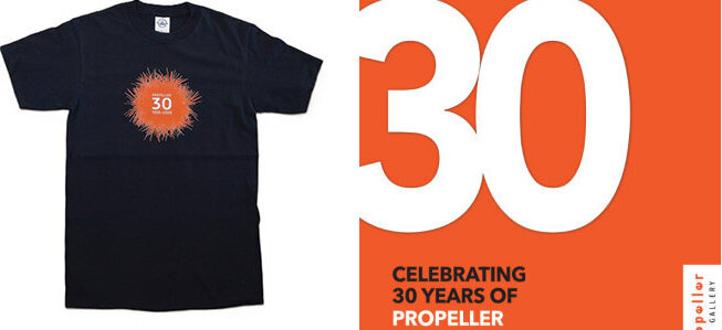
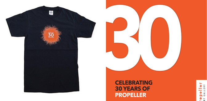
    You can see a copy in the gallery, or read more information here. We also made T-shirts using the logos designs by our long-standing member, Keijo Tapanainen.

    T-shirt (left) book cover (right)

    PAG: Certainly the day we learned that our landlord Artscape was going into receivership was one off the darkest days for us. But the gallery has faced other challenges in the past as rents rose on Queen West and financial uncertainty loomed from time to time. The resilience and bravery of the founding and past members gave us the resolve to dig deep and save the gallery.
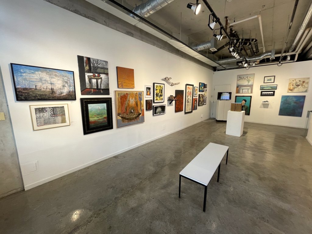
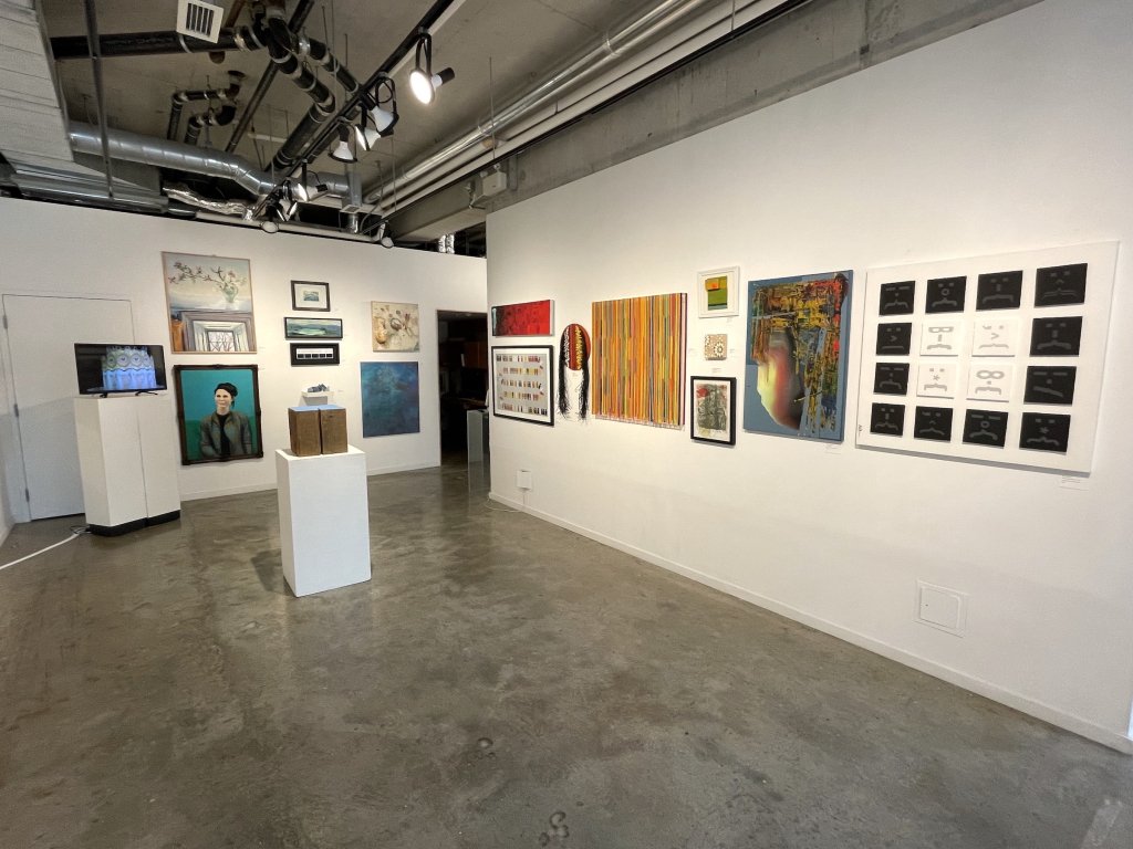
    Installation view of Propeller 30 at Propeller Art Gallery

    PAG: We have been an artist-run Not for Profit organization since inception. Being artist-run means that each one of our members feels a pride and responsibility to each other and to the gallery as an enduring entity.

    PAG: We want to continue to diversify our membership and attract a wide range of artists. We also want to continue to expand our connection with the general community. As the gallery continues to attract more interest and more submissions, managing the workload of our volunteers and employees remains an ongoing issue.

    Installation view of Propeller 30 at Propeller Art Gallery

    PAG: Our Open Mic happens this coming Sunday September 6 and we are looking forward to hearing the stories. We hope you can join us!

    As part of the current exhibition, we asked artists to reflect on what Propeller means to them, and it was very touching to read how many artists have been deeply affected by Propeller throughout the years. There is also a printed copy of their opinions in the Gallery.

    Installation view of Propeller 30 at Propeller Art Gallery

    PAG: The financial realities of Toronto make it a serious challenge for emerging artists to find spaces to exhibit. We are proud to be one of the long standing artist-run galleries, and our role in offering a space and a community for artists.

    Installation view of Propeller 30 at Propeller Art Gallery

    PAG: We worked hard to reach out to as many of our Alumni as possible and we are thrilled with the response from both current members and alumni. We had no idea how many artworks we would get. The absence of a specific exhibition theme could have meant a challenge to curate the works into a cohesive exhibition, but Tiffany Duong, one of the co-organizers, did a masterful job in arranging and organizing the artworks.

    PAG: With the assistance of an Ontario Trillium Grant, we are undertaking some renovations later this year to improve the accessibility of the gallery. We want to be welcoming to everyone.
    Installation view of Propeller 30 at Propeller Art Gallery

    PAG: It was stressful at times, but we never gave up hope. Once we resolved to try to save our space, everyone worked hard to pursue every possible avenue. At the same time, we believed that even if we were not successful, Propeller would continue in some form. We were not going to let Propeller end on our watch.

    Installation view of Propeller 30 at Propeller Art Gallery

    PAG: Our annual fundraising event in December, Off the Wall, is so much fun and a highlight in our year. Our fall programme includes great pairings of members, both newer and long-standing, including a few small group exhibitions. Our first exhibition of 2027 continues our tradition of supporting our Emerging Members with an exhibition. For the first time, we are including our New Members as well.

    Images are courtesy of Propeller Art Gallery

    *Exhibition information: Propeller 30 / Anniversary group exhibition, August 19 – September 6, 2026, Propeller Art Gallery, 30 Abell Street, Toronto. Gallery hours: Wed – Sat 1 – 5:30 pm, Sun 12 – 4 pm.

  • Six Positions in Abstraction at The Red Head Gallery

    The Red Head Gallery at 401 Richmond St, W is a relatively compact space, but for this show a surprising number of abstract paintings are on display. The works of the six artists are each hung one besides the other in turn, to surround the entire space. A major reason that so many paintings can be accommodated is that they cohere so well. And as their write-up states: “the works resonate through their common investment in colour, structure and the expressive potential of paint”. But these listed features are shared by such a variety of abstract painting that it hardly explains why this particular set of paintings fits together, why they resonate.

    In one sense the artists selected one another after a process of showing at the common venue of the Carnegie Gallery, Hamilton, and most recently together at Joshua Farm Gallery, Oakville. They all hail from the Hamilton/Niagara region. They are peers who have each ‘had long-running practices’, as they put it. Several of them began their art educations in the late 1970s. That was a time when the mainstream was beginning to accept abstract art.

    Installation view of Six Positions in Abstraction at Red Red Gallery. Courtesy of The Red Head Gallery

    At the Ontario College of Art in the 1970s, for instance, a revolution of sorts took place when a power struggle among the faculty ultimately led to the overthrow of conservative traditional painting, to be replaced by the latest practices of the international art scene epitomised by the art of New York City. And so both Ian MacKay and Barry Coombs, who studied there at the end of the 1970s, were exposed to the celebrated abstract paintings of the expressionists, colour field painters and the post-minimalists. These movements epitomised the height of abstractionism in art. In other words, the six painters were part of the first generation who grew up with the grand abstract paintings at the end of the modernist era. It was the tradition they inherited.

    Our six painters – Barry Coombs, Jody Joseph, Peter Kirkland, Janice Kovar, Ian Mackay and Marla Panko – have essentially kept faith with the modernist universalist agenda, that is, the view that art ought to concern itself with what is common to us all, notwithstanding the idealism and presumptions behind this view. As such there are no overt cultural or ethnic markers in their works. Their focus is exclusively on formal and emotional qualities using the medium of paint.  

    So in this show we have the works of a collection of painters who have a common artistic outlook. As a result their works share an agenda in a very loose sense – the aim, roughly, of exploring the formal and emotional qualities that painting licenses, and which are distilled and highlighted by abstraction in particular. Let’s briefly look at each of them in turn.

    Throughout her long career Panko has experimented and produced an enormous variety of work, from collages to sculpture. In this show we encounter her sparest, almost minimalist works consisting of bold linear shapes rendered in black-and-white. She masterfully highlights, with a few lines, the illusionistic quality of space rendered on a two-dimensional surface.

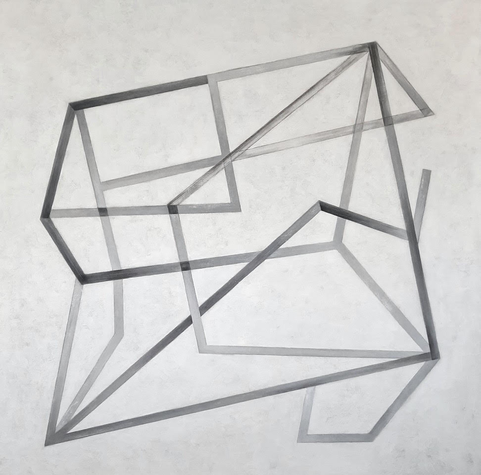
    Marla Panko, Laocoön 2025, acrylic on wood, 36 x 36 inches

    The two-dimensionality of painting is celebrated by Coombs and Mackay more literally. The works of both artists involve the division of the pictorial surface into shapes. The very act of doing this creates spatial illusion, but in this case the spotlight turns onto structure and colour themselves. For Coombs the division of the paintings’ surfaces is hard-edged, and consequently has a cerebral quality to it. His aim, he tells us, is to bring out the magical visual qualities at play in the mundane world, e.g., the way shadows are cast. And that he does wonderfully.

    Barry Coombs, METER #1, 2026, acrylic on canvas,  48 x 36 inches

    For Mackay, on the other hand, his looser rendering reflects a playfulness in his work. His paintings often sit on the edge of representationalism, in as much as some elements hint at the depiction of this or that object, or architectural detail perhaps. He has developed an assured touch that betrays a unquestionable mastery of abstraction.

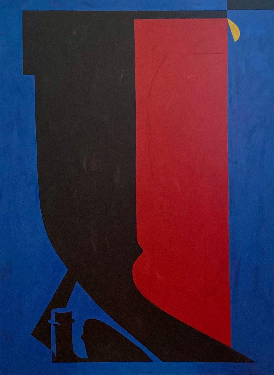
    Ian Mackay, Templum, 2026, oil on wood, 36 x 30 inches

    The works of Joseph and Kovar emphasize the physicality of paint. Both celebrate the material surface and the seductive qualities of paint itself. Every painter has felt its seductiveness, has fallen in love with it. That is especially true of abstractionists. Joseph has spent a great deal of time working in Italy, and that has influenced the pallette and compositions of her paintings. Indeed, she tells me that as well as painting abstracts she has long had a practice of painting the Italian landscape, and luscious Cézannesque still-lives.

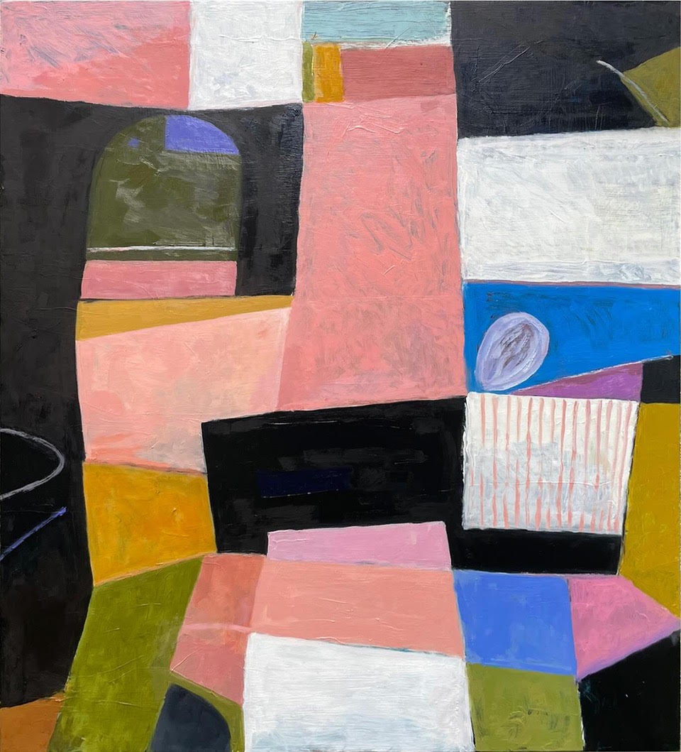
    Jody Joseph, Montecastello, 2026, oil on canvas, 40 x 44 inches

    The surfaces of Kovar’s paintings are truly mesmerizing. Using a combination of roughly blocked shapes and large gestural marks, within a limited pallette, Kovar’s surfaces sing. She sums up her approach as follows:  “I’m drawn to that liminal space—the tension, overlap, and quiet transition between the built and the natural.”

    Janice Kovar, Threshold Blue, 2026, mixed media on cradled board, 30 x 30 inches

    Finally, Kirkland’s images of organic shapes are not in fact derived from directly observing natural forms, as one might suspect. Rather, they are the result of ‘working the surface’ as he puts it. He layers and erases the paint in turn, sometimes scraping or sanding it. Emerging from this process are his magical ‘biomorphic forms’.

    Peter Kirkland, “Painting 6/26 #1”, 2026, oil on wood, 40 x 30 inches

    All of the painters in this show are modest in their ambition. Their works are neither cutting-edge nor candidates for display in the pavilions of the grand biennales, say. Nonetheless they are serious dedicated artists who have spent very many years immersed in their craft. And it shows. Abstractionism is a difficult genre to master. The competent abstractionist walks on the tightrope of producing compelling work, but always risks falling into the merely decorative. These are all compelling works. This show is a dazzling testament to the fact that the modernist tradition of abstraction is thriving, and has plenty of life in it.

    Installation view of Six Positions in Abstraction at Red Red Gallery. Courtesy of The Red Head Gallery

    Hugh Alcock

    Images are courtesy of the artists.

    *Exhibition information: Six Positions in Abstraction, August 5 – 22, 2026, Red Head Gallery, 401 Richmond  St W, #115, Toronto. Gallery hours: Wed – Sat 12 – 5 pm.

  • Sara Cwynar: Baby Blue Benzo Beta at MOCA

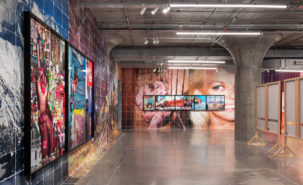
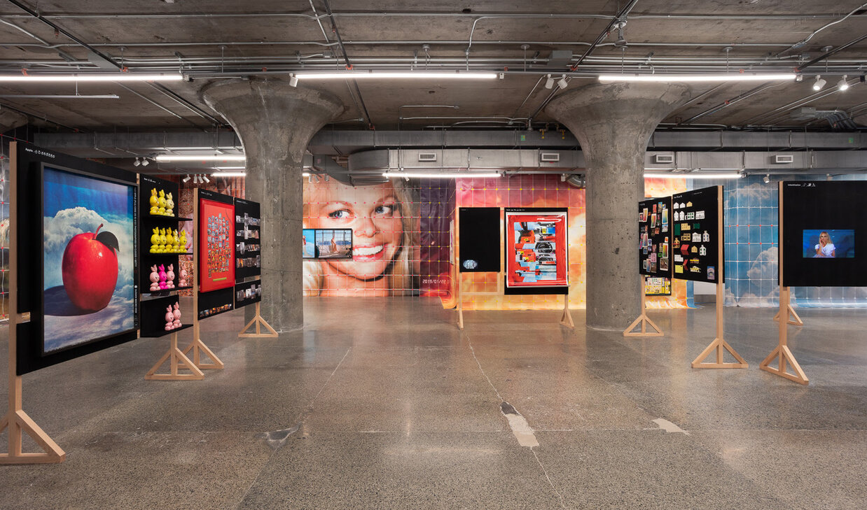
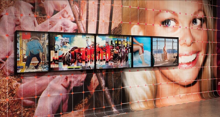
    Sara Cwynar’s Baby Blue Benzo Beta does not create an alternate universe so much as reorganize the one we already live in. Sex, beauty, money, technology and power do not appear as abstract mechanisms operating behind contemporary life, but as blunt forces. Across Cwynar’s collaged images, screens, objects and words, the exhibition suggests that the systems governing our standards and desires have become so ordinary that we barely notice them anymore.

    Cwynar makes them visible again.

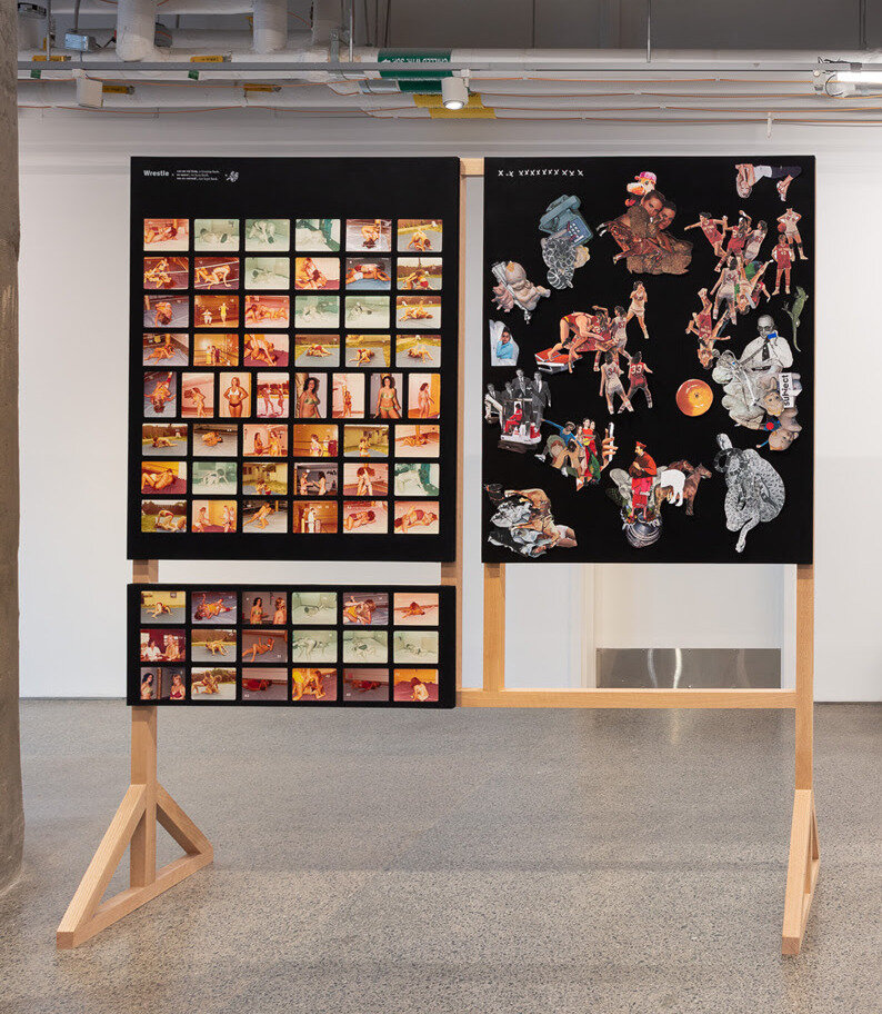
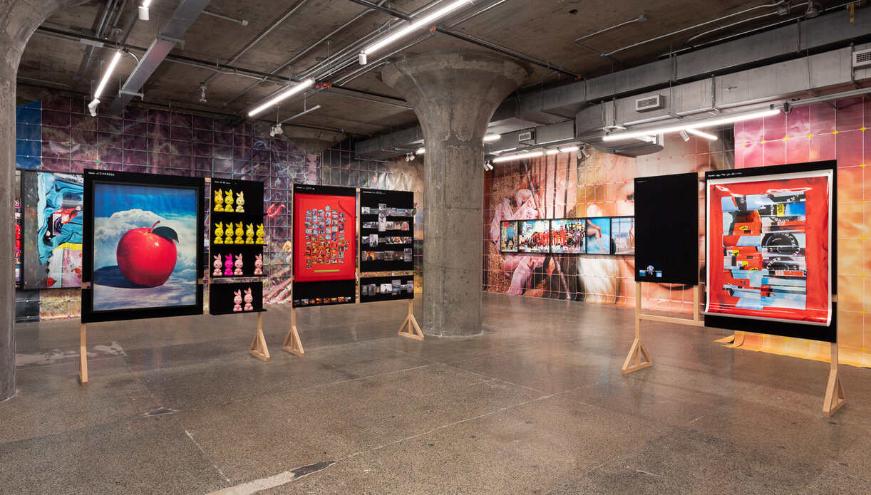
    The exhibition operates like an alphabet for contemporary life. Words and phrases drawn from popular online searches and Cwynar’s own browsing history become starting points for sprawling visual associations. Terms such as “disinformation,” “new woman,” “plastic,” “wrestle” and “youth” are translated into images, objects and cultural references. What initially appears arbitrary becomes revealing: our searches form an accidental archive of what preoccupies us, frightens us and, perhaps most importantly, what we have been taught to desire.

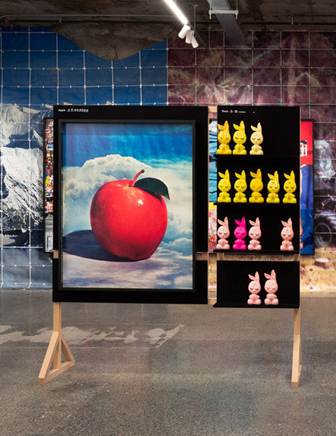
    The alphabet is an especially fitting structure because alphabets teach us how to enter the world. In Baby Blue Benzo Beta, Cwynar reverses this process. Rather than teaching the neutral “A is for apple” alphabet of childhood, she asks what an apple might mean after centuries of accumulated religion, advertising, technology and popular culture.

    “A” inevitably recalls another beginning: the apple of Adam and Eve. The reference positions Cwynar’s alphabet almost as a contemporary Genesis. The biblical apple introduces knowledge through the distinction between good and evil, establishing one of Western culture’s foundational binaries. Good makes sense because bad exists; innocence because corruption exists. Cwynar similarly builds meaning through contrast, exposing how the categories we inherit determine how we understand the world.

    But Cwynar’s Genesis belongs to the age of mass media. Alongside biblical associations are guns, tuxedos, definitions, stock images and corporate imagery. If the Tree of Knowledge once promised an understanding of good and evil, contemporary knowledge arrives through Google searches, advertisements, archives and endlessly circulating images.

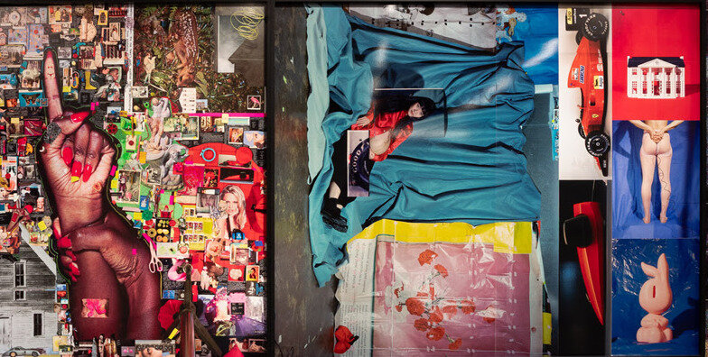
    From A for apple, Cwynar moves to B for bunny. The bunny brings with its Playboy, sexuality, femininity and money. Repeated bunny figures appear alongside images of wealth and consumption, connecting sexual desirability to economic value. Some appear wrapped, others exposed, creating associations with availability, possession and ownership. The exhibition repeatedly asks: what is the relationship between desirability and ownership?

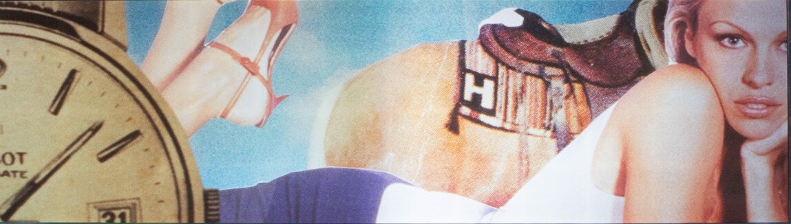
    Women occupy the centre of this visual economy. Female wrestlers, supermodels, actresses and sex symbols such as Pamela Anderson and Marilyn Monroe populate the exhibition’s visual ontology. Yet, their power rarely frees them from the gaze surrounding them. Male figures are more readily associated with politics, authority, wealth and command, while women are repeatedly defined through youth, beauty, vulnerability and sexual availability.

    The female wrestlers (who visualize “W” being for “Wrestle”) make this contradiction especially clear. Their bodies are strong, trained and capable, yet Cwynar selects images in which those same bodies become intimate spectacles: pinned down, entangled, exposed or rendered vulnerable for the viewer. Through the deliberate curation of their pictures, Cwynar demonstrates that even when a woman becomes powerful, an image can transform that power back into desirability.

    A similar contradiction appears in Cwynar’s images of youthful femininity (ie. “Y” being for “Youth,” or “K” being for “Knowledge,” among many others). Pamela Anderson and other cultural icons exist within a world where the ideal woman must be innocent yet sexual, youthful yet mature, maternal yet childlike.

    This tension extends into “H” for home, where domesticity and the nuclear family coexist with the images of bikinis, bodies and sex symbols of the exhibition. Woman appears simultaneously as mother and girl, caretaker and object of desire.

    The “T” for time “Time” sharpens this critique. Clocks and references to youth suggest that women experience time differently within this economy of images. Male power is often imagined as something accumulated: money, authority and influence grow with age. Female value, by contrast, is repeatedly represented as something that expires.

    Youth becomes capital. Beauty becomes maintenance.

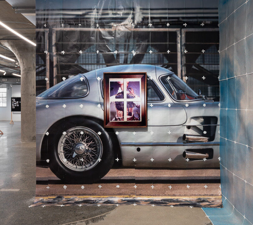
    Cars, women, fashion, houses and luxury objects therefore begin to occupy the same visual vocabulary. A gleaming automobile and an idealized female body appear almost interchangeable as status symbols: desirable objects whose value extends to the person capable of possessing them.

    Capitalism promises freedom through choice. You can purchase the right clothes, drive the right car, modify the right body and assemble the right identity. Baby Blue Benzo Beta pushes that promise toward an uncomfortable question: if we are free to become whatever we want, how much of what we want has already been chosen for us?

    Yet the exhibition never feels purely bleak. Its romantic soundtrack, saturated imagery and visual abundance are seductive. Cwynar understands why we want to look. Familiar celebrities, commodities and symbols dissolve into one another in a dreamlike visual puzzle, implicating viewers in the very culture they are being asked to question.

    Her collage-like logic recalls Surrealism’s ability to create meaning by bringing unrelated objects together, but Cwynar’s unconscious belongs unmistakably to the twenty-first century. It is no longer only the private psyche being mapped, but the algorithm, the search history and the digital archive.

    Our subconscious now leaves data behind; and data legitimizes knowledge.

    By turning that data into an alphabet, Cwynar teaches us our ABCs again – not because we do not know the world, but because we may know it too well.

    Sex. Beauty. Money. Technology. Power. Youth. Ownership.

    These are not discoveries within Baby Blue Benzo Beta. They are the vocabulary through which contemporary life has already taught us to understand ourselves.

    Cwynar simply makes us read it out loud.

    Antonella Pecora Ruiz

    Images: Sara Cwynar, Baby Blue Benzo Beta. The Museum of Contemporary Art Toronto installation view, MOCA Toronto, 2026. Courtesy of the artist, Cooper Cole, Toronto, and The Approach, London. Photo: LF Documentation.

    *Exhibition information: Sara Cwynar, Baby Blue Benzo Beta, May 15 – August 16, 2026, MOCA Toronto, 158 Sterling Rd., Toronto. Museum hours: Wed – Thurs 11 am – 5 pm, Fri 12 – 9 pm, Sat – Sun 10 am – 5 pm.

  • Interview with Daniel Cardoso about The Artist Studio

    Interview with Daniel Nicholas Francisco Cardoso (DC) by Emese Krunak-Hajagos (EKH)

    Daniel Nicholas Francisco Cardoso

    DC: It really all began when the studio I was working out of (Open Studio at 401 Richmond) closed for renovations for a good part of the year. My colleagues and I essentially had nowhere else to go, and I soon came to realize how much studio space was needed in the city, especially space with specialized equipment and support for working artists. Additionally, the pandemic closed down several studio spaces in the city, and artists were left figuring it out on their own. I was also at a crossroads in my career. I had plans to do a Masters, but with the declining jobs and opportunities within the post-secondary world, I knew I had to pivot. This opportunity for a business came up, and with the support of my husband, Alejandro Rizzo Nervo Nieto, who is also a working artist, we decided to venture into owning a studio together, and supporting artists. Thus, The Artist Studio was born!

    DC: I am a graduate from OCADU, with a BFA specialized in Printmaking. I am also one of the last people to take part in the Florence Off-Campus program from OCADU, in which I went through a year of self-directed studio practice in Florence, Italy. It was there that I began my work in studio management, when I volunteered at SRISA (Santa Reparata International School of Art) in exchange for studio access. This exchange was invaluable to my practice and to this day, the connections I made, and lessons I learned continue to influence me. 

    After graduation, I began to work out of Open Studio – I started teaching classes on linocut and etching, as well as assisting artists in specific projects. Open Studio was instrumental in my career – their support and trust allowed me to grow as both an artist and educator. From the experience I gained there, I was able to get the job as a Teaching Assistant and later Class Assistant in the printmaking department of OCADU. Both these opportunities taught me a lot about studio management, teaching, and the kind of support artists need to grow their own careers. I now have years of experience under my belt in education and studio management and am confident I can run a studio.

    My husband, Alejandro, brings the other side of the coin. He works for an art consulting firm, as well as an Editions and Archive Specialist for an established local artist. This experience has brought him knowledge in the backside of studio management and art organization. He brings with him years of experience in documentation, cataloguing, sales, and exhibitions.

    Together, we carry all the skills and experience needed to run a space like The Artist Studio.

    Alejandro (left) and Danny (right)

    DC: Our space at 87 Wade is very accessible by transit, which was important for us. It also boasts a combined size of over 2400 square feet, which allows us to have multiple mediums and various equipment, as well as dedicated private spaces. We were able to renovate this unit into what it is now, thanks to family and community coming together. We are grateful for every single person that has had a hand in making this space possible. It truly takes a village, and we have an incredible group of friends that have supported us in this endeavour.

    In terms of supporting artistic practice, we offer three main routes:

    • First and foremost is affordable access to studio space with specialized equipment. Our goal is to provide access to multiple mediums/disciplines in one space, so artists don’t have to go to multiple studios to get their work done. We currently have access to a black and white photo darkroom (complete with two enlargers and all the equipment necessary), etching press (for printing etchings, linocuts, woodcuts, and more), an acid bath for copper plate etchings, and a washout unit and screen-printing tables. As we grow, we will be getting our own exposure unit to expand even further. 
    • Secondly, we have a gallery in which members can submit to exhibit work. Keeping our members with an ongoing practice, and activating the space with new exhibitions that bring new collectors is a big goal for us.
    • Finally, we provide professional services and professional development for artists. This includes workshops and residencies in which artists can learn new mediums within the space, as well as assisting artists in documentation, cataloguing, giclee reproductions, etc.… If there is a way to support an artist’s practice, we will make it happen!

    DC: We have different tiers of access that accommodate every stage of an artist’s career and budget. Our dedicated room memberships come with a private space in which artists can permanently work out of. Currently, our small and medium-sized dedicated memberships are sold out. We have two of our Master memberships remaining, which come with a large room and access to the entire facilities. 
    We also offer our shared memberships, in which artists have access to the main shared space and all facilities. These are our most affordable options that grant artists access to everything they’d need to create their work. In these tiers, we have an option with a year commitment, or a month-to-month basis, depending on the needs of the artist.

    The membership tiers were set out this way so artists with any range of budget could still have access to studio space and equipment.

    DC: For our inaugural exhibition, we reached out to our direct network of artists, to help activate the space and bring a wide range of people into the studio. Going forward, our members will have first access to exhibition calls, before they go to the public. We also set out a certain number of slots per exhibition specifically for our members. We will continue to make public calls for exhibitions to ensure new artists and art lovers continue to discover us!

    DC: As working artists ourselves, my husband, Alejandro, and I know what the needs of this industry are, and we are both fully committed to help build the artistic community in Toronto. We dream of international collaborations with other studios (residencies and exchanges for mutual growth). We dream of participating in art fairs and being able to showcase our members’ work. I see this business growing into other locations and expanding the mediums and facilities we provide! All in all, we want to get artists paid and create new opportunities for growth and career development. I am basing this on my experience with Open Studio, and how they have fostered my career, and we just want to provide more! There are never enough opportunities to go around for all artists that live and work in this city, and our dream and goals are to create new chances for artists to expand and thrive in their careers. I think all of us are tired of the starving artist trope – artists are some of the most hardworking people I know, and they deserve a livable and steady income!

    DC: I want to thank several artists, including Dan Olsen, Yael Brontman, and Bruce Parsons – a lot of the furniture and equipment was inherited thanks to them, and the trust they put in us to bring new life to these mediums. I also want to thank our entire network and community of artists and colleagues that have donated their time, work, advice, and guidance – without them, none of this would be possible. Finally, I want to say a big thank you to my family – they spent every weekend and even weekdays after work coming and renovating this space. Their support has been beyond generosity. We have built The Artist Studio with help from our community and network, and our mission is to give it all back to every artist in the city and beyond!

    *To contact The Artist Studio please go to their website www.theartiststudio.ca, where you can have more information about joining, using the Studio or renting a room.

  • “Looks Good on Paper…” at Propeller Art Gallery

    What the Hand Leaves Behind: Paper and the Preservation of Memory at Propeller Art Gallery

    Lea Ovčina, Stories told must face the present and see it stands differently, lithograph and intaglio prints, konnyaku paste, machine sewn, light and heavy Usu Kuchi

    In a cultural landscape increasingly shaped by digital technologies, paper has become so commonplace in memory that its material presence is often overlooked. “Looks Good on Paper…”, guest curated by Nancy Jacobi at Propeller Art Gallery, arrives at precisely this moment, inviting viewers to reconsider a medium whose significance extends far beyond its everyday utility. Featuring forty-eight works selected from more than two hundred submissions, the exhibition celebrates paper as an eternal medium of artistic invention and culture. Every work reflects a deliberate engagement with the material itself, revealing how the choice of paper can and undoubtedly does influence meaning just as profoundly as image, form, or technique.

    Nancy Jacobi’s longstanding commitment to handmade Japanese paper informs the exhibition from the outset. Her curatorial vision grows from decades spent introducing artists to washi and advocating for traditional papermaking practices whose future has become increasingly uncertain. Rather than presenting paper as an obsolete medium preserved for sentimental reasons, the gallery demonstrates its remarkable vitality through contemporary artistic practice. Washi appears alongside Korean hanji, archival drawing papers, cardboard, flax paper, cotton paper, vintage postage stamps, and commercially produced coloured papers. Each carries its own physical character, allowing viewers to recognize the importance of paper as a material that is never simply a neutral surface. Texture, translucency, absorbency, weight, and fibre become essential elements within the visual language of each work.

    Joan Burdett Ness, Arctic Glacier and Kittiwaki, molded washi paper, konnyaku, watercolour, copper wire, Japanese Oguni, snow bleached

    The exhibition showcases this sensitivity to material. Moving through the gallery, it becomes impossible to separate the artwork from the paper upon which it exists. Joan Burdett Ness’s Arctic Glacier and Kittiwaki emanates its elegance from snow-bleached kozo paper, whose delicate structure mirrors the fragility of glacial formations. The sculpture seems to inherit its character directly from the material, its lightness suggesting landscapes that appear both enduring and precarious. Sharron Corrigan Forrest’s Wakami Series #1″  reaches a similarly compelling effect through Sekishu Banshi, wrapping the paper around living branches until its flexibility becomes visible in every curve. The paper records the contours of the wood while retaining its own distinct presence, bridging interaction between natural form and handcrafted material.

    Sharron Corrigan Forrest, Wakami Series #1, natural inks & water-based pigments, Sekishu Banshi HW, Taniai Kozo Nagaban HW, Taniai Kozo Udaban & HW Washi

    Historical memory emerges as another defining thread throughout the exhibition. Loretta Faveri’s Apology recalls the internment of Italian Canadians during the Second World War through paper handmade by the artist’s aunt using local fibres. The work carries a sense of inheritance and archive, connecting personal history with a broader national narrative. The work possesses a meaningful dignity that feels inseparable from the paper upon which it is constructed.

    Loretta Faveri, Apology, handwritten text on paper, torn and stitched, paper made by my aunt with locally sourced fibres

    A similar sensitivity appears in Marjut Nousiainen’s My Political Papers, where years of notes, correspondence, and newspaper articles accumulate into an installation resembling a carefully prepared fire. The work reflects on political advocacy with remarkable restraint, suggesting both persistence and exhaustion through documents that once promised change. Paper becomes empirical, preserving the traces of conversations, struggles, and histories that resist disappearance.

    Marjut Nousiainen, My Political Papers, paper on insulation board, newsprint, printer paper

    What gives “Looks Good on Paper…” its lasting resonance is the way these individual works contribute to a broader reflection on the place of paper within contemporary culture. Jacobi raises an important question in the exhibition statement. As handwritten letters, printed newspapers, tickets, menus, and countless other paper objects continue to yield to digital alternatives, what becomes of the tactile knowledge once embedded within everyday life? The exhibition never proposes a nostalgic return to an earlier era, nor does it frame technological progress as something to resist. But instead, it seems to ask viewers to consider what forms of attention emerge through physical materials, and perhaps why we have always turned to them to represent our lives. Paper slows perception. It preserves evidence of the hand. Every fold, stitched seam, printed impression, and torn edge records an encounter between artist and material that cannot be fully translated into digital form. This emphasis on touch feels especially significant because paper has always occupied an unusual position within cultural history. It has served as the foundation for books, maps, correspondence, official records, sketches, photographs, and countless other forms of communication. Entire civilizations have preserved their histories upon its surface. Handmade papers such as washi survive through generations of accumulated knowledge, each sheet carrying techniques refined across centuries. Their continued presence within contemporary art reflects technical craftsmanship alongside a representation of the survival of cultural practices whose value becomes increasingly apparent as they grow less familiar within everyday experience.

    “Looks Good on Paper…” installation view at the Propeller Art Gallery

    The accompanying artist statements further enrich this experience by revealing the extraordinary care invested in each material decision. Reading them alongside the works deepens an appreciation for the dialogue between concept and craftsmanship that defines the exhibition. Every selection of paper carries intention, whether rooted in cultural heritage, environmental concerns, personal memory, or formal exploration— the exhibition encourages visitors to recognize these decisions as integral to the work rather than incidental details of its construction.

    “Looks Good on Paper…” ultimately succeeds because it restores visibility to a material that has quietly receded from ordinary life while demonstrating its enduring artistic relevance. The exhibition honours centuries of papermaking traditions without confining them to the past, revealing instead how deeply they continue to inform contemporary creative practice. At a time when so much of human experience is mediated through screens, Jacobi’s exhibition offers a thoughtful reminder that materials possess histories of their own. Paper remains one of the most eloquent among them, carrying our memory, craftsmanship, and imagination within every fibre.

    Yehyun Lee

    Images are courtesy of the Propeller Art Gallery.

    *Exhibition information: “Looks Good on Paper…” / group show, curated by Nancy Jacobi, July 8 – 26, 2026, Propeller Art Gallery, 30 Abell St, Toronto. Gallery hours: Wed – Sat, 1 – 5:30pm, Sun 12 – 4pm.

  • Queer Asynchronies and A Shadow Holds at United Contemporary

    Queer Asynchronies and A Shadow Holds at United Contemporary

    Queer Asynchronies exhibition view

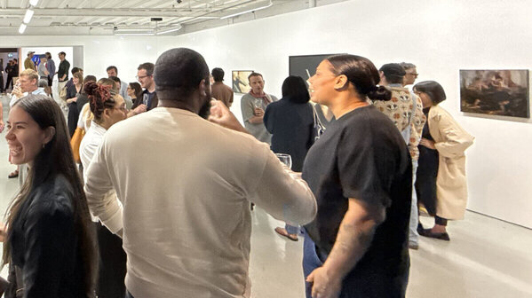
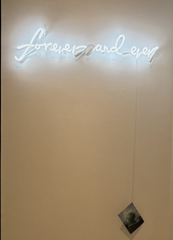
    Wandering in from the summer rain into the gallery, the understated white neon of Steven Beckly’s work greets visitors, Forever and Ever (2019). Queer Asynchronies at United Contemporary contemplates how queer and trans lives exist through plurality, the manifold ways of becoming the self: queer ancestry and culture, lived experiences balanced with futurity, and approaches to world-making. Curator Adrien Sun Hall draws upon José Esteban Muñoz’s theories around queer temporality, recognizing the deviations from “straight time” life trajectory and social dynamics. The artists in the exhibition reflect upon queer temporality with a variety of approaches: comforting the inner child in adulthood, disco as a critical part of queer subculture, speculative love in Christian spaces, modes of bodily and spiritual transformation, and more. 

    Considering the immediate encounter of Forever and Ever, Beckly’s work is an apt fixture of temporal expression. The soft neon glow emanates from the handwritten text containing the title, amplifying the cool tones of the gallery walls. There is a chain hanging from the phrase, with a photograph of a disco ball at the end. The work issubtle enough that people walk past without notice. There is beauty in a work communicating an unending duration, existing and witnessing others independent of reciprocation.

    Steven Beckley, Forever and Ever, 2019. Neon, silver chain, and colour transparency. Neon: 10 x 34 x 2.5 inches. Chain: variable

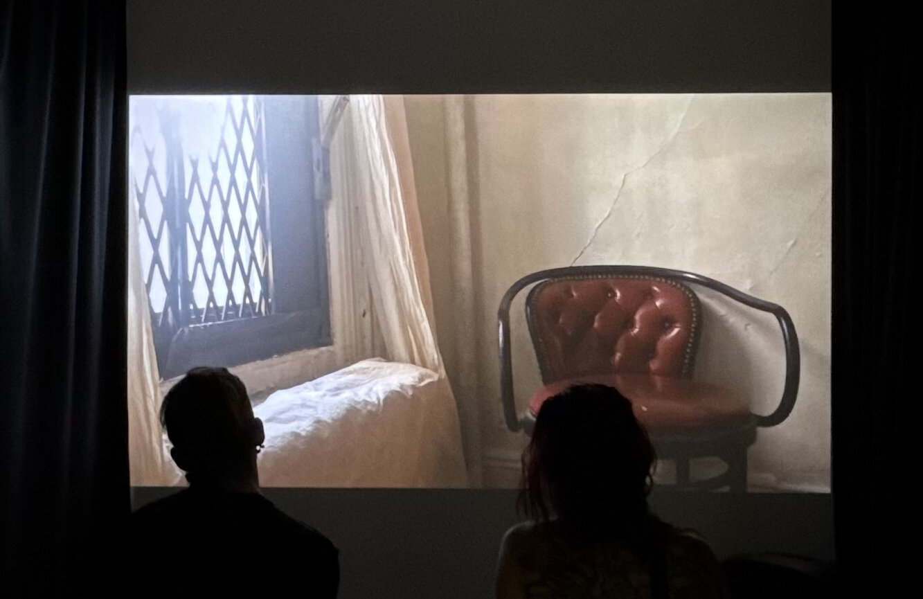
    To the immediate left of the work is a black curtain, enclosing the screen that plays Jordan King’s video installation Goodbye Clark (2024). Playing out upon the screen are scenes of a home being cared for: painting the windowsill, a moment sitting on the fire escape. Within the video, King prepares the Greenwich Village home for his departure. King had lived there with Clark Render, a major figure in the underground nightlife scene in New York. These moments of caretaking, reflection, and unbuilding a home take place after Clark’s passing in 2019. The film prompts contemplation of placemaking and how places of belonging shift with the inhabitants, whether through loss or movement.

    Jordan King, Goodbye Clark, 2024. Digital video, 9:00 minutes

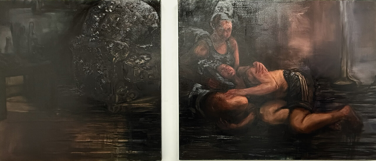
    The spirit of belonging and reflection are also found in Natia Lemay’s Held in Different Times (2026), a diptych in oil on canvas. Tones of ochre and umber are built upon the canvases; the layers appear as a soporific haze enveloping the figures in the right panel. The composition of the subjects echoes the pietà, with a seraphic face gazing downwards in devotion. The setting is indiscernible, though an upholstered seat can be identified as segmented across the diptych. Both subjects of Lemay’s pietà are clad in athletic wear, a muscle tee and oversized shorts. As they observe one another, the shared soft features and complexion is noted as a resemblance. The figures are of the same individual at different times. Beholding the self, Lemay displays the desire for comfort while simultaneously being the source.

    Natia Lemay, Held in Different Times, 2026. Diptych, oil on canvas, 48 x 48 inches, 48 x 60 inches

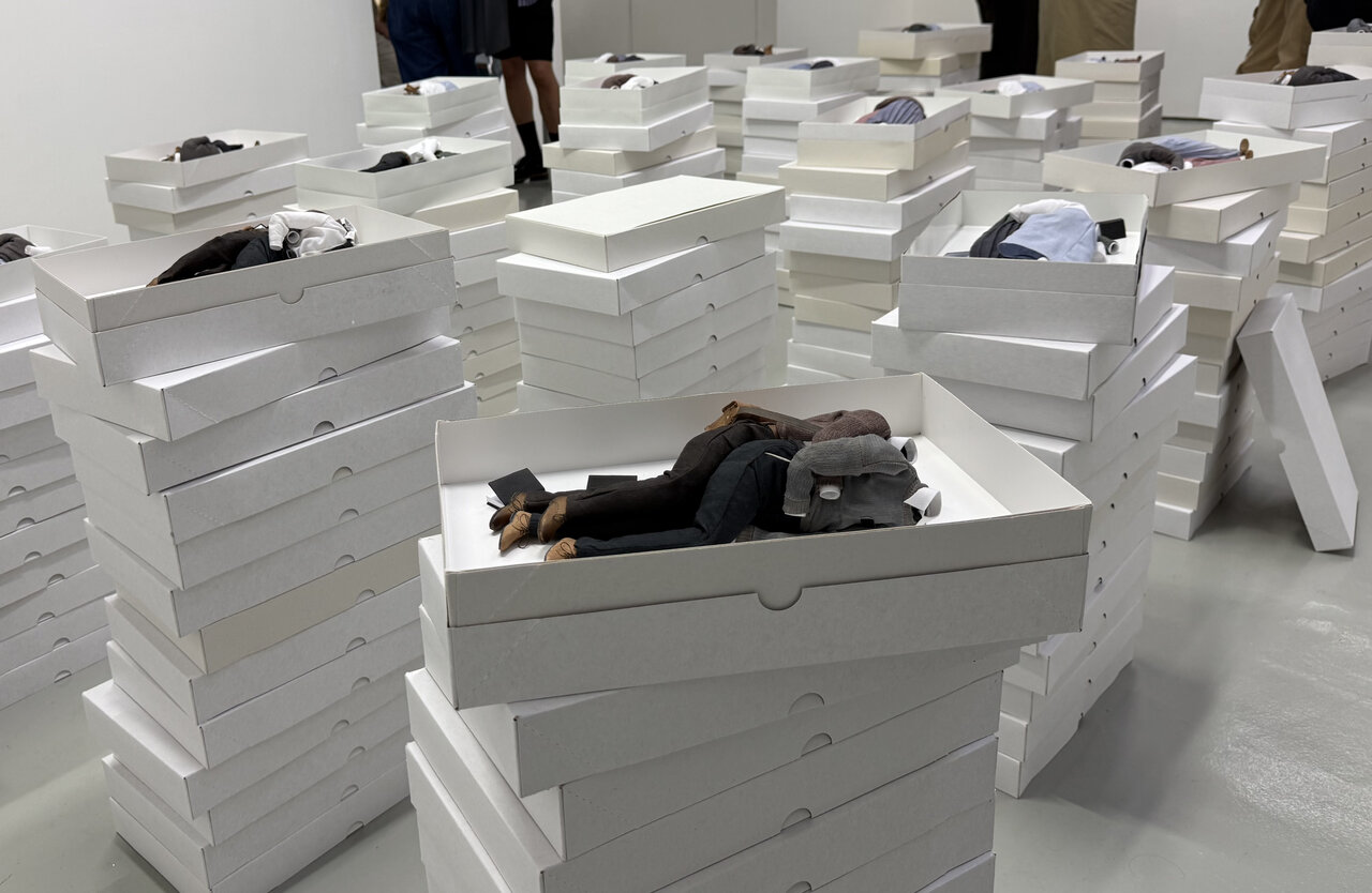
    The gesture of embrace is also found among the towers of white boxes that comprise Camille Charbonneau’s series The House Is a Large Cradle (2023-2026). Within the boxes are miniature figures, each containing a (presumed) same sex couple. The outfits are modest and austere, a palette of white, heather grey, mauve, beige, and olive green. The miniature clothing maintains the volume of the body despite being empty. As such, the boxes are devoid of bodies and brimming with tenderness. The yearning of the embrace is salient, as is the consistent incorporation of the Book of Mormon with each of the pairings. Charbonneau’s work is informed by the artist’s experience in the Mormon Church. The House is a Large Cradle considers speculative love that could form during Church missions, in which pairs of women or pairs of men were sent to spread the gospel. Looking at the couples in the box, I can’t help but think that they’ve been raptured in a divine ascension.

    Camille Charbonneau. The House Is a Large Cradle, 2023-2026. Polyester, cotton, leather, faux-leather, steel, brass, polymer clay, and paper, dimensions variable for assembled series. Each box: 14 x 9 x 2 inches. Polyester, cotton, leather, faux-leather, steel, brass, polymer clay, and paper

    Functioning as the transition point between the two exhibitions is Van Der Hout’s kinetic sculpture, The Shattering (2026). A mounted light shines on the structure as it steadily rotates within the gallery. The sculpture is made of mirrors, soldered together to form a polyhedron of fractures and fragments. The reflections of light trail along the walls of the gallery. As the sculpture turns, snippets of visitors, the environment, and the self are visible: a shoe of mine, a smile of yours, a hand of theirs. The Shattering is evocative of a disco ball, a critical nod to the queer subculture that was bolstered at the height of the genre’s popularity in the 1970s. This was a transformational period for self-expression and visibility, liberation, and solidarity. The structure does not have a completely spherical shape as there are black gaps between the fragments. This is an acknowledgement of the absences within queer history— spaces lost, absences in the archives, missing pieces from the community. The inclusion of such a compelling symbol within Queer Asynchronies affirms the exhibition space as a venue of transformation.

    Ry Van Der Hout. The Shattering, 2026. Steel, mirror, solder, copper, disco ball motor, 26 x 26 x 26 inches

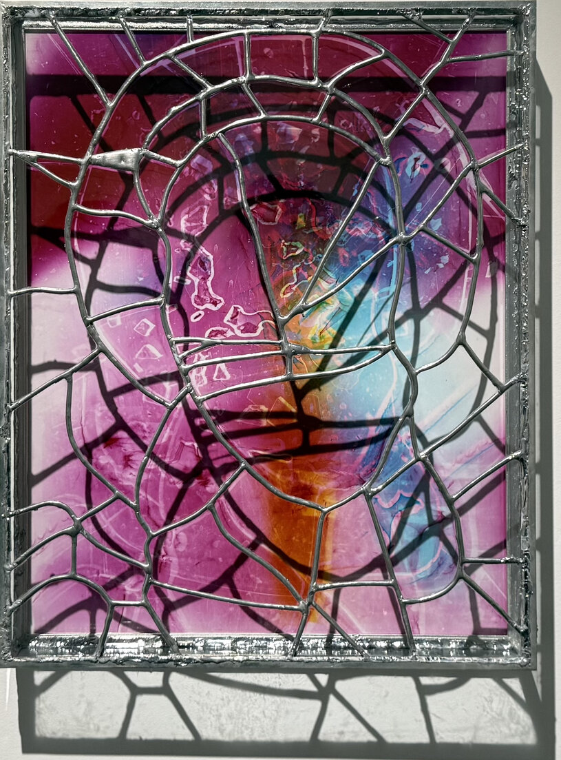
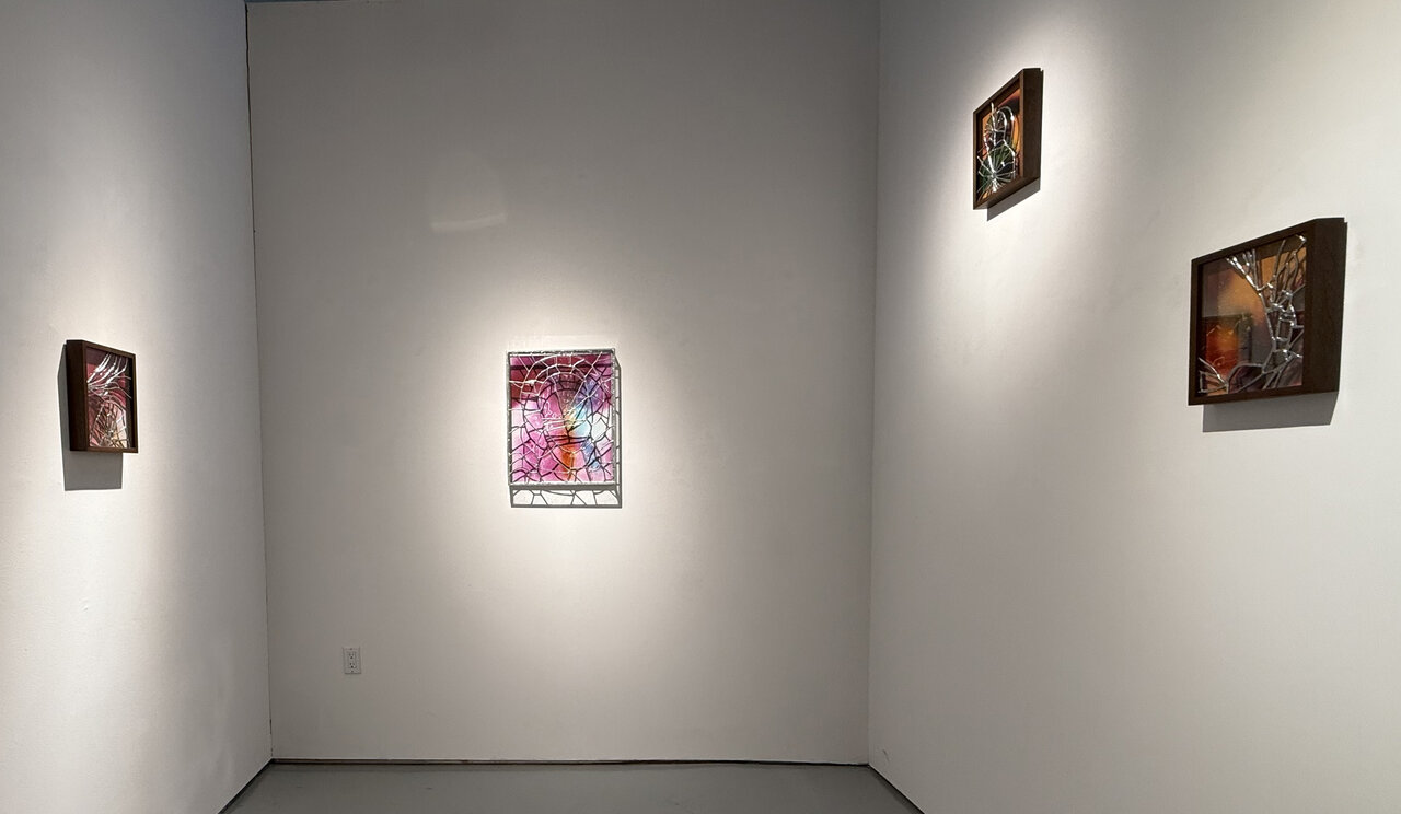
    Meanwhile, Van Der Hout’s works in the series A Shadow Holds are vibrant and lurid. The colours pool across the glass rather than using a myriad of coloured glass panels. The soldering of the works lacks steadiness of the hand, like an urgency to meld together the pieces. Witnessing the artist’s hand in this way is appealing, in that the process is readily apparent in how the vessels were crafted. The colours upon the glass are incorporated through photography, not through the traditional chemistry of ions added or colloidal particles. By photographing the fragmented glass and using that visual in the creation of a new form, Van Der Hout uses fragments as material, process, and as the conceptual framework of breaking apart to put together again. That line of thinking exists in the same vein of alternate temporalities as the way the creation process can be a non-linear method of both making and existing.

    Ry Van Der Hout, a shadow holds 1, 2026. Chromogenic Photogram mounted to dibond, Glass, Solder, Tin, Steel, 20 x 16 x 3 in.

    Adrien Sun Hall’s curation of Queer Asynchronies and Ry Van Der Hout’s series A Shadow Holds are a thoughtful display of queer temporality. It highlights the fissures and fractures, reflections and refractions, and the archives and absences within queer history and world-making.

    A shadow holds exhibition view

    Text and photo: Rashana Youtzy

    *Exhibition information: Queer Asynchronies / Group show with Steven Beckly, Camille Charbonneau, Rami George, Dylan Glynn, Jordan King, Natia Lemay, Oluseye, Ry Van Der Hout and Ry Van Der Hout: A Shadow Holds, June 18, 2026 – July 25, 2026, United Contemporary, 129 Tecumseth Street, Toronto. Gallery hours: Wed – Sat 11am – 6 pm.

  • Lucy Raven at The Power Plant

    Lucy Raven at The Power Plant

    What does water remember? We can trace its persistence breaking down boulders into rocks. We witness water forging a path, eroding the land to make its way. Despite the extent of human intervention, the land, the water, and the Earth persist. The content of Lucy Raven’s Murderers Bar is a reminder of the ever-enduring tenacity of nature.

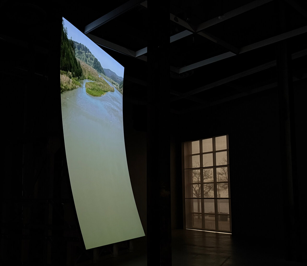
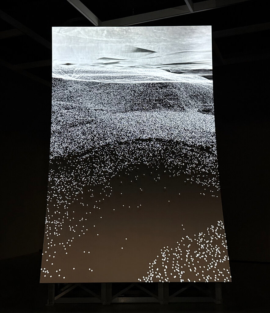
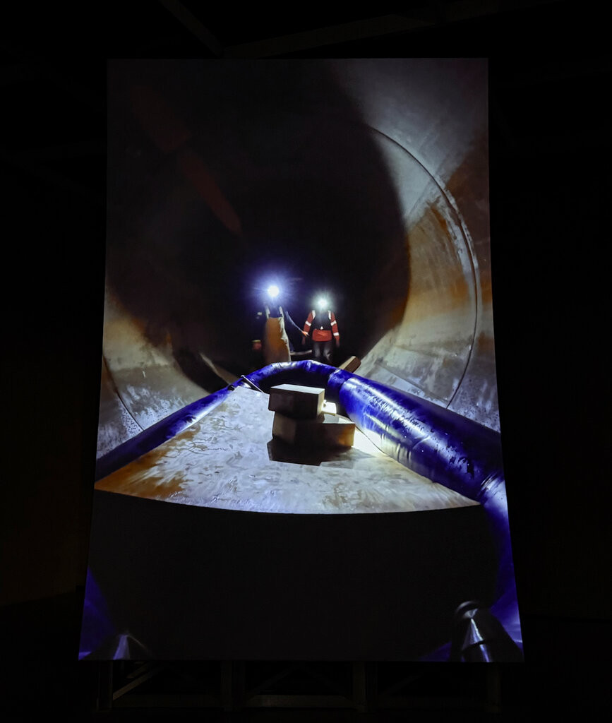
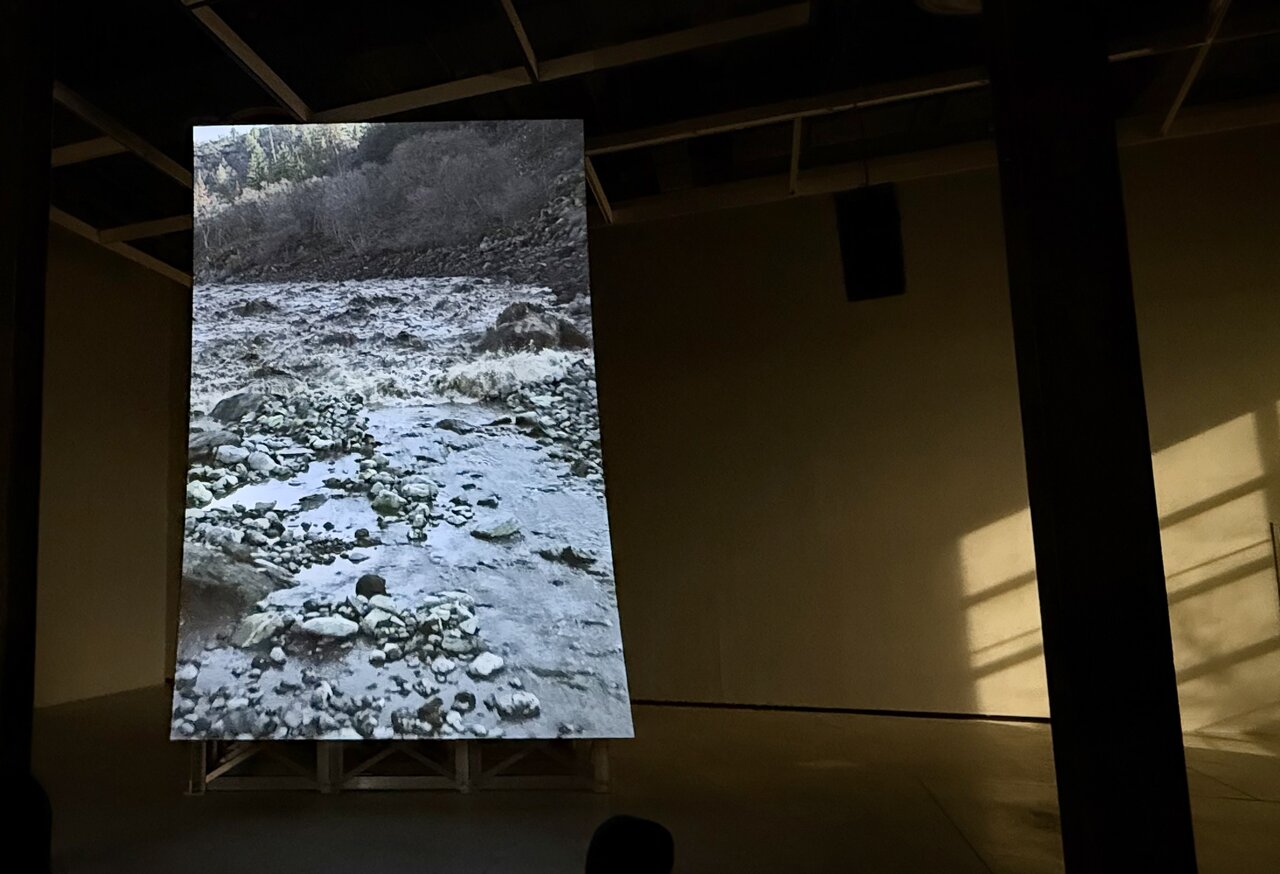
    Murderers Bar utilizes a mixture of drone footage, digital renders, and material from body-cameras in the video. The shifting types of footage present a multifaceted understanding of the land and water. The aerial perspective is akin to that of a bird, gliding and dipping with freedom. The body-camera footage is from those working directly within the environment of the site, a dam on the Klamath River in Northern California. Meanwhile, digital renderings provide an alternative presentation of land in the form of animations. In terms of the latter, the environment is reduced to renders such as topographical surveys and detached from the organic elements of the Klamath River. In turn, it presents the land as a site of extraction and industry. Incorporating these varying perspectives strengthens the work and our appreciation of the natural world with its beauty and verdant abundance. Consequently, we also experience the environment being reduced to renders, as the land and water turns grey and lifeless where it once was brimming with life.

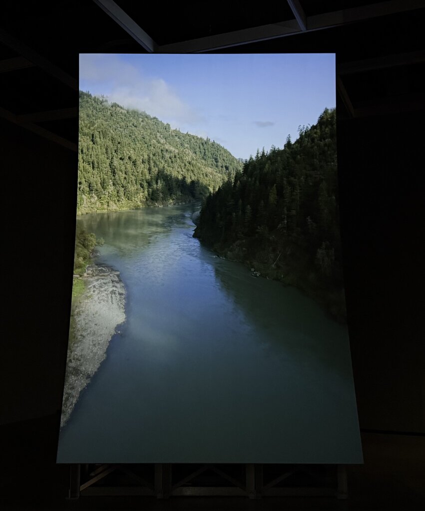
    It’s difficult to discern the exact start of Murderers Bar, a video installation (41:47min) with a sound component and a set of aluminum bleachers for seating. The video plays out on a freestanding concave structure, with speakers spread throughout the space and foam panels along the corridor entering the gallery. I considered the vista view the beginning, one in which a winding river can be seen from above. Waterfowl glide along the gusts blowing through the conifers framing the waterway. The audio component contains the calls of gulls and other natural sounds wooshing by, as if viewers are traversing in real time.

    As the footage progresses through the landscape, the water winds its way among the ridges and trees. Eventually, an overlay of a radar image appears on the screen. With this the camera submerges, crashing and battered by the sediment. The audio amplifies the anxiety and chaos of being underwater. The sound is muffled by the aquatic cushion, with intermittent clarity when the camera breaks the surface of the water. Within the periods of the camera being submerged, one can see topographical renderings of the basin making up the reservoir within the Klamath River. Though visually disrupting, it does provide a perspective that is not otherwise readily experienced by the human eye. The industrial aspect of human-environment relations is explored more deeply in the subsequent section of the video.

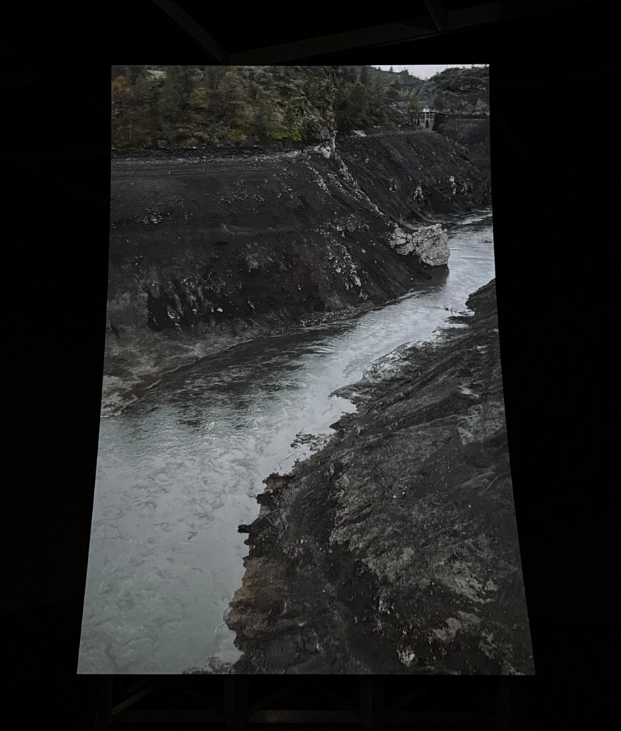
    The drone makes its way to the dam, the area appearing barren of colour and life. Where the water and land were once saturated with deep greens and warmth, now it takes on tones of slate, charcoal, stone. Viewers experience a closer look at the dam, from the body-camera footage of a worker at the service entrance. Here we witness the claustrophobic space, trudging through the water with supplies. Eventually, a cavity is reached, and dynamite is inserted in drilled pockets within the cavernous area. As the perspective shifts once more, the video records the exterior of the dam. The camera pans downward to the ground, with workers walking along the surface.

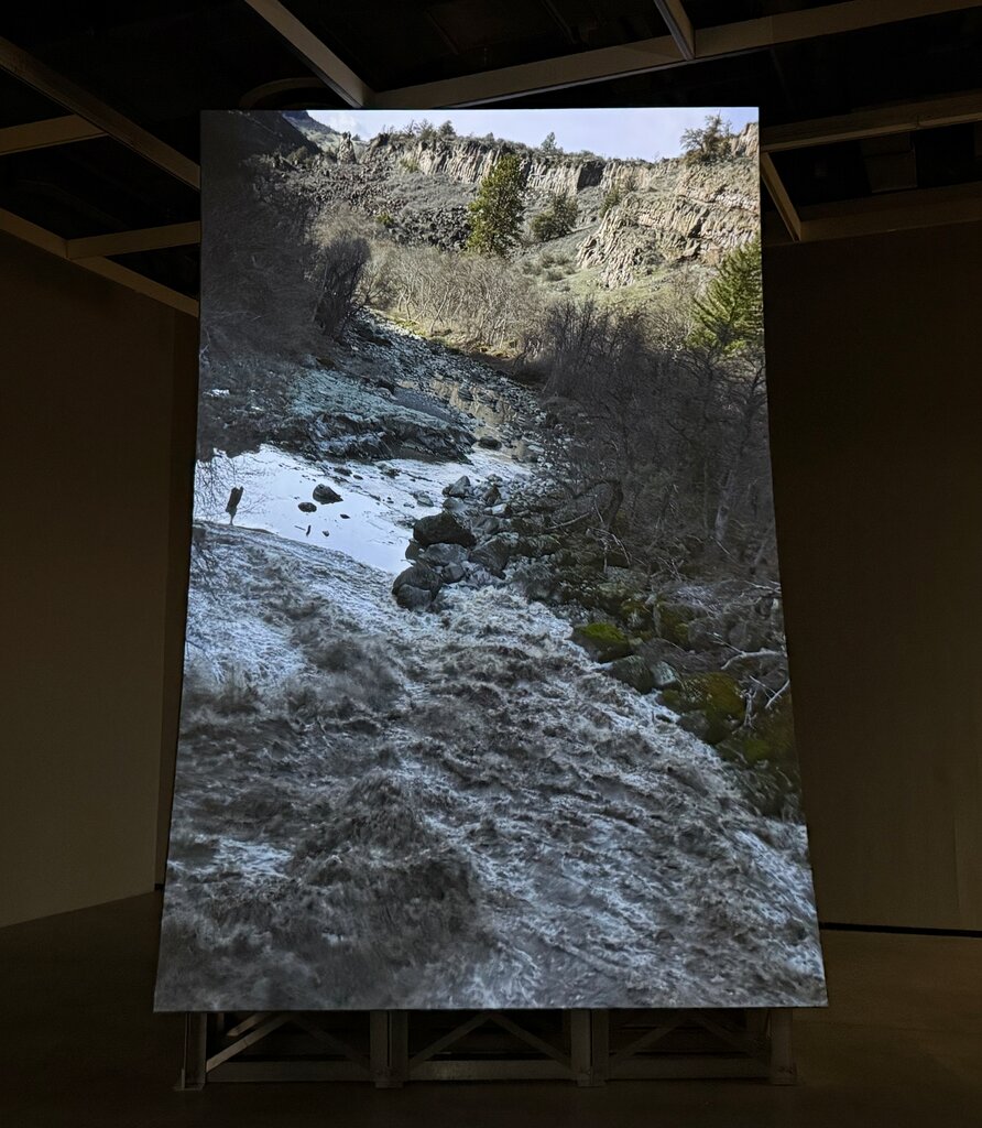
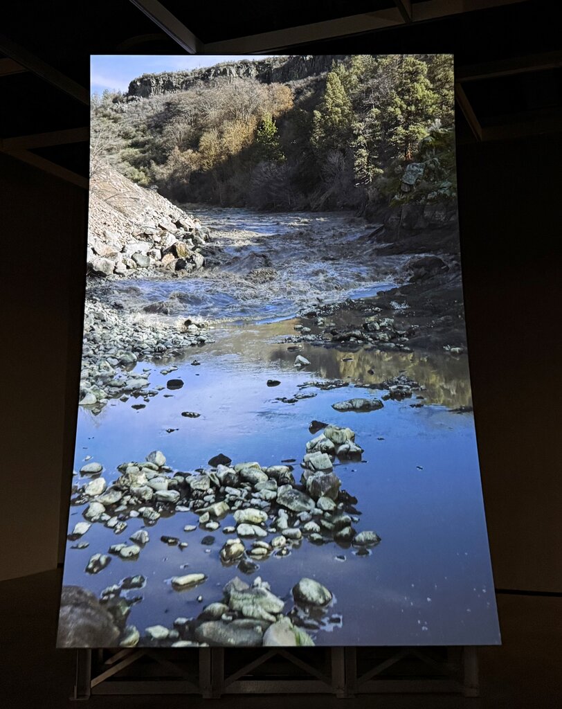
    As the footage focuses on the base of the dam, there’s an explosion. The boom of the detonation reverberates in the aluminum bleachers used as seating in the gallery, another reminder of industrial extraction. The video continues showing the water bounding forth with such power, thrashing everything in its path. The water, free from its reservoir, returns to where it had once travelled, winding once more through the land. The final act of Murderers Bar includes similar footage to that of the beginning: verdant vistas, birds riding along the wind, shimmering waters carved through the land — but with the water returned to the landscape.

    Recognizing that this work has travelled to The Power Plant in partnership with the Vancouver Art Gallery, I considered the labour of the video loop. The venturing for quality field recordings, use of a variety of technology for maximum coverage, and coordination across institutions. In addition, there is labour related to building the dam and its subsequent destruction, as well as nature’s recovery. While Murderers Bar does not showcase the protests, legislation, or an overt display of the peoples advocating for the dam’s destruction, the fruits of their labour are apparent. The site of focus, the Klamath River in Northern California, is a testimony to the stewardship of the Tribal Nations: Yurok Tribe, Karuk Tribe, Hoopa Valley Tribe, Klamath Tribes, and the Shasta Indian Nation. Due to their effort, a historic habitat can be restored. With Lucy Raven’s Murderers Bar, the collective labour can be recognized on a wider scale, invigorating communities further.

    Lucy Raven’s Murderers Bar is a compelling display of the power of water being unconquerable, and the magnitude of human impact on the environment. The grand scale of the video and the booming audio envelopes the viewers. The expansive view and full-bodied sound within the space make for an immersive experience. In this way, one can feel the awe in a bird’s-eye view of a fertile land, or the crushing anxiety of being swept away in a current, gasping for breath. The relief is shared the moment the dam breaks and the water finds its way back. While my interpretation of the video may present the idea of nature recovering despite what humanity throws its way, it does not negate the reality of harm. Like the video loop, this cycle occurs again— awe of nature, dismay at intervention, relief of the return to the natural. As a result, Raven’s Murderers Bar creates an urgency to witness the land and water with which we interact. There is also gratitude in the ready access to the natural world within the immediate vicinity of The Power Plant.

    This appreciation was felt upon walking out toward the waterfront following the exhibition— watching the gulls sweep atop the wind, or the ducks bobbing along the glistening water of Lake Ontario. Whether a moment of calm or chaos, nature is a force with which to reckon.

    Text and photo: Rashana Youtzy

    All images: Installation view of Lucy Raven, Murderers Bar at The Power Plant.

    *Exhibition information: Lucy Raven, Murderers Bar, November 7, 2025 – March 22, 2026, co-commissioned and jointly acquired by The Vega Foundation and the Vancouver Art Gallery,The Power Plant, 231 Queens Quay W. Toronto. Museum hours: Wed & Fri – Sun 11am – 6pm, Thu 11am – 4pm.

  • Paul Orenstein: Stranger on a Train

    Paul Orenstein: Stranger on a Train

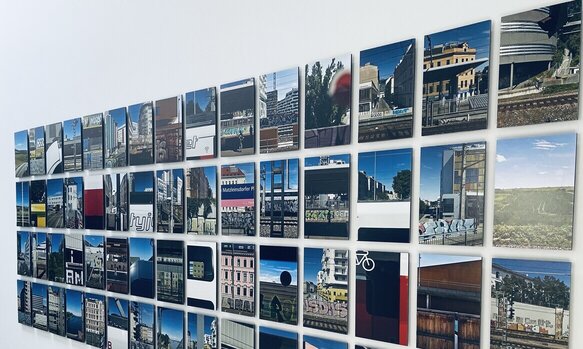
    Orenstein gives urban dwellers new ways of enjoying a city abroad by encouraging them to walk the same street twice, because there is always a chance they’ll see something interesting. Cities are no longer a bore, where every train ride feels like routine, but rather a chance to get lost in urban spaces like no traveler has done before. Urban fatigue of graffiti wired fences, and train stations have been captured in a new type of documentation in photography for some time now, giving the familiar spaces a fresh look. Stranger on a Train by Paul Orenstein takes us to Vienna back in 2024.

    City natives and urban dwellers will always appreciate the fresh perspective of a foreigner. As for a local, not much is absorbed, especially when one becomes accustomed to such things as the line at a coffee shop, or passing the time on the ride to work to decipher tags on the walls or identify the themes of graffiti tattooed on out-of-service trains. Nothing like a tourist, especially a photographer, can change their perspective on how they can explore their own city spaces.

    Installation view of Paul Orenstein, Stranger on a Train “Gang of 60”

    The exhibition presents 74 colour photographs taken in Vienna, in both in printed forms, including large formats, and on digital monitors mounted on the other side of the gallery hall. The pieces depict Vienna’s modern and historical elements, sometimes side by side, in unexpected parts of the city. One can’t help but wonder what stories were told under the bridge in a partly renovated neighborhood.

    Even the colours at the entrance of this exhibition match the colours of vibrantly painted residential buildings and tagged warehouses. Orenstein describes how quickly the excitement shifts when visiting a new country without knowing the language yet somehow managing to move around by looking at street signs, stores, office buildings, etc. The shapes and colours are so different from what you used to it at home, that you feel like an alien on another planet. Even the electrical wires seem to create a picture if you squint your eyes.

    Installation view of Paul Orenstein, Stranger on a Train

    Some of the prints displayed in Stranger on the Train might be shocking to see yet not surprising how much graffiti and tags are covering the surfaces, showing the rapid changes with so much construction going on even in a historic European city like Vienna. This fact reminds us that we must pay more attention to our own space, that may change in a blink, so, we might never see the same city again.

    Installation view of Paul Orenstein, Stranger on a Train with Sot T, cacophony (left) and Sot T, red E (right)

    Text and photo: Polyna Alexseev

    All images are installation views of Paul Orenstein: Stranger on a Train.

    *Exhibition information: Paul Orenstein: Stranger on a Train, May 18 – June 30, 2025, The Hall, 166 Clinton St, rear building, Toronto. Opening hours: Sat – Sun 11am – 6pm. Part of CONTACT Photography Festival.

  • Christina Leslie at Stephen Bulger Gallery

    Christina Leslie at Stephen Bulger Gallery

    Christina Leslie: Pinhole Portraits and Places

    Canadian-Jamaican artist Christina Leslie presents Pinhole Portraits and Places, a solo exhibition that explores identity, culture, and personal heritage through the lens of pinhole photography. The exhibition is composed of three series: Portraits, Places, and Parishes, each offering a different perspective based on Leslie’s cultural background and experiences.

    Christina Leslie began developing Pinhole Portraits and Places in 2016, experimenting with early photographic practices such as the pinhole technique. Through this approach, she challenges the lack of Black representation in art institutions. From 2017 to 2025, Leslie created a collection of photographs where the first series of portraits features Black men and women posed against deep black backdrops. These softly blurred images, tinted in a warm orange tone, complement well with the gold accessories like the hoop earrings and hair beads, highlighting the richness of Black skin and emotional expression.

    Christina Leslie, (L-R) Monique; Caleb and Carol, each from the series “Pinhole Remix”, 2020, printed in 2021, pigment print on archival paper flush mounted to Aluminum Composite Panel

    The exhibition opens with the Pinhole Portraits series, offering an intimate introduction to Leslie’s exploration of identity and representation. Leslie was inspired by the Renaissance and Rembrandt-style, capturing her subjects with intimacy, reverence, and historical depth. Historically, photography has been used to document individuals of high social status, often reinforcing colonial and elitist narratives. Christina Leslie challenges this by using the medium to center and celebrate Black identity. Her work reframes photography as a tool for honoring Black lives, placing her subjects within a lens of dignity, beauty, and emotional depth. In doing so, she creates space for reflection on representation, cultural memory, and belonging.

    Christina Leslie, (L-R) Stephanie, 2020, printed 2021; Andre, 2020, printed 2025 and Melissa, 2020, printed 2021, each from the series “Pinhole Remix”, pigment print on archival paper flush mounted to Aluminum Composite Panel

    The second series is centered around Places, capturing environments that depict a sense of “home.” These photographs offer subtle insights into Leslie’s Caribbean heritage and the lives of those featured in her portraits. Through bold colours, elements like water and seashells, and familiar yet abstract settings, Leslie reflects on spaces shaped by personal history and memory.

    This series highlights people and places that hold deep cultural and emotional significance, formed through lived experience and passed-down stories. The images appear blurred or distant, representing the nature of memory, especially within diasporic contexts. Leslie’s work consistently centers family and community, asserting their rightful place in contemporary art. Places underscore themes of cultural displacement and the struggle for recognition, addressing how society overlooks Black experiences.

    Christina Leslie, Max, Shabazz, and the BK steps, 2023, from the series of “Pinhole Places”, pigment print on archival paper

    Pinhole Places (2022–2025) portrays elements of street photography to explore a variety of spaces, some are familiar, others are more abstract. Through this contrast, the series reflects on the complex relationship between connection and disconnection that often defines diasporic experiences.

    Christina Leslie, Galang, 2025 from the series of “Pinhole Places”, pigment print on archival paper

    The third series, Pinhole Parishes (2023–2025), centers on several parishes in Jamaica, drawing inspiration from stories passed down through Leslie’s family. She successfully blends storytelling with photography, and she preserves these memories while engaging with Jamaica’s post-colonial landscape. Her visits to the island deepen her connection to place and ancestry, grounding the work in personal discovery and cultural affirmation.

    Christina Leslie, (L-R) Pinhole #6, 2024; Pinhole #10, 2024 and Pinhole #4, 2023, each from the series “Pinhole Parishes”, pigment print on archival paper flush mounted to Aluminum Composite Panel

    Across all three series, Leslie presents her work in an engaging and intimate manner. Through textured imagery, warm tones, and visual references to classical art, viewers are invited to piece together a narrative that speaks to heritage, identity, and the power of the Black stories and voices.

    Abuk Lual

    Images are courtesy of the artist and Stephen Bulger Gallery.

    *Exhibition information: Christina Leslie, Pinhole Portraits and Places, May 10 – July 5, 2025, Stephen Bulger Gallery, 1356 Dundas Street West, Toronto. Gallery hours: Tue – Sat 11am – 6pm.

  • The Celestial Collective at Gallery TPW

    The Celestial Collective at Gallery TPW

    Gallery TWP presents their own curatorial researcher, Jesse King, who introduces a group of artists and designers, a collective also known as The Celestial Collective. They are two-spirited, indigenous queer and non-conforming artists who invite the audience into a space of rarely heard voices surrounding the topics of gender and sexual expression through desire and despair.

    Every artist offers an element of unique ancestry and a sense of ownership, body and soul, as well as poetic narratives in treasured memories scattered in lost places. The stories told with each photograph, with each bead and match, honor their ancestors and their families with care, including care for themselves, giving the strength to survive in a new age, where the sense of family is needed more than ever. The exhibition showcases multiple cultural roots where gender identity and indigeneity weave a core of resilience from one ancestor’s branch to another, while inviting others to explore these branches.

    Kikki Guerard, You talked to me on the outside, 2025, wool, silk, fabric print, 55 x 28 inches

    When visitors enter the gallery space, they are facing a flame-like awakening, a journey of storytelling and rituals, rooted in the history of families who survived persecution as a nation and made it out even stronger.

    Kikki Guerard, Redbird, beaded box, 2025, D 2.3 D x W 2.5 x H 4.3 inches

    As for the central piece of this show, Constellation Spark, visitors are welcome to experience, as described by the collective, “touch and ritual,” and become one with the stories the artists tell. As the main foundation of the show, sound and video give visitors a tour inside multiple bodies of work made from beads, TV static, video and print.

    The Celestial Collective, Constellation Spark, video installation / Sound Scape, 2025

    Each TV is playing a video loop, filmed by each member of the collective striking a match from the Redbird box to spark a discussion very similar to the beginning of a sacred ceremony. Each element, such as the Redbird matches and beaded work, is a piece of memory the artists hold close, yet are brave enough to “throw into the fire” to share the story of resilience that will live on.

    The Celestial Collective, Constellation Spark, video installation / Sound Scape, 2025

    Text and photo: Polyna Alexseev

    *Exhibition information: Smoke Signals x Reflections by The Celestial Collective / Jesse King, Jake Kimble, Kikki Guerard, Melissa Johns, Megan Feheley, February 12 – March 30, 2025, Gallery TPW, 170 Saint Helens Avenue, Toronto. Gallery Hours: Wednesday – Saturday, 11 am – 5 pm.