Category: Uncategorized

  • Bursting Bubbles

    Bursting Bubbles

    More and more, Toronto’s Media Arts festivals are incorporating Virtual Reality into their programming. And rightly so: the new medium has the potential to push media arts into unprecedented bounds. In Bursting Bubbles, part of the Rendezvous with Madness Festival presented by Workman Arts, Wendy Whaley presents an interactive, biometric VR piece

    Nestled in a simple cube of a room, Coenesthesia takes the interactive component of a VR experience a step further. I was greeted by an attendant who instructed me to stick on electrodes onto my body (like an EKG test). Once I connected to the electrodes and the headset, I was instructed to face the fuzzy ball on the floor (another piece called Frisson Portal which visitors are encouraged to hug!), after which I was promptly plunged into Coenesthesia’s universe.

    Wendy Whaley, Coenesthesia VR video still. Courtesy of Bustling Bubbles

    It’s quite hard to describe everything in this universe. Massive planet-like objects float in outer space, surrounded by an even more massive ring made up of waves. I put my arms out and twist it in order to fly forward, and the first stop I make is to the red heart that is beating to the beat of my own heart, due to the electrodes. I fly into the heart, which is so giant it envelops me whole, and watch and hear my own heart beat – in my own heart. It’s an indescribably surreal sensation – to be outside and inside my heart at the same time. Embodied by my own heart, the extension of my body becomes hazy.

    Installation view with Wendy Whaley, Coenesthesia VR video still and Frisson Portal (right). Photo: Sunny Kim

    I fly through the other objects. Some are vague spheres of moving water, some are abstract shapes. There’s even a brain I can fly through. If not for the motion sickness and tired arms, I would have explored this universe for hours. In this universe, I am simultaneously my original physical body, a fellow planet, and a soaring star. Fragmentation in the most intriguing sense.

    Installation view with Kat Singer’s sculptures (in the middle). Photo: Sunny Kim

    The main exhibition space is not without its merit as well. Presented are more poignant works about the confusing nebula that is the mind-body relationship. On the wall facing the entrance, notes written by those living with mental illnesses are displayed along with their prescription medication bottles. Kat Singer’s Message in a Bottle is a collaborative project about the stigma of mental illness, but in a broader sense it comments on the common human condition. The emotions underlying the writers’ personal stories are things that everyone feels in a lifetime – isolation, hopelessness, pain, and shame.

    Kat Singer’s Message in a Bottle. Photo: Sunny Kim

    Through these shared emotions, these messages connect the readers to not only the writers, but also the people in the reader’s lives. In a small but significant step, Message in a Bottle gently soothes the helplessness, impatience, and misunderstanding that comes from seeing loved ones suffer, but not being to help, running out of sympathy, and lacking compassion because it blurs the dichotomy between self/other; those living with/without mental illness.

    Installation view with Kat Singer’s Message in a Bottle (in the back). Photo: Sunny Kim

    Bursting Bubbles collectively work to cultivate empathy and blur this dichotomy. Investigations into identification, embodiment, codependency, autonomy are explored in this dynamic group exhibition. Thanks to these investigations, we are able to gain a deeper understanding of others’ madness – as well as our own.

    Sunny Kim

    *Exhibition information: Bursting Bubbles / Creative Context for Evolving Solitudes, October 12 – 21, 2018,Toronto Media Arts Centre (TMAC), 32 Lisgar Street, Toronto. Gallery hours: daily 12 – 6 pm

  • Joan Kaufman: Surface Tension II at Lonsdale Gallery

    The anthropocene epoch, an unofficial offspring of the current Holocene era, essentially defines a period of time in Earth’s history that emphasizes the significant impact of human beings on the natural world. Modern geologists have coined this term in response to the massive destabilization of environmental phenomena via industrialization, poaching, deforestation, and other entropic interventions caused by mankind. Whether informed by capitalist logic, or a result scientific nescience, Earth has undergone a colossal metamorphosis from a bio-diverse Arcadia to an increasingly bleak concrete jungle. While not as immediate, Joan Kaufman’s latest exhibition at Lonsdale Gallery tackles similar environmental concerns, albeit in a more meditative and visually sumptuous manner.

    Joan Kaufman, Surface Tension II, 2017, installation view at Lonsdale Gallery

    This current body of work is an extension of the artist’s exploration of anthropocentric matters that have persisted throughout her distinct oeuvre. Using the photograph as her primary medium, Kaufman’s kaleidoscopic work resembles images of a subterranean landscape removed from any real-world referent. Shot primarily in a South African forest, these artworks are repeatedly stripped of denotation through a rigorous studio process that involves textile screens and alternative lighting techniques as a means of manipulating her source material. This insistent trickery deftly recalls Man Ray’s fascinating studio experiments, as well as Stan Brakhage’s celluloid mutations. Furthermore, a series of photographs that are lined in procession in the upper gallery recall decorated friezes on Greek temples from antiquity, inviting historical iconography into her modern abstractions. Kaufman’s photographic interventions transform her organic subject matter into alien images of biomorphic proportions. Large root systems that comprise her Roots and Radicles series resemble arteries of a fantastical creature, while the figures present in the Night Procession sequence are given moth-like appendages.

    Joan Kaufman, Roosts and Radicles 1, 2017, C-print, 17 x 22 inches

    Joan Kaufman, Roosts and Radicles 3, 2017, 13 x 18 inches

    Joan Kaufman, Roosts and Radicles 12, 2017, C-print, 40 x 60 inches

    As a viewer moves throughout the gallery space, it becomes evident that the artist approaches her socially conscious body of work in a more symbolic manner. While artists such as Olafur Eliasson and Naziha Mestaoui wear their activist tendencies on their proverbial sleeves, Kaufman allows her art to elicit a more contemplative response. Her photographs do not immediately confront; but instead, slowly percolate throughout a viewer’s consciousness as they slowly digest the contextual implications hidden throughout these compositions. While it may not seem obvious at first, when considering the human activity involved in creating these pieces, a viewer will begin to find a correlation between the artist’s anthropocentric concerns and these unique images.

    Joan Kaufman, Night Procession 1, 2017, C-print, 18 x 40.5 inches

    Throughout the exhibition, Kaufman brings attention to increasingly fraught relationship between mortals and the natural world, as the human mind can create images of wonder, but also significantly contribute to the rampant deterioration of a once-thriving global ecosystem. This inherent dichotomy enlivens the work beyond its gallery setting into more cerebral territory.

    David Saric

    Images are courtesy of Lonsdale Gallery

    *Exhibition information: November 17, 2017 – January 21, 2018, Lonsdale Gallery, 410 Spadina Road, Toronto. Gallery hours: Wed–Sun 11 am – 5 pm.

  • FOCUS: Los Angeles / Art Toronto 2017

    FOCUS: Los Angeles / Art Toronto 2017

    Two days should have been enough to cover FOCUS LA at Art Toronto. Blame interruptions by well-meaning friends, lazy feet, and occasionally getting lost in the art fair weeds. Ferreting out all the pieces to the Santi Vernetti-curated LA Project Series: And the Sky is Grey would have been great. What I did manage, was spend some time with the eight FOCUS LA participating galleries, and snatch about half the panel discussion LA Talk: Beyond the Hype. My own familiarity with LA art scene begins to thin out somewhat in the middle of the 2010 decade. So much has happened in Los Angeles since. What I managed to glean was merely a core sample of a vital, if not explosively dynamic arts community.

    Santi Vernetti, Curator of FOCUS: Los Angeles said, “The best thing about LA are the artist-run galleries. Hundreds of artists are moving here. These artist-run spaces are often extensions of the schools, such as Cal Arts. LA is welcoming. There are spaces here. With the shifting geography of the city’s cultural landscape the lack of funding for re-development is a problem, however. While a dozen major international galleries may set up here, there is a lack of dialogue with the community.” He sees the lack of support and funding as a crisis, not only in Los Angeles, but across the U.S.

    Santi Vernetti, Curator of FOCUS: Los Angeles 2017. Courtesy of Art Toronto

    Anat Ebgi

    Gallery director Stefano di Paola studied art history at University of Southern California with an interest in academics and research. He likes working in a gallery because he gets to work directly with the artist and their work. Every six weeks there is something new. It is Anat Ebgi’s first time at Art Toronto. They were invited by curator Santi Vernetti to come here. It turns out that Stefano and Santi were at college together in different programs. The gallery brought Montreal artist Magalie Guérin here as a way of introducing her to collectors and curators here.

    Gallery director Stefano di Paola

    BBQLA

    BBQLA describes itself as a migrating installation, rather than a gallery. Conceived by Timo Fahler, Thomas Linder, and Adam Beris, who went to school together in Kansas City, they host BBQ’s that might be attended by 200 people. “The Gallery” evolved, 2-1/2 years ago from back yard and shed, to a temporary studio space, with BBQ’s of course. It was, and is, very casual. Timo Fahler said, “It’s been great. We’ve sold work.” I spoke with BBQLA artist, Daniel Gibson, who describes his performance as doing a public service, a spirituality. He invited me to take part. This turned out to be Cee-lo, a gambling game with three dice. First throw, I rolled a perfect 4-5-6, winning the bank.

    BBQLA comes to Toronto

    Club PrCo Los Angeles

    Kyle Roberts of Club Pro Los Angeles said, “There is so much art happening in Los Angeles, that there is tension, artists making work and trying to fit with the politics. It’s a mixture of dog shit and lavender.”  Sitting with Kyle was artist, Adam Stamp who created the working bar at Art Toronto, called Sorry’s. I tested it out. It serves wine like any other bar. Adam is a bit disappointed that people don’t get that it’s art.

    Artist Adam Stamp (left) and club Pro Los Angeles gallerist Kyle Roberts (right)

    Adam Stamp’s Art bar, Sorry’s

    Luis De Jesus Los Angeles

    Luis De Jesus represents three Canadian artists, so he decided to come to Art Toronto. He was part of the Speaker Series Power Talks, FOCUS: Los Angeles: Beyond the Hype. His gallery is located in the Culver City gallery district, a new gallery area where there were previously no galleries. The change occurred after Chinatown as a gallery district began to decline, with the departure of Perez Projects for instance. The ebb and flow of culture in urban areas has become a sensitive community issue. De Jesus maintains that it’s not the artists and galleries that are driving gentrification, it’s the developers.

    Luis De Jesus (standing) at his booth with Jay Wingate (seating).

    ltd los angeles

    Gallery owner Shirley Morales of ltd Los Angeles was away in Dallas when I stopped by the booth. I spoke, however, with Kendra Popelas who said, “It’s been very successful. We sold three of John Edmonds’silk prints to the AGO. TD Bank bought five of Esmaa Mohamoud’s basketballs. Her work is about masculinity and race, particularly as they relate to athleticism.”

    Kendra Popelas of ltd Los Angeles

    Moskowitz Bayse

    Meredith Bayse operates the gallery with partner Adam Moskowitz in Hollywood. She noted, “The Melrose/LaBrea gallery district of Los Angeles emerged when post production in film went digital and these great spaces became available.” Adam admits that it was risk to bring only one artist to the fair, but said, “It was worth for us to be here. There have been some sales.” The artist, Kim Shoen was part of the FOCUS Los Angeles panel. She brought up the fact that a lot artist-run galleries are apartment galleries, as well as store fronts and garages. Her empty book works have an analogy to the city of Los Angeles as a site, spaces where things could take place, emptiness as possibility. She was surprised that issue didn’t crop up during the panel discussion.

    Artist Kim Shown and Adam Moskowitz of Moskowitz Bayse

    Night Gallery

    Davida Nemeroff of Night Gallery is from Toronto, but moved to Los Angeles eight years ago, opening her gallery after six months. She represents mainly L.A. artists. Her gallery is located in the downtown warehouse district. She said, “People are really drawn to the work. FOCUS LA has given momentum and interest in LA galleries.”

    Night Gallery artist Josh Callaghan with his deconstructed refrigerator behind him.

    Royale Projects

    Gallerist Rick Royale wanted to show an aesthetic through-line between four different artists at display at Art Toronto. Their only similarity is that they have lived and worked in Los Angeles for about ten years. He set out to expose a formal connection to surface, colour, and light, aspects associated with the geography of Los Angeles.

    Paige Moss and Rick Royale of Royale Projects

    FLOAT Museum, a future-facing virtual institution from Kate Parsons, was part of  the FOCUS LA  Project series.

    Kate Parsons VR installation at FLOAT Gallery

    Text and photo: Steve Rockwell

  • The Multiple Narratives in ‘Form Follows Fiction’

    The Multiple Narratives in ‘Form Follows Fiction’

    Prior to seeing Form Follows Fiction: Art and Artists in Toronto at the University of Toronto Art Museum, I was extremely skeptical. With a scope as large as ‘Art and Artists of Toronto’ and a showcase of work by 86 artists, I wondered how someone could thematically arrange such a broad spectrum of work into a cohesive exhibition. But after seeing it three times, hearing the curator’s talk, and reimagining the diversity of work to be a direct reflection of the diversity of Toronto, my skepticism was put to bed.

    The theme of identity and the desire to define a sense of place is universal. I’ve had the privilege of discovering that after a brief period of separation, a weekend in Montreal or a year in London, the cultural and environmental characteristics of a city become much more distinct. Whether you’ve been here your whole life or migrated recently, everyone defines their sense of self through their similarities and differences to others—and the artists in Form Follows Fiction do just this. Using performative and allegorical processes, described as such by curator Luis Jacob, the work explores how the artists’ conditions have shaped their sense of place.

    Form Follows Fiction is not historical, chronological, or a history of art in Toronto. Instead, over 100 works are thematically arranged under four outlined gestures: mapping, modelling, performing, and congregating. While the works span a period of about 50 years of artistic production, with historical documents dating as far back as the eighteenth century, Jacob’s exhibition was an honest and exciting exploration of artists in Toronto.

    The exhibition was split between Justina M. Barnicke Gallery and the University of Toronto Art Centre. I luckily started at Justina M. Barnicke Gallery, where the works played a major introductory role. Through extremely diverse subject matter and materials, the work loosely dealt with how history informs our cultural environment. Whether asking more complex conceptual questions surrounding the formation of space or directly referencing legislative frameworks, the allegorical subtleties of the works create a powerful narrative about the ‘vacant lot’—a term used by Jacob as a metaphorical tool to consider how space is mapped both literally and figuratively.

    The first work that strikes you upon entering the gallery is Premises for Self-Rule by Saulteaux First Nations Canadian artist Robert Houle. The work is comprised of four canvases visualizing four legislative acts in Canadian history. The middle canvas on the far right wall refers to the ‘Indian Act’ of 1876, a legislative act that became the initial basis for aboriginal assimilation by disallowing the practice of aboriginal ceremony, determining the land base of aboriginals in the form of reserves, and defining who qualified as an ‘Indian’ through Indian status. Despite undergoing numerous amendments, the act is still in place today (which is difficult to imagine considering that Canada was the first country in the world to adopt multiculturalism as an official policy in 1971). Houle’s works act as a ‘panorama’ of a legislative framework that contributed to the cultural upheaval of Indigenous people. Mediated between tradition and an imposed assimilation into Canadian culture, many natives still experience the ramifications of these highly controversial acts today.
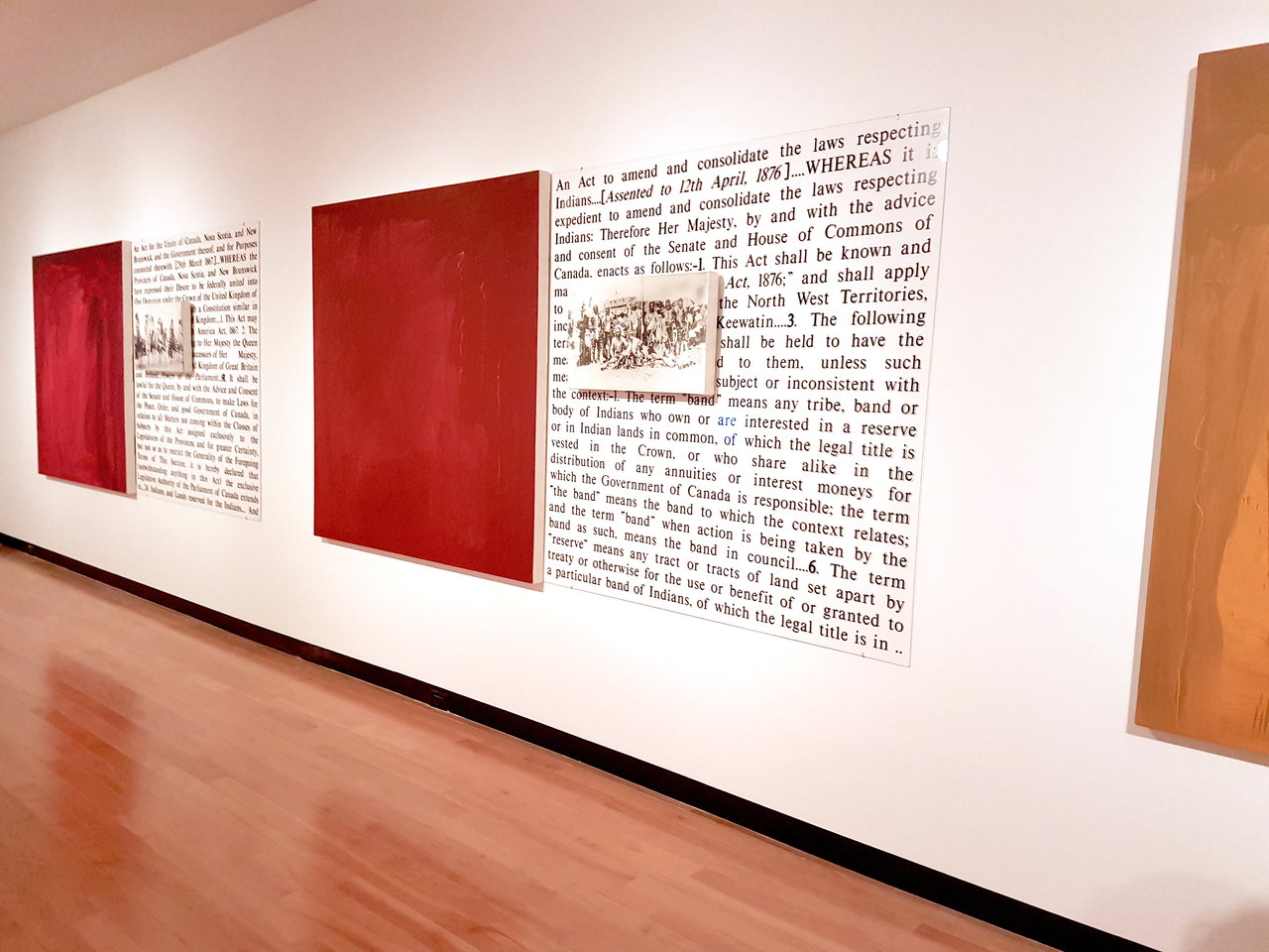
    Robert Houle, Premises For Self-Rule, 1994, oil on canvas, photo emulsion on canvas, vinyl

    Other notable, and slightly less politically charged, works in this gallery were Lisa Steele’s Birthday Suit—with scars and defects, Gordon Lebredt’s Get Hold of This Space, and Carole Conde & Karl Beveridge’s Work in Progress. Steele, born in Kansas City now living and working in Canada, created this video on the occasion of her 26th birthday, showcasing a history of the artist’s life through various injuries and scars and revealing another method of mapping. Winnipeg-born Gordon Lebredt presents a giant black box outlined on the wall with the words ‘GET HOLD OF THIS SPACE’ nestled inside, which articulates our relationship with space using the metaphorical notion of the ‘vacant lot’.
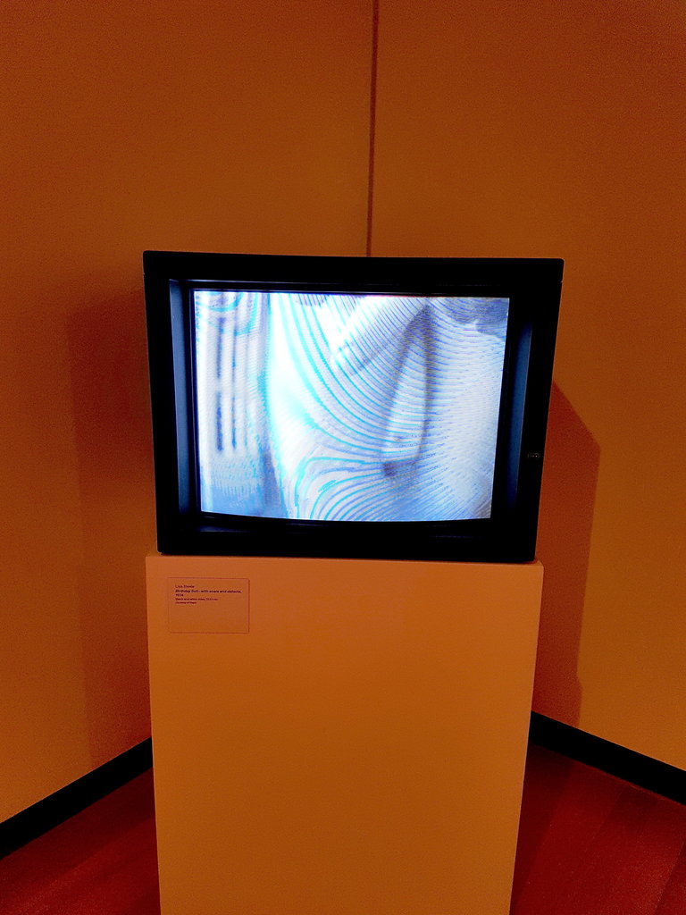
    Lisa Steele, Birthday Suit—with scars and defects, 1974, black and white video, 13:23 min
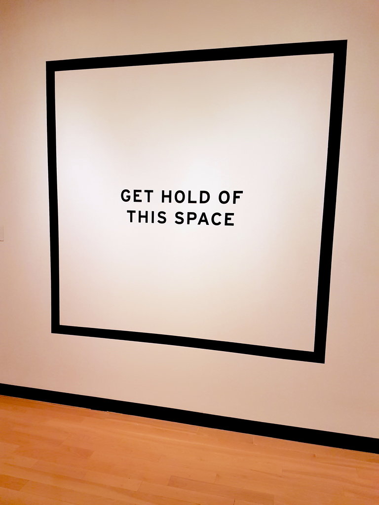
    Gordon Lebredt, Get Hold of This Space, 1974/2010, latex paint and vinyl lettering

    Canadian artists Conde and Beveridge present photographic panoramas that demonstrate a view of working women over twelve decades. Each woman is posed in a kitchen, where objects have been thoughtfully staged and the windows frame a documentary photograph relating to the politics of the period.
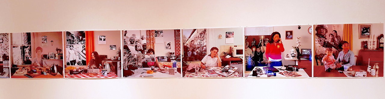
    Carole Conde & Karl Beveridge, Work In Progress, 1980-2006, archival pigment print

    Thus far, the exhibition was winning me over, but as an important aside, the curator’s talk played a major role in my reception of the work. Without it, I didn’t fully appreciate the relevance of certain works or their subtle relationships to one another. Now, to be clear, I am not calling for text panels about the thematic arrangement (which were also not provided), but individual explanations of specific works. For fear of sounding old fashioned: an exhibition of this scale needed some explanatory text panels. For contemporary art exhibitions outside of a major institutional setting, this practice is generally unheard of, but explanatory texts are not just for museums or posthumous shows.

    Before listening to the curators talk, I felt that some of the works were misplaced, but after it I had those “A-ha!” and “Ohh” moments, where I thought, “NOW I get it!” For those unable to attend, explanatory texts could have filled in the gaps and brought the exhibition together. As someone in the arts, there is always that initial fear of embarrassment when you can’t make the leap between artwork and concept, but in many ways this gap is reflective of the exhibition and not a fault in an audiences viewing methodology—especially in a show with over 100 works.

    Moving across to UTAC, which is markedly larger, I braced myself for an abundance of work. The first piece that captured my attention was Lifestyle Series by Ojibway artist Keesic Douglas. Four photographs feature an Anishinaabe couple surrounded by stereotypical features of their culture. Each photograph is a scene, staged and lit like a movie set. The couple are surrounded by dream catchers, stereotypical ‘Indian’ statuettes, deer skin drums, a Pocahontas mug, and many other ‘Indigenous’ objects. Living in these tableaus, the couple are surrounded literally, and figuratively, by the Indigenous stereotypes persisting in contemporary Canada. As Douglas once said in an interview: “I see photography as a reflection of the things around us.”
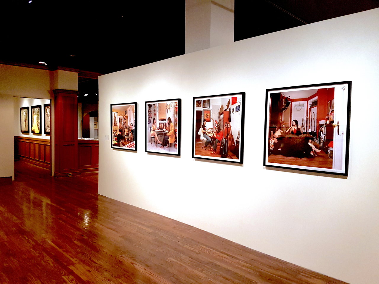
    Keesic Douglas, Lifestyles, 2007

    At this point I realized something: native and migrant groups likely experience a ‘sense of place’ quite differently. Indigenous people have dealt with a (forcible) shift towards assimilation against their established customs and traditions, while many migrants assimilate through choice. The experiences of these two groups created an interesting dialogue between how they are defined in relation to one another and how they mediate the space in-between. This is one of the exhibitions greatest successes, the representation of a diverse spectrum of artists from Indigenous, Canadian and migrant perspectives.

    Despite outlining four thematic gestures at the beginning of the exhibition, there is no signage to designate which one was which, and no attempt to simplify the works into categories. This approach allowed the art and artists to escape restrictive definitions under thematic titles, and reiterated the diversity reflective of every major city. One of the greatest disservices an exhibition of this scale can do is to presume that 86 artists can be organized into neat categories.

    As you delve deeper into the exhibition you are greeted by two crocheted banners stating “WE CAN’T COMPETE” and “WE WON’T COMPETE”. Created by Canadian artists Deirdre Logue and Allyson Mitchell, founders of FAG (Feminist Art Gallery), the works seek to reject the patriarchal art system, calling the biased structures that continue to govern contemporary artistic practice into question. FAG opens up spaces and creates opportunities for queer, feminist and local communities to converge and overlap. Negating existing structures and proposing a new trajectory, this work dealt with the same metaphoric themes as the work around it.
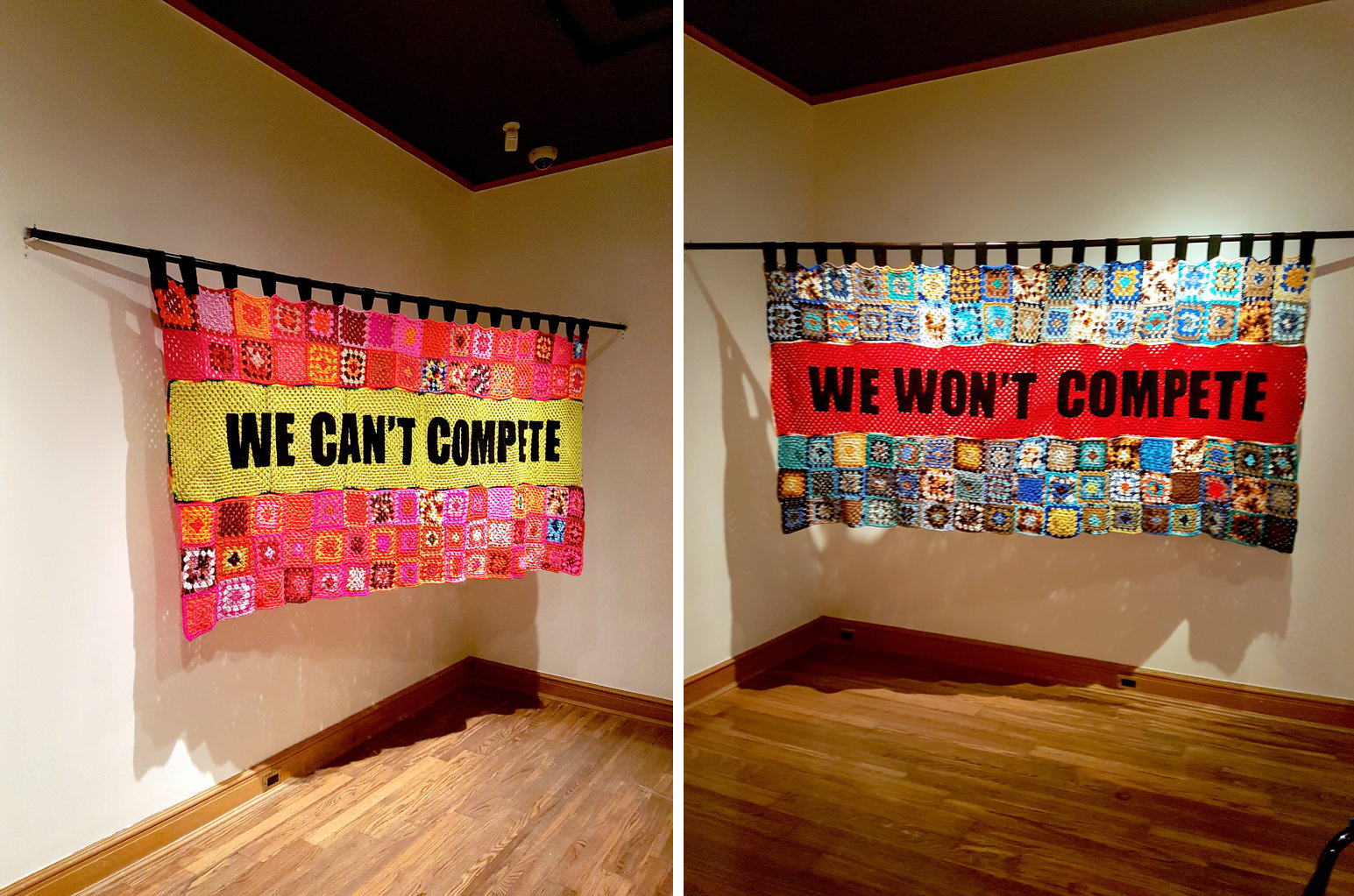
    Deirdre Logue and Allyson Mitchell, CAN’T/WON’T, 2012, crocheted squares

    In his talk, Jacob described this area through the allegorical notion of ‘modelling’. In society there exists a series of models—systems used as an example to follow or imitate. In almost every instance, we either reject them, do not measure up to them, or feel that we are much more than them. This whole room, from Suzy Lake’s A Genuine Simulation of… to Nobuo Kubota’s Reflections I, aims to define an individual sense of self. Suzy Lake, an American-born artist living and working in Toronto, created a series of photographs depicting the artist with varying amounts of makeup on her face. She is recognizable in some photographs while in others the makeup sits on her face like a mask. Lake raises key questions about authenticity, and how conforming to societal ‘models’ can turn you into an artificial version of yourself. Kubota’s work, on the other hand, is a matter-of-fact kind of work. The Canadian artist created a unified mirror that looks like two mirrors intersecting one another. This work, in the centre of the space, ties the artworks together. It is an invitation to look at oneself directly.
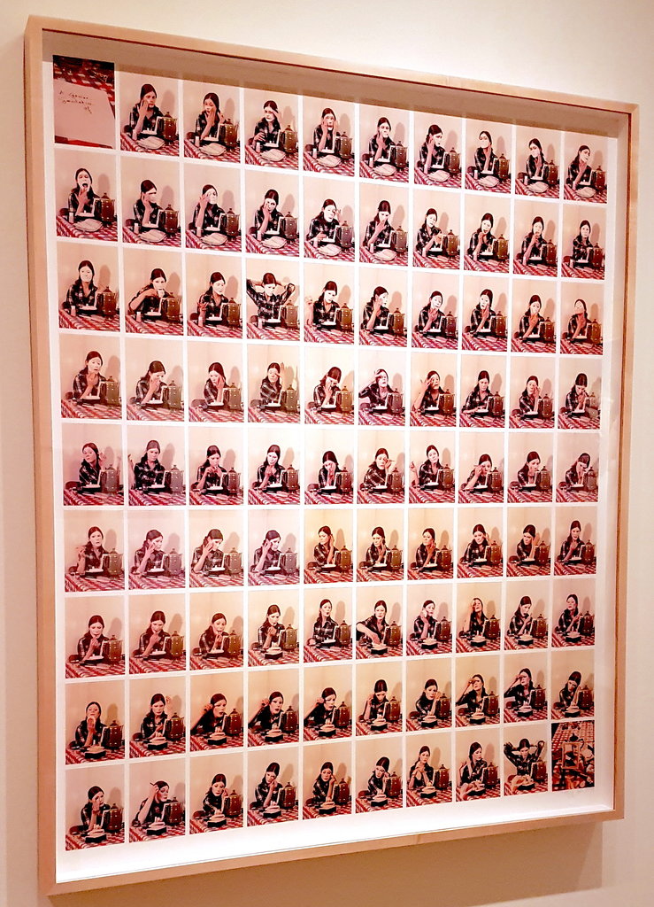
    Suzy Lake, A Genuine Simulation of…, 1973-74, chromogenic prints drymounted
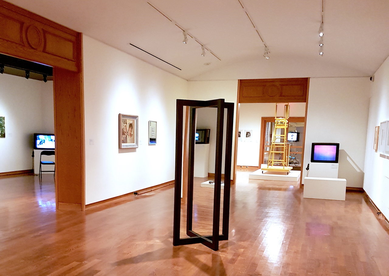
    Nobuo Kubota, Reflections I, 1969, wood and mirror

    Having only spoken about eight works, I could have easily written about every piece in Form Follows Fiction. Other major artists in this exhibition worth noting are Michael Snow, General Idea, Joanne Tod, Joyce Wieland, and many others; all of which are featured in the Art Gallery of Ontario’s Toronto: Tributes and Tributaries, 1971-1989. I initially wanted to review Form Follows Fiction in isolation of the AGO’s showcase, but there were too many comparisons to not give it a passing nod.

    Toronto: Tributes and Tributaries, 1971-1989 brings together more than 100 works by 65 artists and collectives. It explores art in Toronto in the 70s and 80s, a time of economic prosperity as well as social and political upheaval. The AGO structured the exhibition as you would expect; the text panels and thematic organization were definitive of an institutional exhibition. The sections dealt broadly with ‘Performance’, ‘Self/Portrait’, ‘The Body’, ‘The Image’, ‘Representation’, etc. Overall, it was a fantastic exhibition. However, its greatest failure was Form Follows Fiction greatest success: it simplified a vast body of work into neat categories.

    In Form Follows Fiction, every work deserved the time spent, which perhaps amounted to the exhibitions greatest shortcoming. With too many works to provide explanatory texts, and not enough time to appreciate them all, only a proportion of the show could be absorbed by any one visitor.

    Text and photo: Megan Kee

    *Exhibition information: Form Follows Fiction: Art and Artists in Toronto, September 6 – December 10, 2016, Justina M. Barnicke Gallery and University of Toronto Art Centre, under its new name: Art Museum University of Toronto, 7 Hart House Circle and 15 King’s College Circle, Toronto. Gallery hours: Tue & Thu – Sat 12 – 5 pm, Wed 12- 8 pm.

  • Jim Reid: Field of Vision at Lonsdale Gallery

    Interview with Jim Reid (JR) by Nika Teper (NT)

    Jim Reid’s chaotic brush strokes enable atmospheric renderings that are especially provocative when slowly approached from a distance. His representations aim to convey the tensions of space in time. The contentious theme of land use becomes a conversation about conservation and development. To communicate the interaction of natural and human histories, he employs the method of onsite work derived from late 19th/early 20th century Plein Air painting. Peel Plain Farms, a locale northwest of Toronto, is a historic agricultural area facing development. This series presents the transience of nature, the uncontrollability of space; nature’s fragility and resilience, order and chaos. Up close his work appears to be energetic, chaotic, magnetic brushstrokes that interact and exchange. From afar his work becomes cohesive representations that recede in space.

    Jim Reid, Peel Plain 7-4-16: north from King Street west of Sloan Road, 2016, acrylic on canvas, 76″ x 114″

    NT: How does changing atmosphere and weather influence your work? Can you expand upon your process of Plein Air painting? Are the artworks in their entirety completed in the outdoors? How does this method influence the outcome?

    JR: For centuries, Western culture and science have sought to demystify and control nature. Today, no corner of the earth is unaltered by technology, yet nature remains beyond our control, infinitely complex and enigmatic. The fragility and resilience of nature, its order and chaos fascinate me. As a plein-air painter, I seek a complete involvement with the site. Working outdoors on the land, I am immersed in the vagaries of wind, rain, snow and sun. Depending on the site, I may also be buffeted by passing transport trucks or tormented by black flies. Plein-air painters believe that these various sensations of experience can be translated through paint. Many of my paintings are small-scale studies, which are easily transported and depict the landscape with immediacy. I also work on a monumental scale, which presents different challenges. Earlier work from my “Terraforms” series was based on fibreglass casts of the forest floor or Canadian Shield granite. These panels could be constructed on-site and left outside for many months during the process of work. Paintings from the “Forest” series were painted within hiking-distance of my studio, and plywood panels or stretched canvases were portaged to the sites and remained there during the painting process. The “Peel Plain” sites are more public, on roadsides or the edges of fields, and so must be more mobile. I may carry sectional panels tied to the roof of my car, or just unroll a large canvas directly onto the ground.

    2016, site #1, Peel Plain

    NT: Your work is rooted in real landscapes. Do you aim to convey a layered composition of different moments in time simultaneously? How long does it take to complete a piece?

    JR: The large paintings may take many months to complete. I often have several works in progress, and may move them to different sites during their development. The final stages of work are completed on a single site and day, and the works are titled by their completion date and location. The completed work is layered with place and time, be that from dusk until darkness, or through seasons. I use watercolour or acrylic paint, both of which are affected by temperature and humidity. Random “paint events” are allowed to occur, influenced by both the climate and the nature of the materials.

    NT: Your work thematically deals with the collision of nature and mankind and the result reveals many dichotomies. What is your personal opinion about urban expansion and humans’ lack of knowledge about nature?

    JR: On a trip to the south of France a few years ago I was struck by the respect shown to the history of landuse. Ancient towns were continuing to expand, but within boundaries and with architectural consistency. The agricultural land between them remained intact, revealing topography dating back to the Middle Ages. In North America we have held to an expansionist mentality, and we are spiritually poorer because of that.

    Jim Reid, Peel Plain 3-7-16, 2016, acrylic on canvas, 72″ x 108″

    NT: Will your future work also deal with the consequences of urban expansion?

    JR: The work is part of an ongoing observation of the Peel Plain. The Peel Plain is a historic agricultural area north-west of Toronto, defined by Brampton to the south and the Niagara Escarpment to the north. It’s farms reveal a time-layered working of the land, many going back 5 generations. Small sections of woodland date back to the pre-colonial era, when the land was part of the Mississauga First Nation. I have a long familiarity with the area, having frequently travelled through it since the 1960’s. My present studio is just north of the Peel Plain. From 1999 to 2002, at a time when I was working in Toronto and making a daily commute from rural Caledon to the GO station in Brampton, I created a photographic archive of over 2,000 images of the Peel Plain. These were panoramic photos taken from a moving car using a low-tech camera. They documented the transition from rural to suburban land-use at a time when the recent expansion of Brampton was just beginning. A selection from the series, titled “Marginal Lands” was shown at Lonsdale Gallery, and is now in the collection of the Peel Art Gallery. The work in “Field of Vision” revisits many of the sites photographed in “Marginal Lands”. Many other sites have since been built-over. I plan to continue painting and drawing in the Peel Plain in the years to come.

    *Exhibition information: August 24 – October 7, 2016, Lonsdale Gallery, 410 Spadina Road, Toronto. Gallery hours: Wed – Sun, 11 – 5 pm.

  • Mary Catherine Newcomb and Maria Gabankova at loop

    Two artists exhibit their solo shows in the simple and neat Loop Gallery. Mary Catherine Newcomb and Maria Gabankova are both art professors as well as veteran artists. The space is more or less divided into two, the front space displaying Newcomb’s works, and the back Gabankova’s.

    Newcomb’s works are entirely sculptural, utilizing animal remains as well as the edible parts, pondering the identity and belonging of animals that exist both as domesticated and in the wild: frogs, hares, cows, and bees. Two tables greet the visitors: one with cattle bones painted with decorative blue paint, and the other with clay toads, jars, a pot, and dirty paintbrushes. The curation proves to be quite effective here. On the wall are bees pinned in a circular pattern, leading the eye to the work around the corner: a hare skeleton positioned on a glossy black surface. The cattle bones have decorative patterns similar to that of heirloom china one might see displayed in a cabinet. Icons like home, portraits, flora, fauna are painted on the bones. These two tables exist in opposition to each other. Whereas one is organized and neat, displayed on a clean white table, the other is unruly, disorganized, messy, and dirty on an unfinished wooden table.

    Mary Catherine Newcomb, Miss Real Silver, detail, watercolour on cattle bones, dimensions variable

    The dirty table looks like the work table for all of Newcomb’s works in the show. It has the jar of honey and honeycomb for the bees, blue paint for the bones, and clay remains for the frogs. The pot on the table is definitely one of the more interesting thing here, filled with congealed wax, leftover clay, with metal and wire sticking out of it, that produce a fascinating abstracted visual.

    Mary Catherine Newcomb, Augury 1, Plasticine, dried currants, and honeycomb, dimensions variable

    Furthermore, her exhibition as a whole has a fascinating visual to it. The hare skeleton arranged with edible ‘organs’ made of Plasticine, dried currants, and honeycomb.

    Mary Catherine Newcomb, Augury  2, detail, Plasticine, dried currants, and honeycomb, dimensions variable

    Mary Catherine Newcomb, Augury  2, mixed media, dimensions variable

    Past the hare is the beginning of Gabankova’s exhibit. Two large building facades, portrait paintings, as well as sketches of faces adorn the walls. While Gabankova has certainly proved her skills in rendering a face with paint, her pencil/charcoal sketches are where the power really is. In one of the Residents section, four works are hung, two paintings on top and two sketches on the bottom. On the paintings the faces are effectively painted, but their rough sketches grab our attention immediately. The sketches are fast, rough, gestural, and powerful. They focus on the face and the expression; the ‘essence of the moment’.

    Maria Gabankova, House without Home I, charcoal and encaustic on paper, 64″ x 57″.

    The overall theme of the show is fairly clear. These dissidents have been displaced from their home, just like the nursing home residents. However, while the residents are portrayed in their moment of action, either walking or being fed; the dissidents are grouped together in an incongruent manner. Certainly paintings by no means require a ‘finished look’, and they do not have to be painted with the same style or colours. In this show each painting is different. One is half finished with conte, one is a black and white face overlaid with bright rainbow-like colours, one is a traditional portraiture with a splash of glossy black around the face, and one is an off-green portrait that shares none of the same palette with the rest. They are not connected in any other way than the theme of the show, depicting people who are displaced and removed from their original place. 

    Maria Gabankova, Dissidents, 2016, acrylic on canvas

    Maria Gabankova, Resident feeding, 2016, acrylic on canvas, 20″ x 30″

    In the corner of the space there is a little sketch of two people walking away accompanied with a quote from Vincent van Gogh about a heavenly journey. This dialectical presentation, along with the quick but powerful sketch, remained most in my head afterwards.

    Maria Gabankova, Coming home, pencil on paper, 10″ x 8″

    Text and photo: Sunny Kim

    *Exhibition information: Mary Catherine Newcomb, Augury & Maria Gabankova, Home / Residents & Dissidents, June 18 – July 10, 2016, loop Gallery, 1273 Dundas Street West, Toronto, (three doors west of Dovercourt). Gallery hours: Wed – Sat 12 – 5, Sun 1 – 4 p.m.

  • unheimlich / upcoming surrealist artists show

    unheimlich / upcoming surrealist artists show

    Sigmund Freud described the uncanny or unheimlich as, something that is familiar to us in some ways, but it is also strange and unknown. Our gallery exhibition is being hosted in an uncommon space (a student townhouse) and will capture some of what Freud was talking about in “The Uncanny”. The exhibition will display a diverse selection of art created in different mediums, including painting, print, and sculpture.

    The collection features these up and coming surrealist artists:

    Alex Pereira
    Else Holler
    John Campbell
    Kaylin Andersen
    Mike Webber
    Rebeca D’Alessandro
    Sarah Brittany Lowe
    Shelby Hackshaw

    Curated by Kaylin Andersen
    Assistant Curator, Sarah Brittany Lowe

    *Exhibition information: April 29 – May 6, 2016, 3061 Sir John’s Homestead, Unit 46, Mississauga. Gallery hours: Mon – Sat: 12 – 5 pm.  $2.00 Admission
  • Kristopher Karklin at Barbara Edwards Contemporary

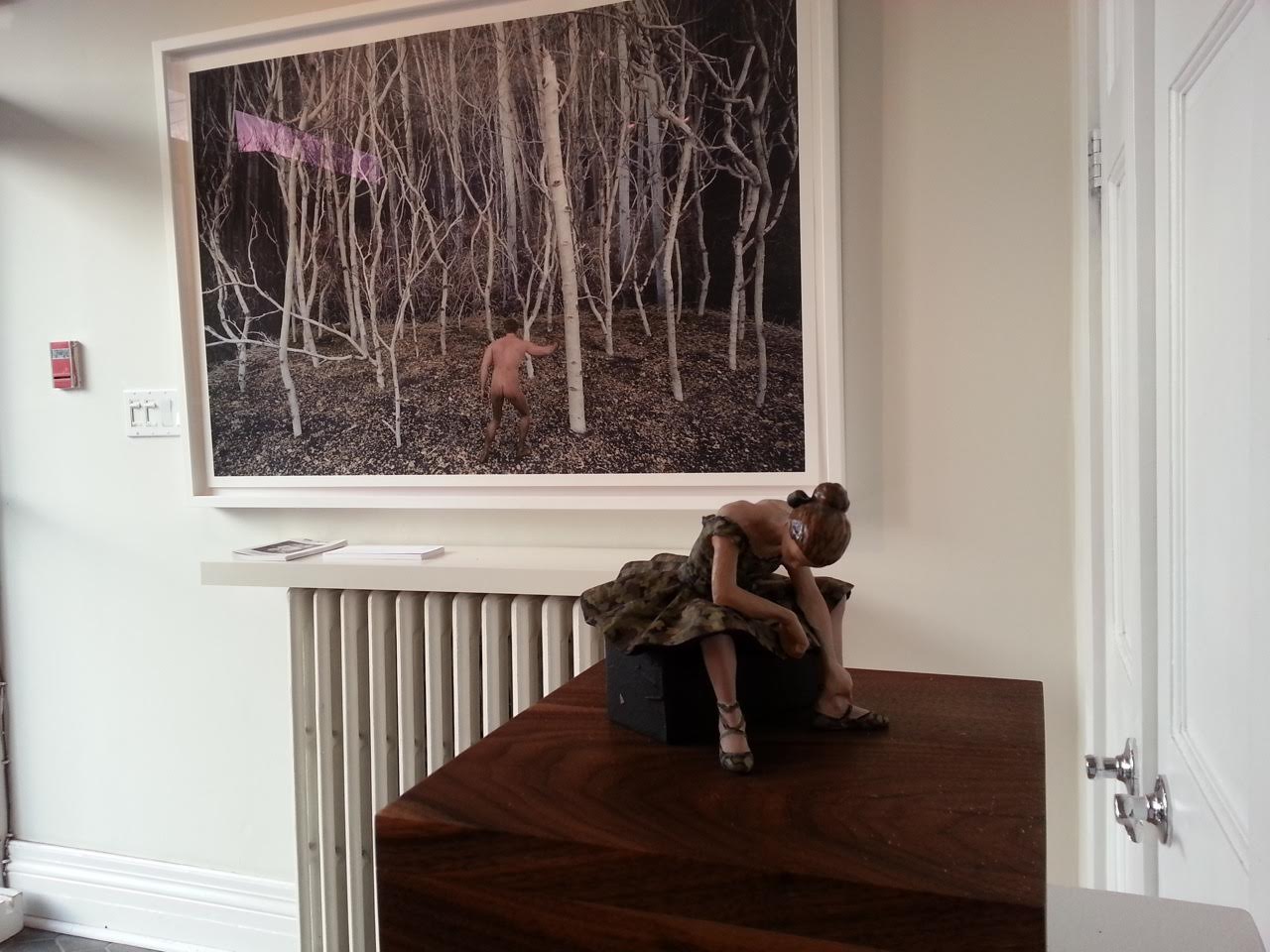
    For those who have yet to see the work of Alberta-based photographer Kristopher Karklin, you may want to pay attention. On the vast spectrum of emerging-to-mid-career artists on the Canadian contemporary scene, he is most certainly one to watch. His most recent work, the subject of a solo exhibition currently on display at Barbara Edwards Contemporary, has not only generated a considerable amount of buzz, but has also piqued the interest of a number of high profile collectors, both individual and institutional. And for good reason. His newest series, a combination of photography and sculpture, strikes with uncanny accuracy not only at the northern Alberta landscape by which it was inspired, but also at many of the confining and alienating elements of contemporary rural and suburban life.

    Installation view. Photo courtesy of Barbara Edwards Contemporary

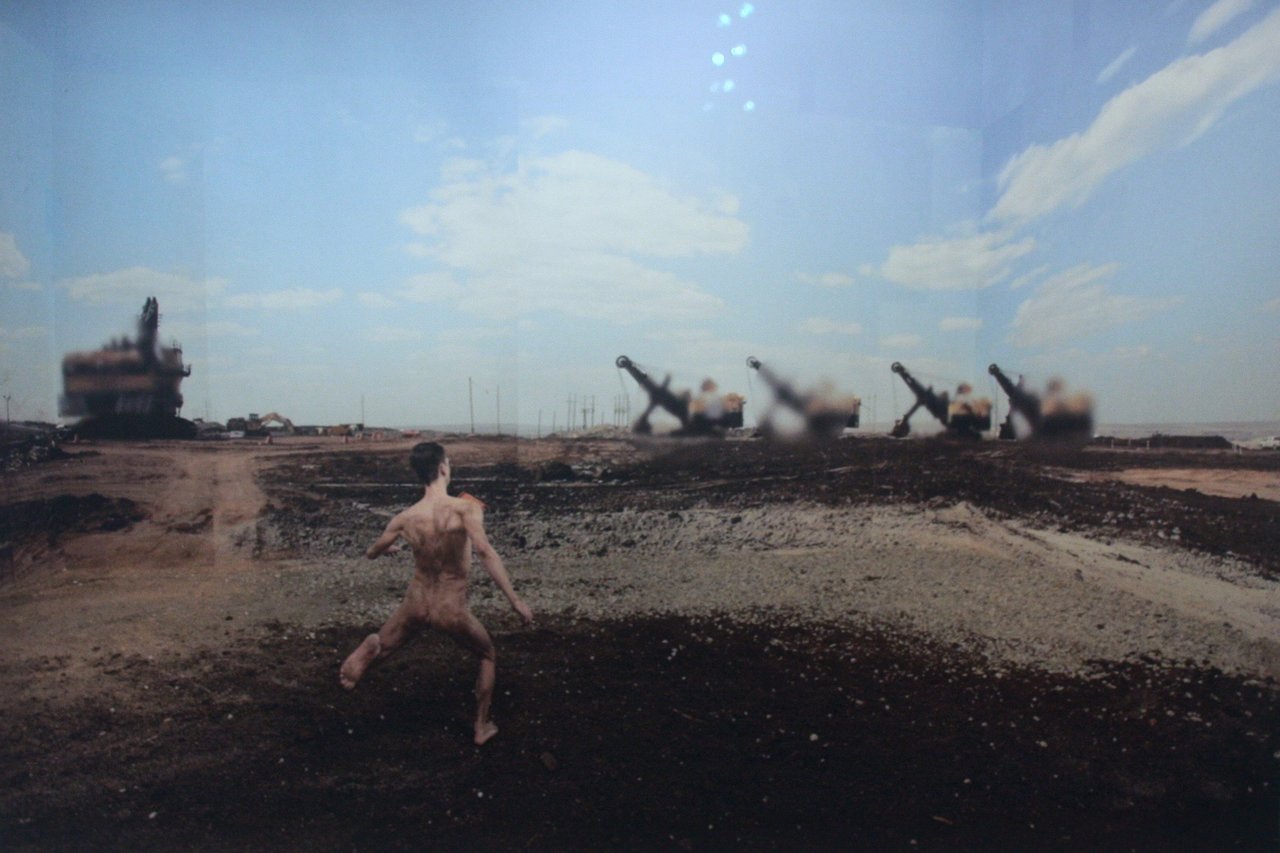
    When, years ago, Karklin began working in Fort McMurray, Alberta – a community now infamously known for its connection to the oil sands — he had no specific intention to create art from his experience. Yet, as he described in a recent interview, he was immediately captivated by what he saw there and simply started taking photographs. “It was like being on the moon or in the middle of the Arctic,” Karklin recollects. The experience was, for him, powerfully surreal. It is a feeling Karklin is remarkably effective at capturing. Building on his previous work, this newest series consists of figures set in strangely pristine, manufactured settings — an aesthetic result of an uncommon and very labour-intensive process. Like Berlin-based artist Thomas Demand, Karklin first creates his landscapes from meticulously constructed scale models — not unlike theatre or architectural maquettes — which he then photographs. Yet, in a departure from Demand, whose images tend to be uninhabited, Karklin also photographs human figures and transposes these into his scenes. The result is a thrillingly disjointed meeting of human and environment, set among layers of photographic and sculptural mediation. 

    Kristopher Karklin, Runner, 2015, inkjet print, edition of 7, 36″ x 54 “. Photo: Catherine MacArthur Falls

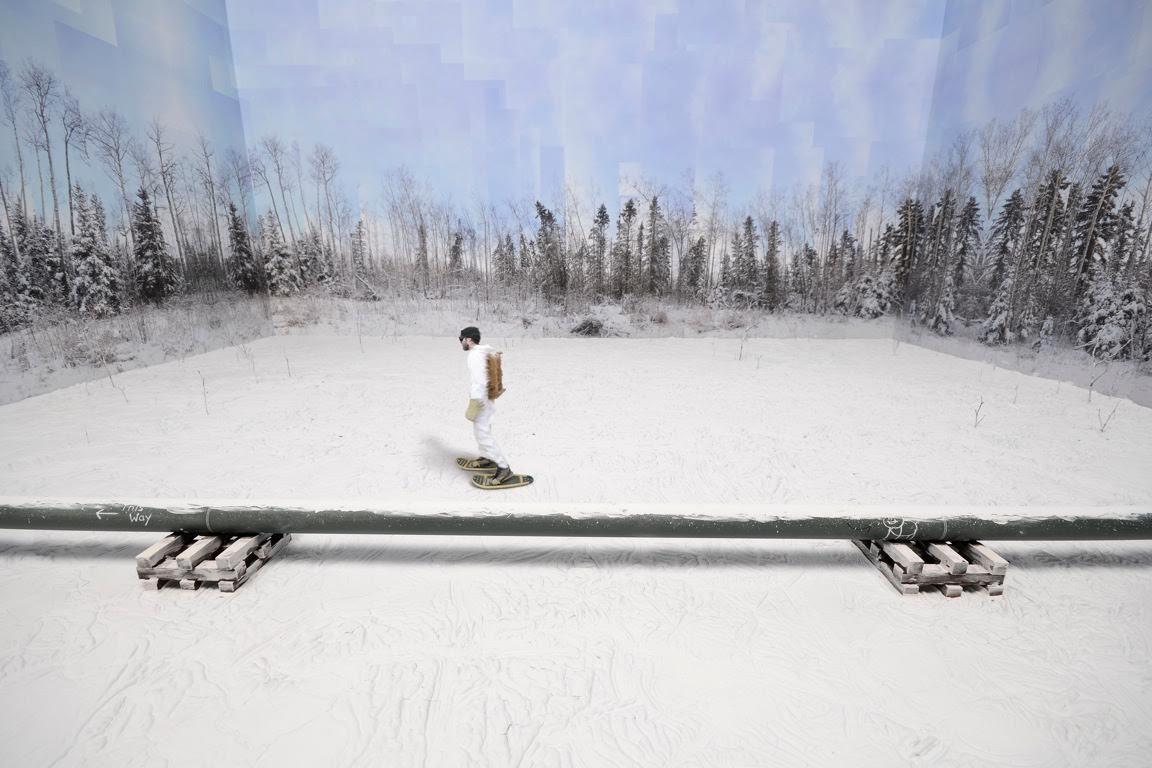
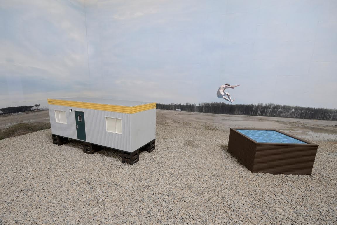
    This mediating effect stems in part from Karklin’s use of photocollage. The backdrops of sky, forest, and field we see in his images are Karklin’s original snapshots of the landscape, which he has pasted like wallpaper to the inside of his scale models and then re-photographed as part of the whole scene. The works are thus not only photographs of built environments, but also photographs of photographs. As the viewer, our distance from the ‘real’ landscape — the landscape that is up there, in northern Alberta, right now — is very far indeed. This distanciation mirrors that of the figures, who are separated from their environment in a number of ways. The most obvious of these, of course, is that the figures represent real people, while the environments are fake on almost every level. But there is also separation by process. Photographed independently, the figures and their environments never inhabit the same space or moment in time — wherever and whenever that might be — until Karklin artificially stitches them together. The snowshoer in “Pipeline” never actually snowshoed past the pipeline; the runner in “Runner” never really ran through the industrial site. The place and time captured in the image never existed. It is a disjuncture that reveals itself in the uneasy, often incongruous, positioning of each figure within his space. The awkward gait of the runner, for instance. The implausible physics of the jumper in “Reclaimed Tub”. The asynchronicity of the snowshoer, whose blurred edges suggest movement, but whose posture is rather still, wooden. It all adds up to a very clear sense of alienation between the figures and their environment, one that Karklin says was a palpable component of his experience in northern Alberta. 

    Kristopher Karklin, Pipeline, 2015, inkjet print, edition of 7, 36″ x 54″. Photo courtesy of Barbara Edwards Contemporary

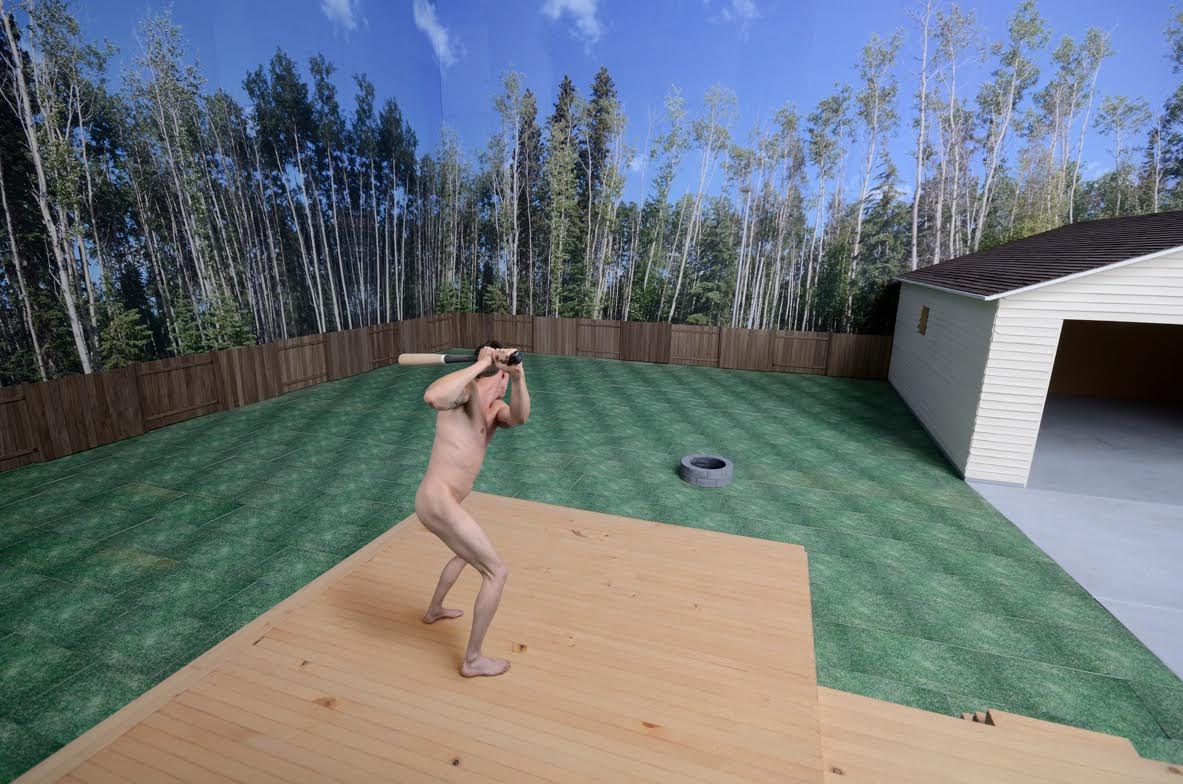
    It is an effect that is somewhat complicated by Karklin’s enclosure of his environments within the interior space of the model. This seemingly small move to bring the outdoors in constitutes a shift from his previous work, which involved maquettes of solely interior spaces. Of his new work, Karklin recalls that, while working in Alberta, he spent much of his time outdoors. The result was that the landscape became more his home than any indoor space. The series, he claims, is an attempt to capture this feeling. Yet, the work also creates a startling sense of un-hominess. By bringing the outside in, Karklin curtails an Alberta landscape known for its expansiveness, rendering it finite, enclosing. This has a surprising effect: the figures are distant from, yet confined by, their surroundings. Far from appearing at home, they seem trapped, in a way, by their rural or suburban environments. It is, perhaps, a feeling many rural, small town and suburban dwellers can relate to. Having myself grown up in suburban Alberta, I can say with certainty that it is a sense I am deeply familiar with.

    Kristopher Karklin, Backyard (Daytime), 2014, inkjet print, edition of 7, 36″ x 54″. Photo courtesy of Barbara Edwards Contemporary

    Karklin at least partially exposes the interiority of his outdoor spaces by allowing signs of his work’s construction to remain visible. A sky will have clearly discernable corners, for example; a forest will have conspicuous seams. Shadows will appear where none should be. It is a display of artifice that also manifests in the materials and textures used—in the hard, plaster-like snow in “Pipeline”, the flat graphic water surface in “Reclaimed Tub”, or the tiled grass in “Backyard (Daytime)”. As Karklin explains, he uses such techniques to emphasize the fakeness of the environment, to bring the landscape into focus, to preclude it from blending into the background. Such details force us to consider the landscape and its relationship to its inhabitants. And, while these details are allowed to show through, many others are conspicuously erased. In all but one photo, for instance, the figures are photographed nude. Karklin thus strips them of much of the information that differentiates one individual from another. The landscape is similarly stripped. In Karklin’s backyard scenes, no toys or lawn equipment are left on the grass, no pots of flowers beautify wooden decks, no Christmas decorations, tools, or sporting goods wait patiently in the garage. There is no sense that anyone really lives in these spaces at all. These are places, persons, and lives that are eerily generic, replicable.

    Kristopher Karklin, Reclaimed Tub, 2014, inkjet print, edition of 7, 36″ x 54″. Photo courtesy of Barbara Edwards Contemporary

    The series is, all in all, full of tensions and provoking contradictions, not unlike the real landscape that inspired it. And though it is hard not to read Karklin’s work as a critique — particularly of a place that continues to receive so much negative attention — he is careful to note that he did not set out to produce political art. He was, rather, simply attempting to document the often-surreal place in which he was living, in all of its ambiguities. In this and many other respects, the work is spectacularly successful. But don’t take my word for it. Even this early in his career, Karklin’s sales history speaks for itself. Many of his pieces currently reside in the collection of Sir Elton John, for instance. Meanwhile, the entire set currently on display at BEC has been purchased by a major yet-to-be-announced Canadian museum. This means — fingers crossed — that it would be available for public viewing for many years to come. We should be so lucky.
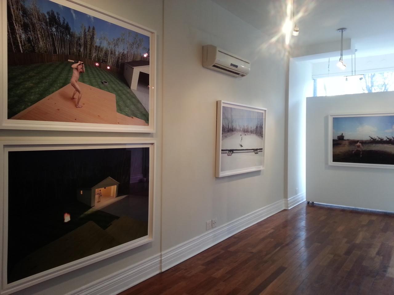
    Installation view with Kristopher Karklin, Hunter, 2015, inkjet print, edition of 7, 36″ x 54″. Photo courtesy of Barbara Edwards Contemporary

    Catherine MacArthur Falls

    *Exhibition information: November 20, 2015 – January 9, 2016, Barbara Edwards Contemporary, 1069 Bathurst Street, Toronto. Gallery hours: Tue to Sat, 11 am – 6 pm (or by appointment).


  • Art Battle / January 2015

    Art Battle / January 2015

    Toronto’s first Art Battle of 2015 saw over 400 keyed-up art lovers packed into the historic Great Hall on Queen Street West for January 20th, a Tuesday night of competitive live painting. The monthly Art Battle event features sixteen artists; fourteen are selected prior to the event while the remaining two are pulled from the night’s audience as “wild cards”. Each artist is given brushes, acrylic paint, a blank canvas, and just 20 minutes to create the painting worthy of a win. The Art Battle competition begins with two groups of 8 artists. The artists have one round of painting to prove that their talent deserves a place in the final round. The audience decides which two artists from each group will paint on in the final round by placing electronic votes through their smartphones. The top 4 artists compete in the final round which determines the champion for the evening.

    Olga Kirnos of group one

    Ford Medina of group one

    Plucking at the audience’s heartstrings is the key to success in this competition; spectators’ electronically casted votes determine which painter will take home the win. Artists paint to secure themselves a cash prize and a spot in the Toronto city-wide finals to be held this summer. This month’s voting produced a tie in the final round; artists Mark Liam Smith and Vick Niresh shared the glory.

    The painting that won Mark Liam Smith his spot in the final round of four painters

    The audience selected this piece, by Vik Naresh, as a favourite during the final round. Naresh tied with Mark Liam Smith as Art Battle champions of the night

    Watching Art Battle unfold from the wings is exhilarating; deep house pulses as the crowd forms a slow-moving tornado of anticipation that circles the platform elevating the artists and their canvases. There are as many smartphones out and recording as at any concert you have ever been to. Necks are craned, laughter is loud, drinks are shared, and camera flashes abound- all while the timer counts down. This is certainly not your average studio experience.

    The painters of group two

    At some point, everyone at an Art Battle competition wonders what it is like to be up there on that platform with that blank canvas. With this curiosity in mind, I (E.K) introduce top finalist, Mike Rachlis (M.R). Rachlis is a Toronto based oil painter, OCAD graduate, and first time Art Battle competitor. His gestural paintings won my admiration.

    E.K: What did you do to prepare for Art Battle prior to the competition?

    M.R: I prepared for only one round not expecting to win.  I did some sketches in charcoal and paint to try to establish an idea of a composition based on photos I had taken of myself.  I had this fear of getting up there and not having any idea what to paint. The second round was on the spot. After having made a composition on the fly, if I were to do Art Battle again, I wouldn’t prepare beforehand.

    E.K: What are you feeling/thinking/doing in the 5-10 minutes before the competition begins?

    M.R: I was unbelievably nervous before, so I was just trying to stay calm and create some sort of a plan for how to start the painting.  I spent the five minutes beforehand with my girlfriend trying not to over think everything and just relax so that my hand would stop shaking and I could paint.

    Mike Rachlis’ efforts during the first round.

    E.K: In Art Battle, you have only 20 minutes to complete a painting amid a large crowd. How did your artistic process differ during Art Battle versus in your studio?

    M.R: The largest difference is that painting in the studio is a triathlon of painting, looking, and thinking, while Art Battle is an all-out sprint to get the painting done as quickly as possible.  In twenty minutes you barely have any time to even think.  I ended up going into a state that is easiest to describe as auto pilot; it’s like trying to get your hand to connect straight to your brain. You don’t have to make a decision about how the painting is going and then continue to paint; it just has to happen right as you think it.  When I work in the studio, I’ll paint frantically and then take just as long to sit back and look and think about where the piece is going.  In Art Battle, this is not an option.  I also work exclusively in oil paint so the switch to acrylic was noticeable. But that was a quick adjustment. 

    E.K: How did the audience’s presence affect you?

    M.R: I hate painting in front of people, so to have 400 people walking around and staring at me was nerve-wracking to say the least.  It actually made me focus on my painting because I didn’t want to stop at any point to take notice of the crowd.  

    E.K:  You had your ear buds in during painting. What were you listening to?

    M.R: I have pretty eclectic music taste. I made a really random playlist for Art Battle.  It was mostly really energetic music ranging from punk stuff (Dead Kennedys, Bloodhouse) to southern rap (Young Jeezy) and some 90’s drum and bass.  I was just looking for loud and fast.  

    Text and photo: Emily Kovacs

  • Propeller Gallery Gala Launch

    The new Propeller Gallery at 30 Abell Street

    Gallery Gala Launch: Saturday, January 17, 2015 / 6 – 10 p.m.

    With a new space to reveal, Propeller Gallery had quite an evening to celebrate on the January 17, 2015. The sounds of live jazz from saxophonist Bill Prouton, guitarist Henrique Matulis and a chattering crowd filled the two-room gallery at 30 Abell Street.

    Live jazz from saxophonist Bill Prouton and the guitarist Henrique Matulis

    Gallery view with its two rooms

    Chosen works from several of the gallery’s artists decorated the event; colorful paintings, photographs, drawings, and even some sculpture complimented the cheery evening. It is evident that Propeller’s new space provides a greater sense of agency to the works, giving them opportunity to interact with the viewer. Propeller artist Heather Gentleman described the new space as “organic” providing guests with a greater sense of flow. I think that was distinct in the space’s design. Guests circulated between the two rooms with ease. Joseph Muscat, Propeller’s Chair, was excited about the new space and the prospective of a lot of future success at the Artscape Loft location.

    Guest with Sharron Forrest, ” Leaves Light and Shadow” (left) and Tatjana Hutinec “Renaissance Woman” (right)

    Propeller artists Heather Gentleman and Philip Hare with Gentlemen’s work “Innana” (on left)

    Propeller Chair, artist, Joseph Muscat

    Installation view

    Guest looking at Anthony Saad’s “Aurora Megalopolis

    The gallery is soon hosting their annual “Black and White Ball V” on January 29th, an event coordinated by Gentleman, who seemed excited for the event’s success in the new space. With many new faces and a great turnout from the Opening Gala, future events at Propeller should be a great success. It is with great excitement that I look forward to future shows at Propeller!

    Text and photo: Brinae Bain

    *Exhibition information: January 15 – 25, 2015, 30 Abell Street, Toronto. Gallery hours: Wed – Sat: 12 – 6, Sun: 12 – 5 p.m.

  • Politics of Fashion | Fashion of Politics

    Politics of Fashion | Fashion of Politicsat the Design Exchange is an obvious treat for fashion lovers, the show also offers a great deal for art lovers too to mull over.

    Installation view.

    Guest curated by the legendary Canadian fashion generalist, Jeanne Beker, and DX curator Sara Nickleson, Politics of Fashion | Fashion of Politics examines the increasingly communicative role of fashion in a modern society where politics, art and fashion interact with fervour. The curatorial statement emphasises fashion as a vehicle for social change, a platform for ideological assertions, and the act of dressing as a means for the expression of communal values. Fashion’s evolving treatment of themes including consumerism, activism, gender, sexuality, ethics, and power are documented here in this show.

    Moschino, “McDonalds Dress, 2014”.  From the collection of Moschino.

    There is feminist art from FEMEN Quebec, Nick Knight addresses race on the runways in a short fashion film, and the English Mod and Skinhead subcultures are examined. Hybrid pieces from Rad Hourani’s gender neutral line sheds gendered clothing traditions with designs rich in geometric shapes, solid colors, and strong, clear lines. Samples from Vivienne Westwood’s post-apocalyptic collection predict fashion in a future where climate change and environmental degradation continues. Outfits feature gasmasks, bleak colours, repurposed material and scraps, army surplus, and unfinished and jagged hems.

    FEMEN, “Crown”, 2013. FEMEN Quebec. From the collection of FEMEN Quebec.

    Rad Hourani, “Looks from Collection #12”. From the collection of Rad Hourani.

    Vivienne Westwood, “Climate Revolution Cape”, 2013. . From the collection of Pearl Westwood.

    A highlight was the collection of vintage paper dresses on display. These A-line minis reek of the 1960s; they are boldly patterned or else they are vibrantly coloured in addition to being incredibly short! The dresses feature popular political figures of the era such as Pierre Trudeau and Richard Nixon.

    A product of the media-image loving post-war consumer society of 1960s America, disposable paper dress fashion embodied ideologies of consumption, mass-production, and commercialism. Scott’s “Paper Caper” dress pitch ran: “Won’t last forever…who cares? Wear it for kicks—then give it the air.” Wearers displayed overt support of specific politicians, but more importantly, alliance with popular consumerist ideologies.

    From left to right: Dress 1, 2, 3: Paper dresses created for the Republican Party National Convention. 1968. Printed and bonded cellulose fibre, Dress 4: Paper dress created for the Liberal Party Leadership Convention. 1968. Printed and bonded cellulose fibre. Collection of the Fashion History Museum.

    Like the pop-art that erupted during the same era, these paper dresses were for the masses. They are a form of pop-art in and of themselves, incorporating representational campaign images from the media and functioning as wearable advertisements. These paper dresses mark an overt merger and interaction between popular fashion, art, and politics.

    Text and photo: Emily Kovacs

    *Exhibition information: September 18, 2014 – January 25, 2015, Design Exchange, 234 Bay Street, Toronto. Gallery hours: Mon & Wed-Sun: 11 – 6 p.m., Tue: 11 – 9 p.m.

  • Yangyang Pan: Inside Out

     Rain, I don’t Mind, 2014, acrylic, spray paint, oil on canvas, 36”x 48”. Courtesy of the artist.

    Throw a glance out the window, feel the pull. Eyes seek, settle; mind follows, stays. The border between inner and outer zones fades to a blur. Yangyang Pan has done her job. What has been outside comes in.

    Yangyang Pan situates the onlooker as an integral part of her work, for it is the ability to view the landscape that provides the link between seeing, seen and scene. She makes the connection between human and natural elements, to remind us that the landscape is not alone. Indeed, nor are we – and through artists such as Yangyang, we are made aware of how we are linked intrinsically to the gifts of the natural world.

    Yangyang’s emotional viewfinder and her bold use of colour, stroke and texture allow us to see, somewhat clearly, through a degree of abstraction. Cheeky, she makes sure to leave us at a point where we must make our own way to the end of the journey.

    What is outside is gathered close and absorbed. What is internal to us is set free and reborn in our interpretation. What is inside is out.

    Sabine Modder

    *Exhibition information: YangYang Pan: Inside Out, Nov 6 – 30, 2014, Parts Gallery, 1150 Queen Street East, Toronto. Gallery hours: Wed – Sat 12 – 6, Sun 12 – 5 p.m.