Category: News Archive

  • Post Mythology in Blake Ward’s sculptures

    Post Mythology: A State of Dematerialization

    Bodies in metamorphosis, balanced between Apocalypse and the Postmodern, steeped in a lost classical age, echoed through an ever-evolving Renaissance, in vibrant tension or torsion as they head toward some future Utopia. Undeniably endowed as sculptor and Neoclassicist, with his wandering, ambiguous forms, Blake questions the anthropological concepts of a heart-rending humanity, suspended between past and future.

    Blake Ward, Ushabtis Hetheru, 2015, bronze, H: 31.5″, W: 6.7″, D: 6.3″(left) & Hathor, 2015, bronze, H: 28.7″, W: 3.5″, D: 6.7″. Courtesy of the artist and Articsók Gallery

    Blake’s strongly dynamic bodies – at once powerful and fleeting and gesturing violently, fixed in bronze in a state of dematerialization, somewhere between being and nothingness – appear to seek a dialogue with the absolute. They are inexplicably solid and light, conceived to last in tome and space, destined to become a mythology of our digitalized, computerized present, and have a great emotional and visual impact. Blake places the human (and especially female) body at the center of what he is seeking, with its expressive, metaphorical potential as a subject of investigation and contemplation of the human condition, using sculpture to give plastic form to our otherwise imperceptible inner realm, in a potent almost Michaelangelesque physical presence.

    Blake Ward, Angel Angthal (Angel of peace), 2014, bronze, detail. Courtesy of the artist and Articsók Gallery

    Calmly, these bodies ooze with anxiety, and seem to express a dialogue between skin and flesh, spirit and matter, in a coupling of physical and spiritual entities: recognition of interior and exterior to be seen and touched, seductive and irremediably tragic in the celebration of the power of the body. They are goddesses and heroes, myths about everything or nothing – bodies that symbolize the loss of the transcendent from its perfect imperfection.

    Blake Ward, Ushabti Renenet, 2015, bronze, H: 32.7″, W: 8.7″, D: 9.8″ &  Ushabti Heqet, 2015, bronze, H: 33.1″, W: 6.7″, D: 8.7″. Courtesy of the artist and Articsók Gallery

    Jacqueline Ceresoli

    *Exhibition information: Blake Ward: Depth of Perception, August 27 – September 19, 2015, Opening Reception: Thursday, Augustus 27, 2015 / 6-9 p.m., Articsók Gallery, 1697 St. Clair Avenue West, Toronto. Gallery hours: Wed – Sat, 12 – 6 p.m.

  • Art Battle / January 2015

    Art Battle / January 2015

    Toronto’s first Art Battle of 2015 saw over 400 keyed-up art lovers packed into the historic Great Hall on Queen Street West for January 20th, a Tuesday night of competitive live painting. The monthly Art Battle event features sixteen artists; fourteen are selected prior to the event while the remaining two are pulled from the night’s audience as “wild cards”. Each artist is given brushes, acrylic paint, a blank canvas, and just 20 minutes to create the painting worthy of a win. The Art Battle competition begins with two groups of 8 artists. The artists have one round of painting to prove that their talent deserves a place in the final round. The audience decides which two artists from each group will paint on in the final round by placing electronic votes through their smartphones. The top 4 artists compete in the final round which determines the champion for the evening.

    Olga Kirnos of group one

    Ford Medina of group one

    Plucking at the audience’s heartstrings is the key to success in this competition; spectators’ electronically casted votes determine which painter will take home the win. Artists paint to secure themselves a cash prize and a spot in the Toronto city-wide finals to be held this summer. This month’s voting produced a tie in the final round; artists Mark Liam Smith and Vick Niresh shared the glory.

    The painting that won Mark Liam Smith his spot in the final round of four painters

    The audience selected this piece, by Vik Naresh, as a favourite during the final round. Naresh tied with Mark Liam Smith as Art Battle champions of the night

    Watching Art Battle unfold from the wings is exhilarating; deep house pulses as the crowd forms a slow-moving tornado of anticipation that circles the platform elevating the artists and their canvases. There are as many smartphones out and recording as at any concert you have ever been to. Necks are craned, laughter is loud, drinks are shared, and camera flashes abound- all while the timer counts down. This is certainly not your average studio experience.

    The painters of group two

    At some point, everyone at an Art Battle competition wonders what it is like to be up there on that platform with that blank canvas. With this curiosity in mind, I (E.K) introduce top finalist, Mike Rachlis (M.R). Rachlis is a Toronto based oil painter, OCAD graduate, and first time Art Battle competitor. His gestural paintings won my admiration.

    E.K: What did you do to prepare for Art Battle prior to the competition?

    M.R: I prepared for only one round not expecting to win.  I did some sketches in charcoal and paint to try to establish an idea of a composition based on photos I had taken of myself.  I had this fear of getting up there and not having any idea what to paint. The second round was on the spot. After having made a composition on the fly, if I were to do Art Battle again, I wouldn’t prepare beforehand.

    E.K: What are you feeling/thinking/doing in the 5-10 minutes before the competition begins?

    M.R: I was unbelievably nervous before, so I was just trying to stay calm and create some sort of a plan for how to start the painting.  I spent the five minutes beforehand with my girlfriend trying not to over think everything and just relax so that my hand would stop shaking and I could paint.

    Mike Rachlis’ efforts during the first round.

    E.K: In Art Battle, you have only 20 minutes to complete a painting amid a large crowd. How did your artistic process differ during Art Battle versus in your studio?

    M.R: The largest difference is that painting in the studio is a triathlon of painting, looking, and thinking, while Art Battle is an all-out sprint to get the painting done as quickly as possible.  In twenty minutes you barely have any time to even think.  I ended up going into a state that is easiest to describe as auto pilot; it’s like trying to get your hand to connect straight to your brain. You don’t have to make a decision about how the painting is going and then continue to paint; it just has to happen right as you think it.  When I work in the studio, I’ll paint frantically and then take just as long to sit back and look and think about where the piece is going.  In Art Battle, this is not an option.  I also work exclusively in oil paint so the switch to acrylic was noticeable. But that was a quick adjustment. 

    E.K: How did the audience’s presence affect you?

    M.R: I hate painting in front of people, so to have 400 people walking around and staring at me was nerve-wracking to say the least.  It actually made me focus on my painting because I didn’t want to stop at any point to take notice of the crowd.  

    E.K:  You had your ear buds in during painting. What were you listening to?

    M.R: I have pretty eclectic music taste. I made a really random playlist for Art Battle.  It was mostly really energetic music ranging from punk stuff (Dead Kennedys, Bloodhouse) to southern rap (Young Jeezy) and some 90’s drum and bass.  I was just looking for loud and fast.  

    Text and photo: Emily Kovacs

  • Susana Reisman: Rough–cut slab

    6”×1”×36” Rough-cut slab, 28 × 20 inch archival pigment print, 2013

    The theme of ‘wood culture’ and a rather multifarious display of their functions circulate in Susana Reisman’s photographic exhibition, Standardizing Nature: Trees, Wood, Lumber.  The eclectic photo series display through the transition of tree to lumber, an order by which nature is transformed to the composite wood. The wood in some of the photographs is neither standardized nor naturalized, but a peculiar representation of the idea.

    The surface of the rugged slab is partially painted white with an unpainted section in the size and form of a standardized lumber. This piece of wood leans against a backdrop of a white wall, which visually emphasizes on the unpainted surface of what it looks to be a common piece of lumber. Reisman standardizes the wood by de-naturalizing its visual form through painting part of it, while not painting the rest, creating two different shapes in one.

    Although it is a rough slab, the first thing we notice is the unpainted shape of a standardized lumber. Through this piece, Reisman distinctively expresses how we recognize the conventional matter in a material rather than in the natural form.

    Eun Byul Jo

    *Exhibition information: Standardizing Nature: Trees, Wood, Lumber, September 12 – October 18, 2014, Gallery 44 | Centre for Contemporary Photography, 401 Richmond Street West, Toronto. Gallery hours: Tue – Sat 11 – 5 p.m.

  • BMO 1stArt Student Competition Award Ceremony, 2014

    October 1, 2014 / 7 – 9 p.m.
    Museum of Contemporary Canadian Art

    The winners: (left to right – row in the back): Elijah Aitaok (Nunavut), Adrienna Matzeg (Nova Scotia), Amy Wells (Prince Edward Island), Stéphanie Auger (Quebec), Sandra Racine (New Brunswick), Brandon Sieber (Saskatchewan), Samuel De Lange (National winner), Emmanuel Osahor (Alberta), Isaac Thomas (British Columbia); (left to right – front row): Maria Mercer (Newfoundland & Larador), Katerina Maria Mendoza (Manitoba), Lisa-Marie Bissonnette (Ontario), Dawn Cain, Curator, Lucy Koshan (Yukon), Nada Ristich of BMO.

    BMO’s 12th annual 1stArt Student Competition Award took place at the Museum of Contemporary Canadian Art.The evening brought in an excited crowd to watch the presentation of awards to thirteen talented students from various post-secondary institutions.  The competition has grown an incredible amount since its first year in 2003; this year had a record 272 submissions compared to the first year of around 120 submissions. In her presentation of the winners, Curator for the BMO Financial Group, Dawn Cain, perfectly reflects, “Perhaps the only encompassing statement one could say is that they are all ambitious and produce strong works that signify a point of experimentation and departure for each of their majors.” Each piece differs in medium—ranging from photography, painting, screen prints, to three dimension mechanical pieces—but shares the same commanding presence upon the viewer. I can only imagine how difficult it was to select the winners from so many submissions.

    Twelve awards are presented to regional winners and one to an esteemed national winner. This year’s national award went to Samuel de Lange from the University of Guelph with his work entitled PVTREFACTIO VI (Black Sun).

    National winner, Samuel de Lange (University of Guelph) with his mother, in front of his piece, PVTREFACTIO VI (Black Sun)

    The national winner receives $10,000 and the regional winners each receive $5,000 for his or her artwork. The national winner’s work will become part of BMO’s corporate art collection, which includes historical and contemporary Canadian masters such as Kenojuak Ashevak, Emily Carr, Paterson Ewen, Tom Forestall, Marc-Aurèle Fortin, Lawren Harris, Thaddeus Holownia, David Milne, Margaret Priest, Denyse Thomasos, Ian Wallace and others.

    Guests in front of Regional winner, Emmanuel Osahor’s The Conundrum, University of Alberta

    Regional winner, Isaac Thomas (Emily Carr University of Art & Design, British Columbia), Alleyway Landscapes

    Regional winner Elijah Aitaok (Nunavut Arctic College), with his sculpture, Precious Time

    Guests looking at Elijah Aitaok’s Precious Time

    Regional winner, Katrina Marie Mendoza’s installation, University of Manitoba

    Regional winner, Sandra Racíne, Fancy Basket in Green, New Brunswick College of Craft & Design

    The ceremony was a glamorous affair filled with wine, delicious foods, and good conversation. While I am sure the winners, who were constantly conversing with interviewers and inquisitive guests, were exhausted by the time nine o’clock rolled around, I found myself, as an attendee, enjoying the beautiful art and stylish company too much for the party to come to an end. Congratulations to all the winners of this year’s award and a huge thank you to BMO for providing an enjoyable night for all.

    Guests viewing Stéphanie Auger, Untitled (turquoise and cobalt 1), Université Laval, Quebec

    All winning entries will be on display at the 1st Art! 2014 exhibition, held at the Museum of Contemporary Canadian Art, October 2 – 26, 2014.

    Text and photo: Carter Brown

  • 3rd Anniversary of Robert Kananaj Gallery

    3rd Anniversary of Robert Kananaj Gallery

    Installation view. Courtesy of Robert Kananaj Gallery

    Located in a strip of land between an abandoned factory property and the Bloor-Lansdowne residential neighbourhood with tidily maintained front yards, Robert Kananaj’s new gallery venue boasts high ceilings, ramps and bright lights. When confronted with the question, why move, he responded with a smile that the choice was easy. Indeed it must be since the the new gallery is simply perfect and beautiful. However it needed a lot of imagination to design it in details and hard work to physically do it. It used to be a textile factory where workers needed strong light, that’s why the place is blessed with huge windows at the front. The light coming in gives the place a temple-like feeling. The high ceiling is painted in a silver-metal color and that again, gives the gallery a somewhat elevated athmosphere. Kananaj moved walls, built in some others, devided the right wall into two levels, videos could be projected from a hidden place on the left – creating a modern Kunsthalle both in size and perfection.

    Gallery owner, artist Robert Kananaj in front of his installation

    Susan Valyi’s sculpted blue bull watching over umbilical cord installation by Robert Kananaj

    Robert is in the process of transforming that pristine space with his monumental installation, to which he enthusiastically refers as “the umbilical cord,” assembled from hundreds of empty medication boxes.

    Work by Italian artist Andrea Fiorino

    Paintings by Italian artist Silvia Mei

    Photographs by Albanian artist Ëndri Dani

    Artist, Istvan Kantor is enjoying the show

    The shoes with concrete have a story: once, a person in orange prison dress came to the gallery. He was just released, but had nowhere to go, no money, and so he came to the gallery. Robert helped him, bought him new clothes and gave some money, in exchange for the uniform.

    Mirror installation by Robert Kananaj

    Robert Kananaj Gallery is one of a kind, where shows merge into one another, artworks have no cards beside them so you have to talk to Robert to learn more about the pieces on display. The gallery celebrates its three year’s anniversary featuring five Albanian and five Italian artists, among overall thirty artists.

    The area in St. Helens Avenue is becoming a new art centre with Daniel Faria Gallery and Clint Roenish Gallery, TPW moving into the place beside Kananaj and the galleries on Morrow Avenue  just over the bridge.

    Text and photo: Elena Iourtaeva

    *Exhibition information: July 17 – September 6, 2014, Robert Kananaj Gallery,172 St Helens Avenue, Toronto. Gallery hours: Tue – Sat, 11 – 6 p.m.

  • Sorry

    Sorry

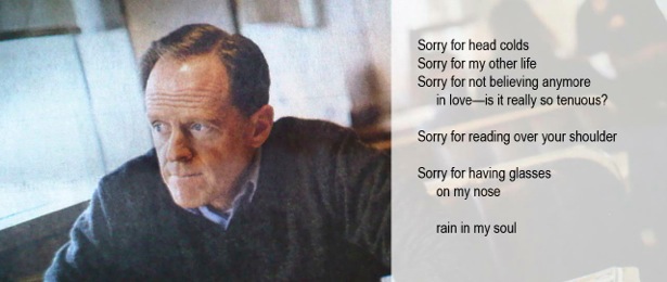
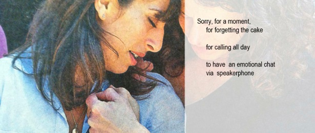
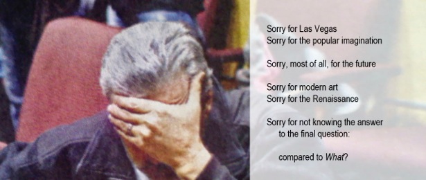
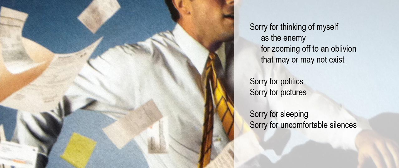
    Pairing a collection of private apologies written in response to personal traumas with a charged series of photographs capturing intensely human moments, Pattison’s Art in Transit programme launches the year with Sorry—a collection of illustrated poems by Boston-based artist Gary Duehr.

    Reaching over three million daily viewers across Pattison’s country-wide network of digital screens, Duehr’s poems will catch audiences in the very places they are most likely to apologize: the subway during a busy commute, the workplace, the mall. And it is exactly in these places that the artist hopes his works will have their greatest effect. “I have strong feelings about the American tendency for a knee-jerk apology,” explains Duehr, “[which is used] almost as frequently as ‘Have a Nice Day’—and also about mea culpas by politicians who seek forgiveness so they can go and sin some more.”

    Although the artist’s apologies were originally written as heartfelt confessions, when strung together all sincerity is lost to redundancy, as each mounting apology becomes more extreme than the last. From excusing himself for headcolds to apologizing for modern art, the works are meant to sting audiences to attention, and ultimately to exorcise what the artist sees as a growing cultural trend to apologize without any intention of making a meaningful change. “My apologies go to such extremes and are so many in number,” Duehr notes, “that they almost inoculate passersby against the act of apology.” So next time you bump into one of his works on your way home from the office, chew on his dark humour and take a cue from his dispirited anti-heroes—and stand by your actions, whether good or bad.

    Veronica Scarpati (V.S.) approached artist Gary Duehr G.D.) with a few questions.

    V.S.: Are the poems the result of personal experience— that is, are they true apologies for events which have taken place in your own life, or have they been drawn from a broader cultural tendency you’ve seen growing over the years?

    G.D.: The poems are definitely the result of personal experience – both my emotional life with its mini-traumas like anyone’s, and years of living in the culture and thinking about it critically.

    V.S.: How do you select your images, and how do you decide which poem will accompany each work?

    G.D.: I have taken the photos to reflect a broad diversity of human experience, while choosing images that are somewhat abstract or open to interpretation: a lone figure, a couple, a scene from a conflict. I worked intuitively in pairing the images and poems, trying to have them relate indirectly or create reverberations—but not to illustrate each other. I like the surprise and contradictions in certain pairs.

    V.S.: Is there a particular piece which you think will resonate more strongly with viewers?

    G.D.:  No, not really. I thought about the 20 images as 20 pages in a book that will have a cumulative effect. But a book where you can’t see everything at once. I do enjoy the ones that have a political tinge or black humor, like “Sorry for being redundant.”

    V.S.: Canadians are famously known for their politeness and ready willingness to apologize; do you see these images resonating with Canadian audiences more than with American viewers?

    G.D.: I have just learned about their renowned politeness! It does add a whole other level of humor. On my part, this was unintentional. I started the poems about 4 years ago. But I’m a big fan of Canadian art and culture, so for me this is a nice fit.

    V.S.: Any last thoughts you’d like our readers to note?

    G.D.: It would be nice if everyone could count to three before they apologize and ask themselves what they’ve done. And maybe instead of apologizing in a shallow way, do something to make the situation better!

    Veronica Scarpati
    The images are courtesy of Art in Transit

  • Katzman Contemporary  Opens at New Location

    Katzman Contemporary Opens at New Location

    Katzman Contemporary
    86 Miller Street

    Katzman Contemporary is the new iteration of the former Katzman Kamen Gallery and the original Leo Kamen Gallery. With a critical directorial vision, refined mandate, and new location, Katzman Contemporary is growing and expanding from its original ethos and roster of artists to include new visions and international exchanges.

    Jeannie Thib, Catch, 2004

    Katzman Contemporary first exhibition is JEANNIE THIB: Imprint
    Opening Reception: Saturday, February 1, 3 – 6 p.m., Remarks at 4:30 p.m.

    Jeannie Thib led an outstanding career. She was an integral part of the Katzman Contemporary roster, an inspiration and influence to the artistic community, and an irreplaceable friend to many. In the spirit of her remarkable artistic contributions, Thib’s career will be celebrated at the inaugural exhibition of Katzman Contemporary on February 1, 2014.

    Accompanying Thib’s work will be artistic responses by four contemporary artists, Randy Grskovic, Shelley Miller, Meghan Price, and Pete Smith, as a tribute to her artistic legacy.

    Imprint features seminal works from multiple eras of Thib’s career to offer a holistic instance of her practice and artistic ethos. Many of the included sculptural and wall works have not been shown in Toronto, and never together in this context.

    Exhition dates: February 1 – 18, 2014, Katzman Contemporary at 86 Miller Street. Gallery hours: Tue – Thurs 11 – 5, Fri 11 – 7, Sat 11 – 6 p.m.

  • ECO ART 2014 / Opening Reception

    Opening Reception: January 9, 2014, 8 – 11 p.m.
    Gallery 1313
    1313 Queen Street West

    ECO ART 2014 explores a number of environmental concerns such as air quality, urban sprawl, water quality and nature preservation. Artists have long filled the role of social activists expressing their concerns about issues important to them. In this exhibition they also mirror the concerns of today. The artists featured in the exhibition include Ghanesh Da, Heather Ahn, Carmen Lee, Dason Pak, Anna Snyder, Lindsay A. Veh, Jenny Li, Paul Brandejs, Arthur Ostrowski, Ruth Hartman, Daniel Sun, Stefan Herda, Adam Filek, Gregory Robin, Tibor Bedi, Katlin Brough, Sandra Herman, Catharine Somerville, Valerie Sabaliauskas, The Department of Biological Flow and Vjosana Shkurti.

    The ECO ART Exhibit opened just as things were starting to warm up in Toronto having experienced a cold spell that some could argue was a result of the erratic climate patterns caused by global warming. The annual exhibit true to its traditions contained a variety of expressions drawing our attention to different environmental concerns.

    Gregory Robins (left) and John Wiles with their sculpture Whale Coffin.

    As you enter the gallery you see the work of Gregory Robins and John Wiles called Whale Coffin. The large sculpture of a whaling ship with a whale in its belly effectively makes its point. A very different sculpture installation by Arthur Ostrawski titled Industrial Migration covers the gallery floor with plastic fish lying on a bed of steel.

    Arthur Ostrawski, Industrial Migration

    Winnipeg artist, Tibor Bodi took a look at the fast food industry’s use of disposable containers and recreated them using  more traditional glass and porcelain moulds. Carmen Lee also used photographs she took with her camera phone to depict disposable objects such as coffee cups and then using an Galaxy S Pen to create illustrated  messages on them.

    Carmen Lee with one of her works

    Medicated by Valeria Sabaliauskas, an Ottawa artist, is a book installation using an old set of children’s encyclopaedias with representations of endangered animals in the centre cut out portion in the books. She reminds us that if we continue our path of treating the earth the way we have then one day our only experience with animals will be in books.

    Valeria Sabaliauskas, Medicated

    Vjosa Shkurti examines our experience with artificial light from technology in her video work Sundown. The video is a playful interactive performance between a candle and a light bulb.

     Vjosa Shkurti, Sundown

    Stefen Herda’s The Litmus Tests uses various organic dyes and household chemicals reacting with paper to create his video work. The results are an ever changing canvas of chemical reactions creating abstract forms. Video maker, Adam Flex’s work I will Grow Tall starts with a solitary figure crouched naked in the wild. As the title says, the figure gradually rises and with arms out stretched.

    Adam Flex, I will Grow Tall (left)

    Jenny Li is originally from Shanghai  and she depicts the air pollution preset there with her three oil on canvas paintings including one titled Little Sister.

    Jenny Li with Little Sister

    The installation by The Department of Biological Flow titled Mon Santos! My Farmville is Burning takes a different approach and uses poetry, video and objects to create its message.

    The Department of Biological Flow, Mon Santos! My Farmville is Burning

    At the opening new friendships were formed as the artists talked about each others work and artistis methods. And of course they all shared their common concern for our environment.

    Now if someone can just explain what’s up with the weather ?!

    Text and photo: Phil Anderson

    *Exhibition dates: January 8 – 19, 2014, Gallery 1313, 1313 Queen Street West. Gallery hours: Wed – Sun 1 – 6 p.m.

  • Trade Marks at Prefix  / Opening Reception

    Trade Marks at Prefix / Opening Reception

    Opening Reception: September 19, 2013, 6 – 8 p.m.
    Prefix Institute of Contemporary Art
    401 Richmond St West, Suite 124,

    Entering 401 Richmond is always a delight, seeing eclectically dressed, fast talking creators zipping in and out of the massive cultural hub. But tonight artists, writers and enthusiasts wandered in to celebrate the opening of Trade Marks, a group exhibition featuring four young contemporary indigenous artists.

    Betty Julian, curator of the show, opens the reception by giving a brief introduction to the themes discussed in the multi-media exhibition. Julian highlights the use of symbolism and the emphasis on mark making when discussing the theme of indigenous interaction in modern day Canada. This is evident in Keesic Douglas’ work where by using the point blanket to stand in for the tradition and conflict that exists between the Indigenous people and the Hudson Bay Company respectively. Douglas uses photography to comment on the trade relations and its corresponding inequities with a minimalist language.

    Keesic Douglas’s interaction between traditional textile and old-rye Whiskey to highlight the divide between customs and commodities

    Keesic Douglas busy in conversation describing the distinct stripes of the point blanket and their connotation in his photograph

    Symbolism is also present in Nigit’stil Norbert’s work where she uses a stencil inspired by her grandmother’s Gwich’in needlework to make a mark on urban spaces. This leads to a fantastic new lens through which to look at Toronto.

    Norbert intersects two separate symbols of urban living and Indigenous handiwork to create a new space. One of my favourite works of the night

     Nigit’stil Norbert displaying her work

    Meryl McMaster interprets mark-making by creating a sculpture made out of paper swallows cut out of North American history books. Then she moves within this swirl of paper birds. The large scale triptych is fascinating and immediately grabs your eye and very successfully elicits a sense of movement within the photographs.

    Meryl McMaster standing by one of her beautiful photographs, Murmur

    The fourth artist of the collective is Bear Witness who was not present at the opening. In his audio element in the show, his spoken worlds and sound piece summons you into the gallery and makes you feel like a cherished part of the community; much like the numerous Indigenous gatherings he’s appropriated.

    The show is open from September 19th to November 23rd with plenty of interactive events including a curator’s talk on September 28, 2013 at 2 p.m. and the Image Native Art Crawl on October 18, 2013. Prefix Institute of Contemporary Art, 401 Richmond St West, Suite 124,  Toronto. Gallery hours: Wed – Sat 12 – 5 p.m.

    Text and photo: Aliya Bhatia

  • Jessica Stockholder

    Jessica Stockholder returns for her second show at the Barbara Edwards Contemporary. She has recently become the Chair of the Art Department at the University of Chicago, formerly Director of Graduate Studies in Sculpture at Yale University. Recognized internationally, for her installations and sculptures, Stockholder has exhibited her work in both North America and Europe.

    Jessica Stockholder in front of her work, Green Shape and Gaming, 2013. Photo: Alice Tallman

    Ms. Stockholder is best known for her large-scale three dimensional pieces, however the works in this show are mostly on paper. Starting her career in the 1980’s, she was influenced by Minimalism, and by artists such as Sol LeWitt. Her response to the geometrically sleek essence of minimalism is through bright colours and forms both geometric and abstract.

    Jessica Stockholder, Fish, 2013, Litho print, acrylic paint, collage, graphite and coloured pencil on paper, 29 1.2 x 18 inches. Courtesy of  Barbara Edwards Contemporary

    Stockholder with her mixed media works on paper sets out to explore both the alphabet in the process of becoming language as well as the human body, particularly the belly. She merges these two together and illustrates how they are connected. Her abstracted drawings of the belly morph and become a part of a universal pictorial dialogue of undulating sinuous curves, in which the human body is both a landscape and a language.

    Each piece is marked with unique and eccentric particularities illustrated through line, shape, and colour. With the artist’s emphasis on the alphabet, Stockholder continues to explore the repetition of writing out the alphabet and how this repetition helps to evolve language. With these works there is a collision of the opposing realms of formalism and abstraction. These images are both real and unreal, adhering to an autonomous ordering of visual perception.

    Jessica Stockholder, Puzzled, 2013, litho print, pencil color, acrylic paint, glue, plastic parts and graphite, 22 x 30 inches. Courtesy of  Barbara Edwards Contemporary

    I (A.T) spoke with Jessica Stockholder (J.S) about her works after her show opened here in Toronto in April.

    A.T. You discussed your interest in the alphabet, can you describe what your own artistic language is composed of?

    J.S. The words you use in your question “my own” can refer to the way I use shared language, convention, habit, and metaphor. “My own” can also refer to more idiosyncratic invention that isn’t shared. My work leans heavily on minimalism, though it doesn’t appear minimal. The works of the Minimalists opened up a space for attention to physical experience in relation to apprehension, and called attention to the dumb fact of its existence; they valued the experience of the body the most. Minimalism’s intersection with the world around it was also pointed in relation to the grid. The grid is a very human structure. Geometric grids don’t often exist in nature. We invent them in our city planning and inside almost every building we make. The ever-present grid is full of all kinds of metaphors. Within my work, I try to access idiosyncratic invention, that isn’t necessarily rational, but that is more difficult to discover, more difficult to apprehend.

    Jessica Stockholder, Story of Angle #3, 2013, graphite and coloured pencil on paper, 11 x 14 inches. Courtesy of  Barbara Edwards Contemporary

    A.T. In working on paper rather than in the three-dimensional space, do you feel that there is a difference in the space? Are they similar in any way?

    J.S. No they’re quite different. Paper presents a neutral, blank, emptiness. Whereas a room is always a different thing, containing different light, different characteristics and a more idiosyncratic set of limitations within which one can work.

    Jessica Stockholder, Green Shape and Gaming, 2013, collage, litho print, pencil color, acrylic paint and graphite on paper, 23 x 15 3/4 inches. Courtesy of  Barbara Edwards Contemporary

    A.T Your works are composed of a diverse range of materials and objects; what determines your selection?

    J.S. In some ways it is the case that I could make art out of any material. I mean at some essential level, what I’m interested in is the intersection between the things I am constructing and inventing, and how that is materializing. I’m interested in the way in which materials are meaningful. Usually not in a connotative way, but in other essential ways – like how plastic is made and where it comes from. I’m interested in the design that is embedded in materials; how each object have different kinds of significance and resonance in the world. There are historical references, values, hierarchies and class structures embedded in all made objects. I am aware of this information in the objects and I’m happy that it is there to use.

    Jessica Stockholder (in the middle) and art critic Sarah Milroy (right). Photo: Alice Tallman

    This is an exciting opportunity to see Jessica Stockholder’s most recent work until June 8, 2013 in Barbara Edwards Contemporary, located at 1069 Bathurst Street. Gallery hours: Wed – Sat 11 – 6 p.m.

    Alice Tallman

  • Teri Donovan: An Archeology of Time

    Remains, mixed media on Mylar, 7 x 15ft.

    June 22 – July 16, 2011
    Opening: June 24, 7-10pm
    THE RED HEAD GALLERY
    401 Richmond St. W., Suite 115.
    Toronto, ON M5V 3A8
    T:  416 504-5654.
    Email: art@redheadgallery.org.
    www.redheadgallery.org.
    Hours: Wed – Sa. 12 – 5 pm.

    Teri Donovan’s new body of work deals with time and memory and its impact on identity and culture. According to John Lock, there is no identity without memory. It follows therefore, that there is no memory without time.
    In this exhibition Teri Donovan focuses on cultural as well as family histories, and incorporates the use of wallpaper as a signifier of temporal context. Parallels are drawn between the repeat patterns of wallpaper and the repetition of personal and cultural histories. These repetitions speak to the long half-life of influence exerted by some histories, alongside the ever increasing speed at which contemporary developments are relegated to the past tense.