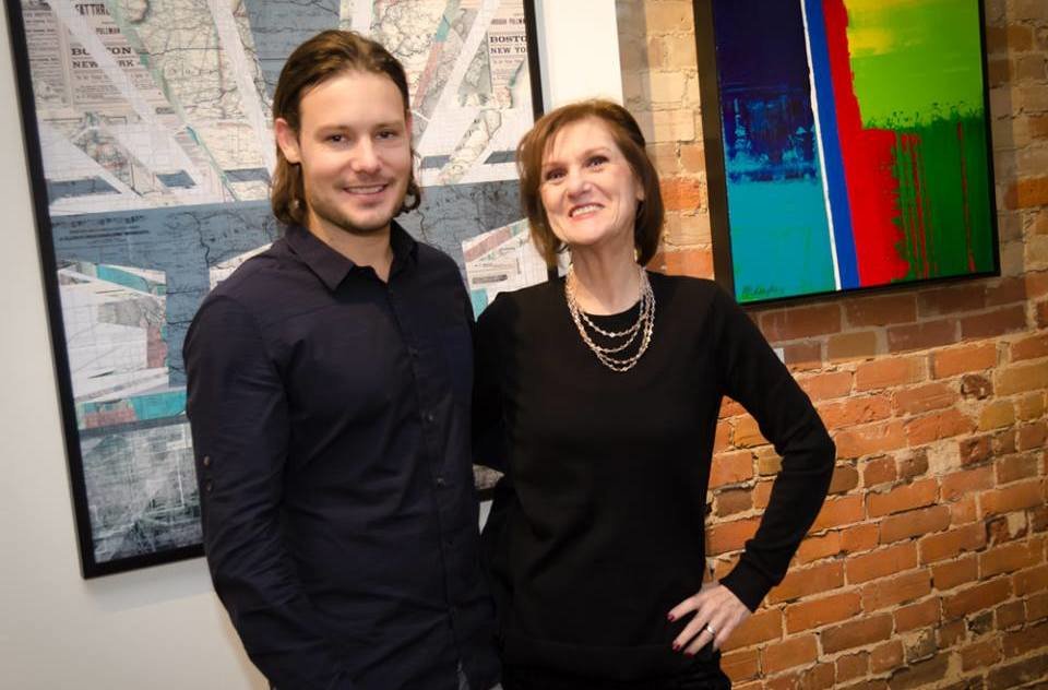
 Lloyd Arbour and Elaine Fleck, owner of Elaine Fleck Gallery. Photo courtesy of Elaine Fleck Gallery
Interview with Lloyd Arbour (LA) by Nika Teper (NT)
Arbour’s new series Power, exhibited at the Elaine Fleck Gallery, focuses on the juxtaposition of architectural shapes created by power lines viewed in their natural settings. In the depth of these pieces you will find sacred geometry overlaying landscapes — forcing the viewer to have a deeper understanding of their surroundings.
NT: Your work is reminiscent of architectural renderings, atmospheric paintings and artistic collages. The results are compositions that are both familiar and dreamlike. How do you incorporate the recognizable with more imagined elements, playing with transparency colour saturation, photography and illustration? How do you decide upon what information to heighten or subdue?
LA: By picking apart and dissecting segments of my photography as it allows me to keep and incorporate the most important elements. By collaging these pieces together new scenes and landscapes emerge. To create a high level of contrast I essentially subdue areas of less importance putting more emphasis on where I would like the observer to focus.
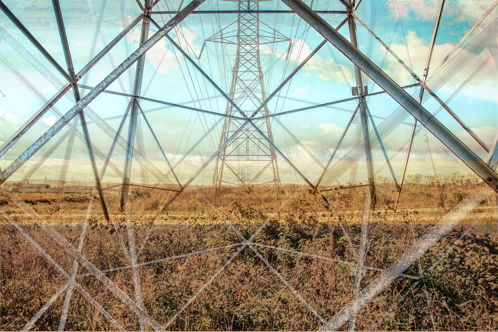 Lloyd Arbour, Power I, 2016, Photography, Digital Composite, Archival Print, 40 x 60 inches. Courtesy of Elaine Fleck Gallery
NT: Your work evokes the constant flux of the urban environment. How does motion play a role in your art and your conception of the city?
LA: I find it effective to combine different overlaying angles of the same setting or objects to create the illusion of movement. Creating a sense of depth allows the viewers eye to be drawn into a deeper perspective. The isolated nature of my work doesn’t include all the elements found in a busy urban atmosphere. However I achieve this feeling by combining intersecting lines and juxtaposed colours and shapes to express the sense of movement.
NT: As a trained and practicing graphic designer who engages with the contemporary urban landscape, how do you understand the role of graphic design in the field of architecture? Do you see a potential for a greater reciprocity between the practice of graphic design, art and architecture?
LA: Yes, I feel that the connection between architecture, art and graphic design will only continue to become stronger. I find that simplified communication is the root to solid design as a whole. I feel there are similar traits such as balance, white-space and visual communication that are apparent in both practices.
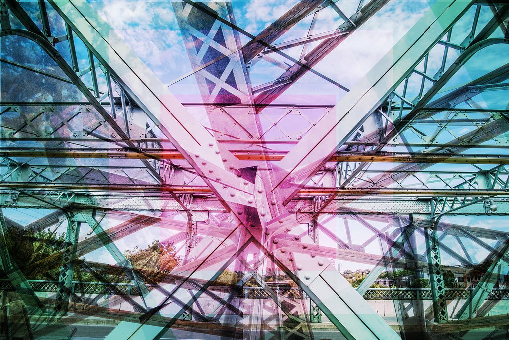 Lloyd Arbour, Blueprint I, 2016, Photography, Digital Composite, Archival Print, 40 x 60 inches. Courtesy of Elaine Fleck Gallery
NT: Your work is rooted in different cities. When placed side by side, overarching infrastructures are revealed. Simultaneously, the aggregation and colour schemes demonstrate each city’s unique nuances. What would you define as the similarities and differences between your examined cities?
LA: The main similarities found in my work would include architectural elements such bridges and beams, among others. I create perspectives using infrastructure. It is difficult to briefly describe the differences between each city but rather I focus on the emotions inspired by a city when I am creating the work. I’ll let the artwork tell the story.
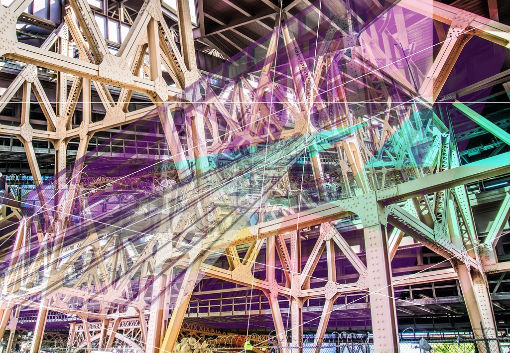 Lloyd Arbour, Blueprint V, 2016, Photography, Digital Composite, Archival Print, 40 x 60 inches. Courtesy of Elaine Fleck Gallery
NT: Can you expand upon your process of creating these digital illustrations. How do you construct, warp, add?
LA: The process of creating my digital composites first start as ideas and much of the planning and conceptualizing of the work is all constructed on my computer. I often start with a photograph that has the strongest perspective and then layer a series of additional photos in the foreground, I tend to stray away from using any destructive effects or filters. In addition I include an array of textures, architectural elements and colours to add further detail. In my current work I’ve been finishing off the pieces with the inclusion of thoughtfully placed geometric lines which add a further sense of depth or dimension.
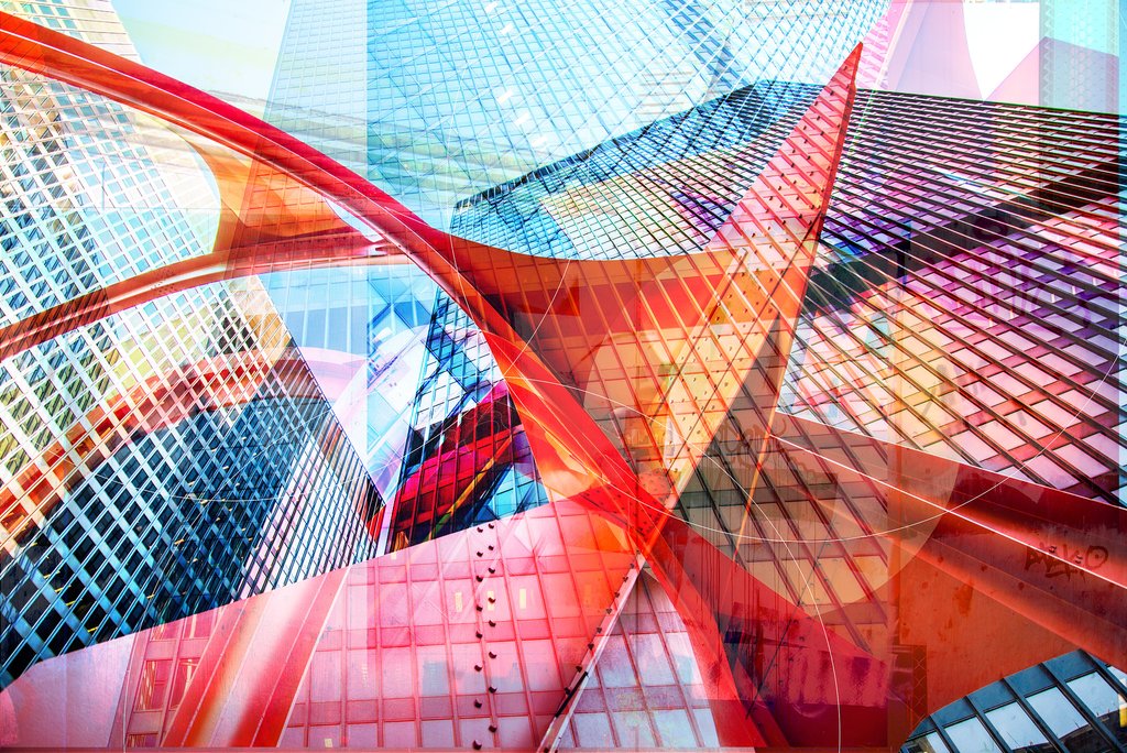 Lloyd Arbour, Blueprint III, 2016, Photography, Digital Composite, Archival Print, 40 x 60 inches. Courtesy of Elaine Fleck Gallery
NT: In future work, how do you plan to continue to address this important idea of highlighting possibility and creativity in the built world of the everyday?
LA: Inspiration for creating new work comes to me naturally. By continuing to travel to new cities and always pursuing new experiences I continue to expand my outlook on life. I find beauty and creatively in many of the basic elements that surround me on a day-to-day basis — one day it might come from architecture and the next a gradient of colour.
*Exhibition information: Lloyd Arbour & Kristyn Watterworth: Landshapes, January 2017, Opening Reception: January 7, 2017, 2 – 4 pm, Elaine Fleck Gallery, 1351 Queen St. West, Toronto. Gallery hours: Mon, Wed, Thur & Fri: 12 – 6 pm, Sat: 11 am – 6 pm.
